Wednesday, 28 February 2018

'Summer 2017' Junque Journal Page | Vicki Boutin

Hi everyone!

Today I’m sharing a page that I created in my Vicki Boutin Junque Journal! As I’ve mentioned previously, I’m going to be using this junque journal as a mini album to document all of the fun things that we did with our kids over the summer. This is the first page that I’ve created for the album, and I decided to make this a title page of sorts. And of course I wanted to have a play with my Vicki Boutin mixed media goodies…


Here’s the page that I created…


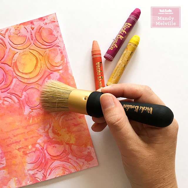
To create this background, I started off by applying gesso through a stencil. I didn’t apply it to the entire background, just to three different sections, leaving some areas with no stencilling. Next I scribbled three different colours of art crayons (all warm colours) onto a sheet of acetate, and used one of the water brushes to create some pretty watercolours. I then applied the art crayons over the top of the stencilled background by ‘kissing’ the sheet of acetate to the page. The areas where I had applied the gesso resisted the art crayons, which gave some nice variance in the depth of the colours. Once that was dry, I came back in with the pink art crayon, and I applied it over the top using the stencil brush. I love how this background turned out!


I added a title to the page using a combination of the ‘All the Good Things’ Chipboard Thickers and the numbers from the Watercolor Sticker pack. I kept the embellishing fairly simple, using two of the gorgeous die cut butterflies from the collection. I added some craft foam underneath the wings of the butterflies to give them some extra dimension.


Up in the top right hand corner of the page, I added a little chipboard banner from the Finishing Embellishments pack.


I finished the page off with a few black enamel dots, and then it was ready to pop into my Junque Journal!


Thanks so much for joining me today! I hope that you’ve been inspired to play in your Junque Journal too! You can check out my process video for this page over on my YouTube channel… 


Here’s a list of all of the Vicki Boutin products that I used to create this page…
Art Crayons #1 – Warm
Gesso
Stencils
Watercolor Brushes
Stencil Brushes
Junque Journal
Junque Journal Refills - White
Thickers – Alpha/B&W Chipboard
Cardstock Die-Cuts – Icons
Adhesive Finishing Embellishments
Watercolor Stickers


Tuesday, 27 February 2018

Note Travelers Notebook Spread | Vicki Boutin

Hey friends!

Today I'm sharing a traveler’s notebook spread featuring the Vicki Boutin ‘All the Good Things’ collection by American Crafts! If you’ve ever wanted to include some mixed media into your traveler’s notebooks, but you weren’t sure how, then today I have a technique to share with you! You CAN still have fun with your mixed media goodies, without worrying about how it will affect the pages in your insert! All you need are some art crayons, and the awesome Vicki Boutin watercolour stickers! Here’s the spread that I created, using these…


I had lots of fun getting ‘arty’ and painting those beautiful flowers from the watercolour sticker pack using the art crayons! I love that I was able to include some mixed media on this page, and what’s best is that I could customise my flowers to whatever colour I chose! I’m so happy with how they turned out!

I created a cluster with the flowers in the bottom corner of the left hand page, and then I tucked the die cut word ‘note’ in above the floral cluster. I love the contrast of the black title against the bright colours of the flowers! Above the title I added one of the word stickers, which I cut in half. It was the perfect sentiment for this page!


I added my photo to the right hand page, which I matted with two of the patterned papers from the ‘All the Good Things’ collection. I tucked a couple more of the painted flowers around the photo, and I also added a die cut heart to the top right hand corner of the photo.


In the bottom right hand corner of the page I added some short journaling.


I finished the spread off with a few enamel dots, and a doodled border around the edge of the page.


Thanks so much for joining me today! If you’d like to watch how I created this spread, you can check out my process video over on my YouTube channel…


Here’s a list of all of the Vicki Boutin products that I used to create this TN spread…
Art Crayons #1 – Warm
Art Crayons #2 – Cool
Art Crayons #3 – Neutral
Watercolor Brushes
Watercolor Stickers
Cardstock Stickers – Words
Cardstock Die-Cuts – Icons
Cardstock Die-Cuts – Frames
Self-Adhesive Finishing Embellishments
Double Sided Patterned Paper – Pretty Words
Double Sided Patterned Paper – Good Vibes


Saturday, 24 February 2018

Junque Journal Cover | Vicki Boutin

Hey friends!

I’m happy to be back sharing a new Vicki Boutin design team project with you! This week we are focusing on the Junque Journals, and I had so much fun adding some mixed media and embellishments to the front of my journal! I’ve been deciding on what to use my journal for, and I’m thinking that I’ll use this one as a mini album. My eldest two kids have just gone back to school after 7 weeks of school holidays, and I thought it would be fun to use my Junque Journal to document all of the fun things that we did over the summer! The beauty of these journals though, is that you can use them however you like!

Here’s a look at what I did on the cover of my Junque Journal…


I’m going to show you how I created the mixed media background for my cover by giving you a step-by-step tutorial. It was a super easy and fun, so maybe you can give it a try too!

1) Add a strip of washi tape down the edge of the spine so that you don’t have to worry about your mixed media getting on the fabric spine cover. Next, cover the entire cover with white gesso. This will give you a good base for adding your mixed media onto.


2) Choose three colours of acrylic paint – I used Juicy Pear, Blue Hawaiian, and Sugared Strawberry (these are all part of set 3 of the Color Pop Paints). Next paint the cover of your journal with one of the lighter colours from the ones that you’ve chosen. I let mine dry and then gave it a second coat, to build up the vibrancy of the colour a bit more.


3) Once the first colour is dry, apply a second colour of paint through a stencil on the bottom right hand corner of the cover and the top left hand corner. I used the Blue Hawaiian paint and one of Vicki’s new stencils.


4) Next choose another stencil that has a smaller pattern than the first one, and apply your third colour of paint through this stencil. I chose the Sugared Strawberry as my third colour because I wanted it to contrast with the cooler colours that I’d used for the first two layers. I think this really helps the background to ‘pop’! I also mixed this paint with the Vicki Boutin Iridescent Glaze to make it a bit thicker and give it some sparkle! I love how this makes it look more dimensional when applied through the stencil, and it looks so pretty and shimmery!!


5) The last thing that I did on the background was splatter some watered down black acrylic paint. This adds some more contrast, and also adds to the messy factor!


Here are some closeups of the finished cover so that you can see all of the details…


I created those flowers by stamping onto the scraps of a background that I had left over from cutting a title for a previous layout! So make sure you don’t throw away your scraps, because you can use them to create your own die cuts like this!


I used one of the phrases from the ‘All the Good Things’ Foam Thickers pack as a title, and I also added a sticker that says ‘Let the Good Times Roll’. These were the perfect phrases for this mini book!


Underneath the title I created a little cluster using one the cute birds from the ephemera pack, and a few more of my die cut flowers.


I finished the cover off by adding a couple of the enamel dots from the Finishing Embellishments pack, and a strip of thin washi tape down the edge of the spine.

Thanks so much for joining me today! I hope that you’ve been inspired to play with your Junque Journal too!

Here’s a complete list of the Vicki Boutin products that I used to create this…
Junque Journal
Gesso
Color Pop Acrylic Paint – Set 3
Iridescent Glaze
Stencils
Stamps & Dies – Set 2
Mister Bottles
Cardstock Stickers – Words
Thickers – Phrase/Glitter Foam
Cardstock Die-Cuts – Icons
Self-Adhesive Finishing Embellishments
Washi Tape


Wednesday, 21 February 2018

Selfie | Charms Creations

Hey scrappy friends!

Today I'm sharing a new layout for Charms Creations!


I documented a recent selfie of Isaac and I, taken when I took the kids on a little day trip during the last school holidays. I used the Paige Evans 'Turn the Page' collection to create this layout. I love the combination of aqua and red together!

I also used one of the February 15th sketches from Stuck?! Sketches as inspiration for the design of this page. Here's a look at the sketch...


And here are some closeups so that you can see all the details...


I added a Charms Creations Denim, White & Black Chevron to the right of the photo. These have always been one of my go-to Charms Creations embellishments! I also tucked a Kinder Kreations flair button under the edge of the chevron, and I added a wood veneer word from D-Lish Scraps underneath the photo. I love the interest that the different textures, such as the denim and wood, add to the page!


I also embellished this layout with lots of stars, because you really can't go wrong with stars on a boy themed page! I fussy cut that large red one from one of the patterned papers in the 'Turn the Page' collection, and the others are a combination of Shimelle Thickers, Felicity Jane wood veneers, and Bella Blvd puffy stickers.

Thanks so much for joining me today! I hope that you've been inspired by my layout. Make sure you go check out the Charms Creations shop for these and lots more awesome handmade embellishments! And if you're looking for a good sketch to inspire your creativity, pop on over to the Stuck?! Sketches blog!

Mandy x

Saturday, 17 February 2018

Preschool Girl | Vicki Boutin

Hey friends!

Today I have a multi-photo layout to share using Vicki Boutin mixed media products and the ‘All the Good Things’ collection! I had a play with Vicki’s new stencil brushes on this page, and they are AMAZING!!


The colours in the ‘All the Good Things’ collection were perfect for documenting these photos of my youngest daughter on her first day of preschool! She looked so cute with her big back pack on! Here’s the layout that I created…


I started my layout off by applying three different colours of art crayons through the new butterfly stencil using the larger stencil brush. I started with pink at the bottom of the page, fading into purple, and then blue. I tilted the stencil a little each time I changed colours to make it look like the butterflies were floating up the page. I then added some water to the purple art crayon and splattered it onto the page using a small paint brush. This background was so quick and easy to create, and I love the subtle detail that it adds to the layout!

I adhered the photos onto a piece of white cardstock, and then matted them with three patterned papers from the ‘All the Good Things’ collection. The papers I used were… Positive Note (reverse side), Birds of a Feather (reverse side), and Blossom to Awesome (reverse side). I also fussy cut one of the floral clusters out of the Blossom to Awesome patterned paper and tucked it under the top edge of the photo strip. And I added a sticker that says ‘Fun Starts Here’, along the top of the photos as well.


Underneath the right hand side of the photo, I tucked a few of the die cut flowers from the ephemera icons pack. I added some foam tape underneath the leaves to lift them up and give them some extra dimension. 


Underneath the bottom edge of the photo strip I tucked a label from the frames pack, and then on top of that I adhered the die cut piece that says ‘Be Fearless’. I added foam tape underneath this as well to once again create some more dimension. I also tucked some leaves from the watercolour sticker pack underneath the bottom edge of the photos. Next I added my title, and the chipboard Thickers from the collection were perfect for this!


I created another little cluster in the bottom right hand corner of the page using a couple more die cuts. The birds in this collection are so cute! You can also see here that I added two strips of patterned paper across the bottom of the page, which helps to ground the layout.


I finished the layout off with some typed journaling and a few enamel dots from the Finishing Embellishments pack.

Thanks so much for joining me today! If you'd like to see how this layout came together, you can check out my process video on my YouTube channel...


Here’s a list of all of the Vicki Boutin products that I used on this page…
Art Crayons #1 – Warm
Art Crayons #2 – Cool
Stencils
Mister Bottles
Cardstock Stickers
Thickers – Alpha/B&W Chipboard
Ephemera Cardstock Die-Cuts – Icons
Ephemera Cardstock Die-Cuts – Frames
Self-Adhesive Finishing Embellishments
Mixed Media Watercolor Stickers
Double-sided Patterned Paper – Blossom to Awesome
Double-sided Patterned Paper – Birds of a Feather
Double-sided Patterned Paper – Positive Note


Thursday, 15 February 2018

Love You | Cocoa Vanilla Studio

Hello friends!

Today I'm sharing a layout for Cocoa Vanilla Studio, featuring the beautiful More than Words collection! We're continuing with our 'love' theme over on the CVS blog for the next couple of days, and so I'm sharing a layout of my hubby and I, taken on Christmas Day last year! I decided on this page that I wanted to focus on the corals and blues within the collection. Here's the layout that I created...


I chose the Radiant patterned paper (reverse side) as the background for my layout, and I matted it on the Gossamer patterned paper (reverse side). I also added some machine stitching around the edge of the page to give it some subtle texture.

Next I applied some acrylic paint to my background using a palette knife. I created that lovely coral coloured paint by mixing together pink and yellow. The painted background really helps the photo to pop off the page! I also splattered some watered down white gesso onto the background for some more interest.


I matted my photo with several patterned papers from the collection. The papers that I used were - Collage (reverse side), Treasure (reverse side), Noteworthy, and Gossamer (reverse side). I also added a doily from my stash, and I tucked a tab from the die-cut ephemera pack underneath the left hand side of the photo.


I combined one of the chipboard titles from the collection, with a banner from the die cut ephemera pack, and a couple of the little word stickers, to create the phrase 'love you my darling, with all my heart, always'. This was the perfect sentiment for this layout, and it serves as both the title and my journaling. I also added a little chipboard arrow underneath the title.


Underneath the title I added a couple of die cut feathers as well as a flair button from the collection. I added some foam tape underneath one of the feathers to give it some extra dimension.

I finished the layout off with a few enamel dots, and a chipboard hearts.

Thanks so much for joining me here on my blog today! I hope that you enjoyed taking a look at my layout!

Mandy x

Wednesday, 7 February 2018

Sweet Happy Moments | Charms Creations

Hi friends!

Today I'm sharing a layout that I created for the Charms Creations Creative Team!


I documented some cute photos of Eleanor on this layout. She loves the little rides that are scattered around our local shopping centre, (which I'm positive are (in)conveniently located so that you can't avoid them when you're shopping with a toddler!). Whenever she gets to have a ride on one, she's over the moon, and I took these photos on one such occasion.

I used the Maggie Holmes Carousel collection on this layout, as well as some Vicki Boutin mixed media products.

I also used the February 1st sketch from Stuck?! Sketches as inspiration for my page. Here's a look at the sketch...


I started my layout off by creating a mixed media background using the Vicki Boutin art crayons. I added water to them so that I could use them like watercolors, and I painted it onto the background using a paint brush. I also stamped some circles in a darker yellow onto the background to give it some more interest.

Then I used the sketch as a guide to add my photos, title, and embellishments to the layout.

Here are a couple of closeups...


I added a Charms Creations hot pink hessian arrow to the cluster to the right of the photos. You can find all the Charms Creations arrows in the shop here. I also layered a D-lish Scraps flair button on top of the arrow.


All of the other embellishments on the page are from the Carousel collection. I used the die-cut ephemera, the cardstock stickers, and the puffy stickers. I particularly love the pretty florals in this collection!

Thanks so much for joining me today! Make sure you go check out all of the beautiful embellishments in the Charms Creations shop, and head on over to the Stuck?! Sketches blog to play along with their January 1st challenge.

Mandy x

Thursday, 1 February 2018

Wonderful & Sweet | Cocoa Vanilla Studio

Hi friends!

Today I'm sharing a layout that I created for Cocoa Vanilla Studio using the stunning new More than Words collection! I just love the soft colours in this collection, and of course the beautiful florals! It's so lovely to work with, and I couldn't wait to create another layout with it!


On this layout, I documented a photo of my youngest daughter Eleanor with our new little kitten Archie. I just love the way they both look so happy and content together. Eleanor has such a sweet relationship with both our cats, and I'm so glad that I captured this moment!

I started my layout off by trimming an inch off each side of my white cardstock. I then added a thin border around the white cardstock using the reverse side of the Darling Buds patterned paper, and then matted the entire layout on the A-side of that same patterned paper. I love the sweet little flowers on that paper! I also added some machine stitching around the edge of the white cardstock to give it some additional texture.

I added some pretty layers behind my photo using a few patterned papers from the collection as well as a doily from my stash. The papers that I used are - Noteworthy (both the front and the reverse side), and Collage.


I created a pretty cluster of embellishments on the right hand side of the photo. The cluster includes a butterfly that I fussy cut from the Treasure patterned paper, some beautiful flowers from the die cut ephemera pack. a flair button, a little word sticker from the accessory sticker sheet, and a chipboard frame from the Wild at Heart collection. I used foam tape underneath some of the elements withing the cluster to give it lots of dimension! You can also see here the cute little chipboard banner that I added to the top right hand corner of the page.


I created a smaller second cluster down in the bottom left hand corner of the page. This gives the layout a diagonal flow, and helps to draw your eye from the photo, down to the title and journaling. This cluster includes more of the beautiful die cuts and stickers from the collection. Once again, I used foam tape to create varying heights within the cluster.


Lastly I added my title and journaling to the page. I created the title using a chipboard sticker from the More than Words collection, combined with alphabet stickers from the Hello Lovely collection. The wood grain look of the alphabet stickers balances out the chipboard frame in the top cluster.

That's it from me for today! Thanks so much for joining me here on my blog! Make sure you keep your eye out at your local retailer for the More than Words collection, as this is one that you will not want to miss!

Mandy x