Tuesday, 18 April 2017

Let's Go Traveler's Notebook Spread | The Cut Shope

Hi everyone!

Today I have a traveler's notebook spread to share that I created using the Let's Talk Summer cut file set from The Cut Shoppe Etsy store!


I'm using this notebook to document photos from our cruise that we went on last year. This photo of my daughter was taken just before we set sail from Sydney. The view of the Sydney Harbour Bridge was amazing!

I used patterned papers from the Bella Blvd Secrets of the Sea collection, combined with embellishments from Cocoa Vanilla Studio.

The Let's Talk Summer cut file set was perfect for this page...
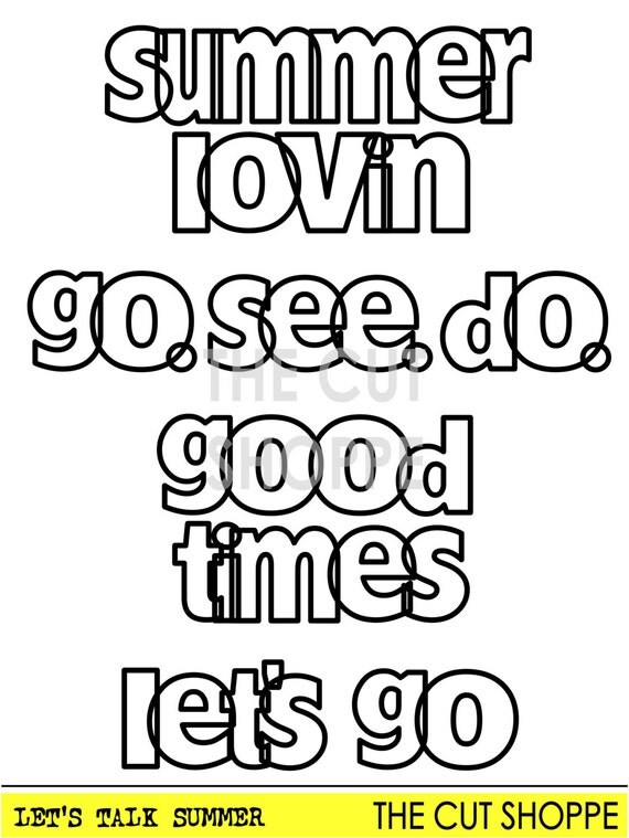
The Let's Talk Summer Cut File, includes 4 welded phrases that can be used on your Summer and Travel layouts or paper projects.

I love the font and the phrases in this set, and I'll definitely be using it again as I document our vacation snaps!


I covered the left hand side of the spread with a Bella Blvd pattern paper, and then added my photo to this page. I fussy some flowers from one of the pattern papers in the Cocoa Vanilla 'Hello Sunshine' collection and adhered these using some foam tape onto the bottom right hand corner of the photo.


I added a die cut banner from the Hello Sunshine collection up in the top left hand corner of the page, and then popped some enamel dots next to the banner.


I used the 'let's go' phrase from the 'Let's Talk Summer' set as the title for my spread. I cut it from another Bella Blvd pattern paper. I love the open letters!


I added some more fussy cut flowers from the Hello Sunshine collection up in the top right hand corner of the page.


Lastly I added some more flowers at the bottom of the page, as well as a wood veneer piece from the Cocoa Vanilla 'Endless Summer' collection, and a few more enamel dots.

If you use traveler's notebooks, have you tried using cut files in your notebooks? I recommend giving it a try! Stop by the shop to check out all of the awesome cut files available!

Saturday, 15 April 2017

My Boy | Stuck?! Sketches April 15th challenge

Hi friends!

I hope that you are having a wonderful Easter weekend! I'm popping back in today to share the latest sketch challenge at Stuck?! Sketches! Here's the fabulous April 15th sketch designed by Laura Whitaker...

No automatic alt text available.

And here's my layout that I created using the sketch...


I documented a recent photo of my son and I taken while we were having a picnic. I love his natural smile in this photo, and that it really captures his happy and carefree personality!

I used the Simple Stories 'Love & Adore' collection to create this page. Although this is a Valentines collection, and is quite feminine, I was still able to find elements within the collection to make it work for a layout about me and my boy!

Here are some closeups...


The cluster to the left of my photo includes a Charms Creations chevron, a flair button from D-lish Scraps, and some die cut flowers from the Love & Adore collection.


I created another cluster on the bottom right hand corner of the photo using more die cuts and a chipboard sticker from the collection.


Using the sketch as a guide, I created a third cluster at the bottom of the page using a chipboard heart, a floral sticker, and a die cut piece with the phrase 'You're my Sweetheart'. I used alphabet stickers from the collection to create my title. You can also see here that I added some texture paste to my background using a Dusty Attic stencil.

I finished my layout off with some typed journaling, and by adding a few enamel dots to each embellishments cluster.

If you haven't done so already, I hope that you'll head on over to the Stuck?! Sketches blog and take a look at the fabulous layouts created by my fellow design team members! We'd love you to play along with us by creating a layout based on this sketch! Link up your layouts on the Stuck?! Sketches blog by April 29th to be in the running to win a prize from one of our very generous sponsors:

Image may contain: text

No automatic alt text available.

Thank you so much for visiting my blog and taking a look at my layout! Thank you to those who take the time to leave a comment as well - it is always very much appreciated!

Mandy

Happy Easter | Cocoa Vanilla Studio

Hi everyone!

Today I'm up on the Cocoa Vanilla blog sharing an Easter themed layout! To create this layout, I dug into my stash of Cocoa Vanilla goodies and used SIX different collections on this one page! That's just one more thing that I love about the Cocoa Vanilla collections - they all work so well together!


I documented a couple of cute photos of my youngest daughter enjoying her very first Easter egg last Easter! I printed the photos in black and white, as this allowed me the freedom to choose whichever colours I wanted to use on this page. I decided on using soft, pastel colours, as these really remind me of Easter!

I pulled out some patterned papers from the Colour Me Happy collection as well as the Hello Lovely collection, and used these to create some layers for my photos to sit on. I also matted my white cardstock background on the reverse side of the Star Spangled patterned paper from the Colour Me Happy collection. I like that this gives the layout a nice border.


I added a die cut banner from the Love Always ephemera pack to the photo on the left. I like lots of dimension on my pages, so I popped some foam tape underneath the die cut to give it some added height.


For my title, I used a wood veneer word from the Colour Me Happy collection as well as the Love Always alphabet stickers. Combining different fonts and textures, as well as using varying heights for the words, helps to adds interest to the title.


I tucked a chipboard frame from the Wild at Heart collection underneath the photo on the right. I love using these not just as frames, but as layering pieces under my photos. To create the cluster to the right of the photos, I added a tag and a die cut flower, both from the Make a Wish ephemera pack, as well as a flair button from the Colour Me Happy collection, and a wood veneer heart from the Love Always collection. I love how beautifully all of these items coordinate with one another!


Up in the top left hand corner of the layout, I added a little bunting die cut from the Endless Summer ephemera pack, which I popped up on some foam tape. I also added two little phrase stickers from the Love Always accessory sticker sheet. You can also see here the die cut scallop that I tucked under the top edge of the paper layers. This is from the Love Always ephemera pack.


To create a diagonal flow to the layout, I created another little cluster in the bottom right hand corner of the page. I used a small strip of the Colour Me Happy Paisley Patch patterned paper, as well as another die cut scallop from the Love Always ephemera pack. I popped an Endless Summer woodie on top, as well as a butterfly from the Love Always vellum accents pack.

I finished the layout off by adding some typed journaling, which I cut into strips.

Thank you so much for joining me on my blog today! I hope that I've inspired you to create a layout using more than one collection!

I wish you and your family a very Happy Easter!

Mandy x

Sunday, 9 April 2017

Hip to the Hop | The Cut Shoppe

Hi everyone!

Today I have a new layout to share with you, using the super cute Hip Hop cut file set from The Cut Shoppe!


As soon as I saw this cut file set I knew that it would be perfect for scrapping this adorable photo of my eldest daughter when she dressed up as Cottontail for her book parade in Kindergarten. This was 7 years ago now (she's now in high school), but I'm so glad that I finally have this photo documented!

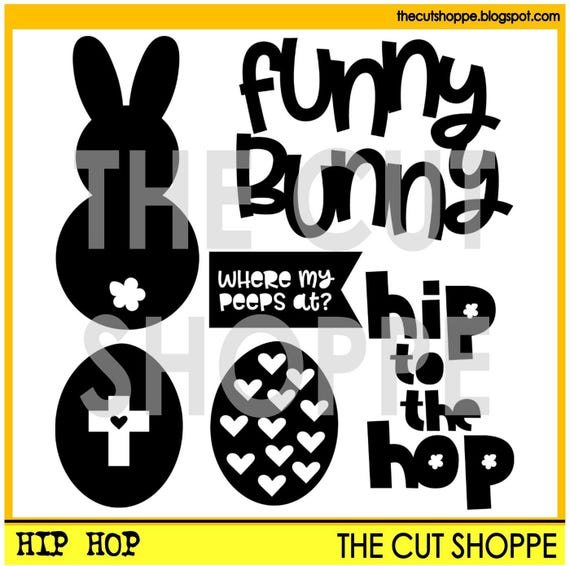
Here's the Hip Hop cut file set that I used...

The Hip Hop cut file set includes 6 Easter themed images, that can be used for your scrapbooking and papercrafting projects.

I enlarged the 'hip to the hop' phrase to make a large title for my page, and backed each word using patterned papers from the Shimelle 'Little by Little' collection, and the Crate Paper 'Cute Girl' collection. I added foam tape in between the white cardstock and the patterned papers to give the page some extra depth and dimension.


I created a little cluster in the top left hand corner of my layout using some die cuts and a wooden button from the 'Little by Little' collection, as well as a couple of Maggie Holmes little word stickers.


On the top right hand corner of my photo, I added a sticker from the 'Cute Girl' collection, and then I tucked some little flowers underneath that I fussy cut from one of the Shimelle patterned papers. I also fussy cut a couple of cute clouds and adhered them above the photo using some foam tape.


On the left hand side of the photo I added a crepe paper rosette, and I popped a cute little flair button from Kinder Kreations on top. I also added a few Bella Blvd puffy heart stickers to the page, and a little bit of stamping.

Thanks so much for joining me on my blog today! Make sure you pop on over to The Cut Shoppe etsy store to check out this fabulous cut file set!

Sunday, 2 April 2017

Beautiful Tea Cup | Felicity Jane Studio

Hi friends!

Today I'm sharing a layout that I created using the beautiful Felicity Jane March 'Jane' kit!


The gorgeous florals in this kit reminded me of my late mother-in-law's beautiful tea cup, and I thought it would be the perfect opportunity to document her love of this tea cup. Sadly she's been gone for 8 1/2 years, and I still miss her so much, but I actually quite enjoyed creating this page, because it brought back such happy memories of times spent enjoying cups of tea with her.

I started my layout off by mounting the black & white dot patterned paper onto the black & white burst paper, leaving a small border around the outside. I then added a 4x12 inch strip of the pink geometric patterned paper across the middle of the page.


I created some layers behind my photo using one of the solid colour paper from the kit, and a 3x4 journal card. I then added a flair button and a wood veneer heart to the right of the photo. The wood veneer heart was part of the piece that had a row of hearts, but I cut them off to use individually. Above the photo you can also see that I stamped the word 'Lovely' three times using a stamp from the kit.


The wood shapes in this kit are stunning! I used the word 'beautiful' as part of my title, and then added the words 'tea cup' using FJ tiny dot alphabet stickers. You can also see here that I tucked the little doily from the kit under the bottom edge of the pink patterned paper.


Look at those beautiful roses!! I love them!! I added some foam tape underneath to give them extra dimension. To the left of the roses I added a sticker from the cut apart sheet that says 'pretty'.

I finished the layout off by adding my typed journaling which I cut into strips.

I'm so glad that I finally got around to scrapping a photo of my mother-in-law's tea cup. I think it's so important to document little things like this to remember those we've lost.

Thanks so much for stopping by and taking a look at my layout!

Mandy x

Saturday, 1 April 2017

Minnie Mouse | Stuck?! Sketches April 1st challenge

Hi everyone!

It's time to reveal the latest challenge at Stuck?! Sketches! Here's the fabulous April 1st sketch designed by Laura Whitaker...

No automatic alt text available.

And here's my take on the sketch...


I loved this sketch, and it was perfect for documenting these photos of my eldest daughter when she dressed up as Minnie Mouse!

I used the Echo Park Magical Adventure collection for this page, and I love how it really complemented the photos!

Here are some closeups so that you can see all the details...


Following the design of  the sketch, I created a cluster to the right of the photos. The cluster includes a Charms Creations Denim, White & Black chevron, with a D-lish Scraps flair button on top, and a camera that I fussy cut from one of the patterned papers underneath.


I added my title to the left of the photos using some Maggie Holmes Thickers and the word 'mouse' which I once again fussy cut from one of the papers in the collection (can you tell I love fussy cutting?!). You can also see here the circle that I machine stitched behind the photos, in place of the large heart on the sketch.


I added lots of stars to the page! They are a mixture of Freckled Fawn glitter chipboard stars, Bella Blvd puffy stickers, and some that I fussy cut.

I finished the page off by adding my journaling and a little bit of stamping.

If you haven't done so already, I hope that you'll head on over to the Stuck?! Sketches blog and take a look at the fabulous layouts created by my fellow design team members! We'd love you to play along with us by creating a layout based on this sketch! Link up your layouts on the Stuck?! Sketches blog by April 29th to be in the running to win a prize from one of our very generous sponsors:

Image may contain: text

Image may contain: text

Thank you so much for visiting my blog and taking a look at my layout! Thank you to those who take the time to leave a comment as well - it is always very much appreciated!

Mandy

Love You | Cocoa Vanilla Studio

Hi friends!

Today I'm sharing a new layout for Cocoa Vanilla Studio featuring the gorgeous Wild at Heart collection! I just can't get enough of this collection! I really love all of the beautiful colours, and this time I thought I'd focus on the navys and the pinks throughout the collection.

I documented a sweet photo of our new little kitten Sasha! She's such a lovely and gentle cat, who is very loved by us all! She's even won over my husband, who isn't usually much of a pet person!


I started my layout off by using the Grow Wild patterned paper as my background. I love the rich colours in this paper, as well as the beautiful little florals! I then adhered a 6 inch wide piece of white cardstock in the middle of the page to allow a clean space for my photo, title and embellishments. On either side of the white cardstock I added a thin strip of the Patchwork patterned paper (reverse side).

I created some layers behind my photo using the Momento and the Luscious patterned papers, as well as a label from the Fussy Cuts sheet and a doily from my stash. I adhered my photo with some foam underneath to give it some extra dimension, and then I added my title underneath my photo using the 'Love You' words from the chipboard sticker sheet.


I fussy cut one of the florals from the Luscious patterned paper and tucked it under the left hand side of my photo. I think this might be my favourite patterned paper in the collection... It's so pretty! I also popped a flair button from the collection on the bottom left hand side of the photo.


I created a little cluster at the top of the page using one of the gorgeous rubber charms as well as a cute bitty bloom. I also tucked a little flower from the die cut ephemera pack under the side of the photo.


To complete the visual triangle, I created a third cluster at the bottom of the layout. I used another one of the rubber charms, another bitty bloom, and a butterfly that I fussy cut from the Mariposa patterned paper. How seriously beautiful are those rubber charms?!!

I finished my layout off by adding some of the sparkly enamel dots to my embellishments clusters.

Thanks so much for joining me on my blog today!

Mandy x