Hello!
I am so excited to be sharing my first layout as a design team member for The Cut Shoppe! I've been a fan of Ashley's cut files for a long time, so I am absolutely thrilled to now be on the design team!
The layout that I'm sharing today features a sweet photo of my two girls out enjoying the sunshine. My eldest daughter was lifting my baby girl up, and with the sky in the background, it made me think that she looked like she was flying! So that became the title for my layout... "Fly"
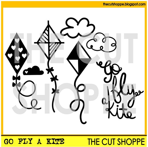
I used the Go Fly a Kite cut file set for my title. I didn't want the whole phrase, just the word 'fly', so I just traced that word in my Silhouette software. I like to try and think of different ways that I can use my cut files to get more out of them!
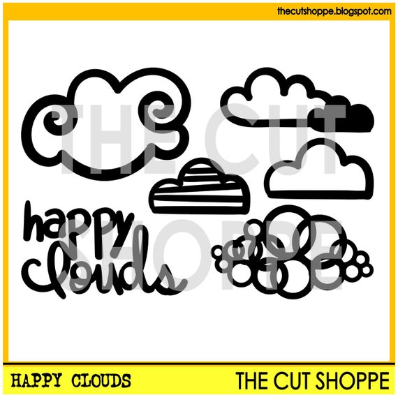
I also used the Happy Clouds cut file set to cut the clouds for my layout.

As my photo had lots of different shades of blue in the sky and in my daughters' clothing, I wanted to carry those blues onto my layout. To do this, I first created a watercolour background using Distress Inks in aqua and blue. I used the popular 'packaging technique' to apply my inks. I cut the clouds from white cardstock and I tucked some in behind my photo and others I added thin strips of foam tape to the back of to give them extra dimension.
The blues and aquas also carried through into my embellishing. I created a pretty cluster of embellishments on the bottom right hand corner of my photo, using items from lots of different collections including Maggie Holmes Shine, Amy Tangerine Better Together, Crate Paper Hello Love, as well as a tassel and flowers from D-lish Scraps. I love how well they all came together!
I intitially just cut my title on white cardstock, but I felt like it didn't stand out enough from the background, so I used the offset function in my Silhouette software and cut it out again from one of the same patterned papers that I used to layer behind my photo. I also added foam tape to the back of it. By doing this, it helped to make it stand out a little more while still keeping the light and airy feel.
Lastly I added my journalling, which is actually a poem. This poem really spoke to me and I felt that it was perfect for this photo.
Thanks so much for joining me today! Thank you for any lovely comments as well!


This is gorgeous! LOVING the colors and the clouds!!!!!!!!!!!!!!!!!
ReplyDeleteLove the layout Mandy! Congrats on joining the Team
ReplyDeleteYour first layout for the team is beautiful!!! I love that color blue & how you outlined the word with it.
ReplyDelete