Hi there scrappy friends!
This month I'm kicking off my D-lish Scraps layouts with my take on the January Inspiration Board!
Here's a reminder of what the inspiration board looks like...

How much fun is this board?! Perfect for scrapping those photos of our boys! I was particularly inspired by the bunting and the fun combination of patterns on the blanket and cushion in the top left image. I was also inspired by the stars on the wall in the bottom right picture, and the phrase "hey, good lookin'". I also loved the sketch and used this as a basis for my layout. (If you're playing along with our inspiration board challenge, note that the sketch is optional, the colour scheme is compulsory, projects must be made EXCLUSIVELY for this challenge and can not be combined with any other challenges or DT commitments.)
I used lots of awesome embellishments from the January Just Add Paper kit on my layout, starting with the red spot tissue paper. I just used it as I would patterned paper, and added it as a strip down the right hand side of my layout. I really love how bright and vibrant it looks against the white cardstock. Along the edge of the tissue paper, I added a strip of the chevron arrows washi tape. I then used the Scrap FX Star Confetti stencil with grey distress ink to add some stars to the white cardstock. I love this stencil and use it quite often, particularly on boy layouts!
Here are some closeups of my layout...
I added some patterned paper layers behind my photo and also tucked the filmstrip that came in the JAP kit behind my photo. I created a little cluster to the left of my photo that includes the tag from the kit packaging, a flair button that came in the lucky dip bag of flair that I purchased, and the lovely felt bow from the JAP kit.
To the top right hand corner of my photo I added a felt star from my stash as well as a blue retro dot button.
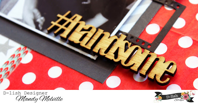
I ADORE this wood veneer word that came in the JAP kit! It was the perfect title for my layout! I decided to just leave it raw as I like how this looks.
This cluster in the bottom left hand corner of my layout includes a journal spot that came in the Christmas mini kit, a phrase from the Everyday Moments Wordfetti sheet, a strip of blue washi tape from a previous JAP kit, and the super cute wood veneer glasses that came in this month's kit. These glasses were actually the starting point for this layout and are what prompted me to scrap this photo! I love how one embellishments can do that!
I finished my layout off with some typed journalling. I've noticed lately that I haven't been including as much journalling on my pages... sometimes that's because the photo doesn't need a whole lot of journalling and that's fine, but other times it's because journalling is the last thing that I add to my layouts and there just isn't enough room to say all that I want to. This time though I was determined to include all of this journalling on my layout, so I decided to type it, and used a size 10 font so that I could fit more on my page. After I cut it up into strips, it fitted perfectly where I wanted it to!
I do hope that you will join in on our inspiration board challenge at D-lish Scraps this month! I always enjoy visiting your blogs and seeing what you've been creating when you link up your layouts here on our blog. Prizes are awarded each month both for the layout decided as 'best' and a random draw from all eligible participants! So what are you waiting for... Give it a go!
Mandy


Gorgeous! LOVING the colors and the stars!!!!!!!!!
ReplyDeleteGorgeous male layout, love the bow and the photo is so cute too.. he looks so handsome in his new glasses!
ReplyDeleteThis is incredible!!!!
ReplyDelete