Tuesday, 20 June 2017

Adventure is Out There | The Cut Shoppe

Hi everyone!

Today I'm sharing my last design team project for The Cut Shoppe! Ashley has decided to take an indefinite break from designing new cut files, and so this is the last month for the design team. There are still hundreds of awesome cut files in The Cut Shoppe Etsy store though, so plenty to choose from!

I created a traveler's notebook spread to share today, using the Hit the Road cut file set...


This cut file set is not just for documenting road trips, I think it was perfect to document a photo of my daughter enjoying a ride on her trike!
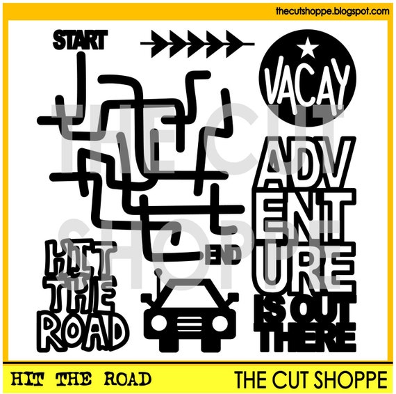
The Hit the Road cut file set consists of 6 travel themed Icons, that can be used for your scrapbooking and papercrafting projects.

I used patterned papers from the Shimelle 'Little by Little' collection on this spread, as well as embellishments from the Cocoa Vanilla 'Wild at Heart' range. I think the colours in these two collections coordinate perfectly with one another!


I sized the cut file so that it would take up most of the left hand side of the spread. Once I cut it out with my Cameo, I backed the open letters with some different patterned papers. I like how the pastel colours really soften the look of the page, while the navy provides a nice contrast.


I tucked a couple of die cut butterflies from the 'Wild at Heart' collection around the cut file, and then added some sparkly enamel dots and a little word sticker as well.


I covered the right hand side of the spread with the light purple patterned paper from the 'Little by Little' collection. I matted my photo with the same patterned paper that I used for the cut file, and then added it to the page. I embellished the top right hand corner of the photo with a couple more stickers and another die cut.

Lastly I added my journaling underneath the photo.

Thank you so much for joining me on my blog today! I hope that you've been inspired to use some of the fabulous cut files from The Cut Shoppe in your traveler's notebook!

Mandy x

Thursday, 15 June 2017

#BFF | Stuck?! Sketches June 15th Challenge

Hi friends!

Who's ready for a new sketch challenge at Stuck?! SketchesLaura has once again designed an awesome sketch to inspire us! Here's the June 15th sketch...

No automatic alt text available.

I love the central design of the sketch, and that everything is clustered around the photo!

Here's my take on it...


I documented a photo of my eldest daughter with one of her best friends just before they headed off on their Year 7 camp. They were both very excited, and they had a great time!

I used the beautiful Felicity Jane 'Caroline' kit on this layout. I love the fun colours in this kit!


I used a sticker from the Caroline kit as the title for my layout, and popped it up with some foam tape for added dimension. I moved the title to sit above the photo rather than to the left, just because it was a little too big and and made the layout feel a bit unbalanced when I put it on the left.


Here you can see the layers of patterned paper that I added behind my photo. I love all of the pretty colours and patterns peeking out from behind the photo. I also tucked a little tab under the left hand side of the photo.


I added a beautiful Charms Creations DIY star on the bottom right hand corner of the photo, and popped a D-lish Scraps flair on top.

I finished the page off by adding some journaling underneath the photo, and lastly I added some black ink splatters and a sprinkling of puffy star stickers.

If you haven't done so already, I hope that you'll head on over to the Stuck?! Sketches blog and take a look at the fabulous layouts created by my fellow design team members! We'd love you to play along with us by creating a layout based on this sketch! Link up your layouts on the Stuck?! Sketches blog by June 29th to be in the running to win a prize from one of our very generous sponsors:

No automatic alt text available.

Image may contain: text

Thank you so much for visiting my blog and taking a look at my layout! Thank you to those who take the time to leave a comment as well - it is always very much appreciated!

Mandy x

Hello Mr Rad | Cocoa Vanilla Studio

Hi everyone!

Today I'm sharing a new layout using the awesome 'You ROCK' collection from Cocoa Vanilla! This week is 'Scraplift Week' on the blog, and I am loving seeing how the design team members have been scraplifting each other's layouts! I chose to lift a fabulous layout by the talented Sue Plumb. I was inspired by the grid design of her layout.

Here's my page...


And here is Sue's layout...


You can read more about Sue's layout on her blog.

I chose to scrapbook a photo of my son, taken when I took the kids to a local reserve a couple of months ago. I love seeing how much Isaac enjoys the great outdoors, and it was the perfect opportunity to snap a pic of him while he was in his element!

I started my layout off by matting my white cardstock background on the B side of the Starshine patterned paper, and adding some machine stitching around the edge of the page.

Then I was ready to start putting bits and pieces together to form the grid. I used some of the pieces from the Random cut apart sheet, as well as the B side of that paper, and the Stripped and Night Sky patterned papers. As I was choosing what I would add to the grid, I kept in mind that I wanted a blue, black and wood grain colour combination, so I pulled out anything in these colours.


I added a little bit of embellishing to some of the sections in the grid. Here you can see that I added a chipboard star to one piece, and a rubber charm to another. These rubber charms are one of my favourite things in this collection!


How 'awesome' are all of the pieces on the cut apart sheet? They made putting this kind of layout together a breeze!


I matted my photo with the B side of the Galactic patterned paper, and then added some foam tape underneath to lift it up and give it some extra dimension. I then popped one of the super cool flair buttons on the right hand side of the photo. I added my date to one of the labels off the accessory sticker sheet, and then adhered that to one of the sections in the grid.


I added some foam tape underneath the circular die-cut piece that says 'Rad' to give it some extra height. The last piece of the grid to embellish was the strip along the bottom of the page, and I added a chipboard arrow to this section.

To finish the layout off I added a few of the little phrase stickers from the accessory sticker sheet around the page, and lastly I added some black ink splatters and a few enamel shapes.

Thanks so much for joining me on my blog today! I had so much fun scraplifting Sue's layout! Maybe you've been inspired by her layout too, and could try your own scraplift!

Mandy x

Friday, 9 June 2017

Family of 5 | The Cut Shoppe

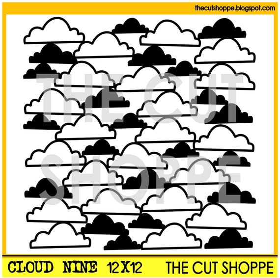
Hi everyone! Today I'm sharing a layout that I created using the 'Cloud Nine' cut file from The Cut Shoppe Etsy store.


I documented a family selfie that my eldest daughter took of us when we were on holidays recently. We don't often get photos of the five of us together, so I knew that I wanted to scrap this one straight away!

I used patterned papers and embellishments from the Amy Tangerine 'Better Together' collection on this page, as well as some bits and pieces from Felicity Jane.

I love the 'Cloud Nine' cut file, and decided to use the 8.5x11 version on this layout...

The Cloud Nine background cut file is available in 8.5x11 and 12x12 sizes, for your scrapbooking and papercrafting projects.

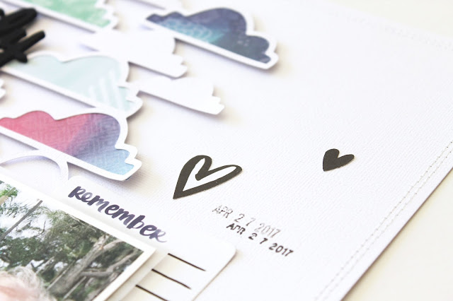
Here are some closeups of my page so that you can see all of the details...


I backed most of the open clouds in the cut file with patterned papers, and then added foam tape underneath to lift it up and give it some extra dimension.


I always love mixing up the alphas in my titles, and on this page I used a combination of Amy Tangerine Thickers, Felicity Jane Chipboard Alphas, and a sticker from the Crate Paper 'Cute Girl' collection!


I layered a Felicity Jane chipboard frame underneath the bottom right hand corner of the photo, and also tucked some fussy cut florals underneath the side of the photo. I finished off the cluster with a Felicity Jane flair button.


I tucked another fussy cut flower under the top left hand corner of the photo.


I finished my page off by adding some little hearts around the page, as well as a few enamel dots, and lastly I added my journaling and the date.

Thanks so much for joining me on my blog today!


Thursday, 1 June 2017

You are Special | Stuck?! Sketches June 1st Challenge

Hi everyone!

Here we are in June already, and the start of a new month means that it's time for a new challenge over at Stuck?! Sketches! Laura has designed a lovely multi-photo sketch for this challenge...

Image may contain: indoor

Here's my take on the sketch...


 These photos of my youngest daughter make me laugh, and I love how they really capture her funny and sweet personality! She was wearing her older sister's beanie backwards, and wanted me to take photos of her while she made kissy lips! Love this girl's personality!

I used patterned papers from the Crate Paper 'Cute Girl' collection on this page, and a mixture of embellishments from Charms Creations, Felicity Jane, D-lish Scraps, and Bella Blvd.


The title 'You are Special' is a Heidi Swapp stamp, and I love how it looks stamped onto the textured cardstock! On the sketch, the title is underneath the photos, but I decided to move it above the photos, as it seemed it fit better there for me. Underneath the photos I added a gorgeous Charms Creations Hot Pink Star with a D-lish Scraps flair button on top.


I fussy cut a couple of flowers from one of the patterned papers, and popped one to the right of the photos, and the other to the left. The yellow label sticker is from Felicity Jane, as is the 'About You' stamp.


I added a strip of patterned paper along the bottom of the page, and then in the bottom right hand corner I adhered two little phrase/word strips, one from Felicity Jane, and the other from Crate Paper.

I added some journaling to the layout, and then lastly, I added some enamel dots, some Bella Blvd puffy star stickers, and a few black ink splatters.

If you haven't done so already, I hope that you'll head on over to the Stuck?! Sketches blog and take a look at the fabulous layouts created by my fellow design team members! We'd love you to play along with us by creating a layout based on this sketch! Link up your layouts on the Stuck?! Sketches blog by June 29th to be in the running to win a prize from one of our very generous sponsors:


No automatic alt text available.

Thank you so much for visiting my blog and taking a look at my layout! Thank you to those who take the time to leave a comment as well - it is always very much appreciated!

Mandy x

Awesome | Cocoa Vanilla Studio

Hi friends!

Today I'm up on the Cocoa Vanilla blog sharing another layout that I created using the fabulous 'You ROCK' collection! I'm absolutely loving the bright and bold colours in this collection!


I took this photo of my son on Easter Sunday last month, and I just love that it captures his happy personality! (Of course it probably helped that he'd just collected basket full of chocolate Easter Eggs!)


I really wanted to feature some of the gorgeous patterned papers in the collection on this page, so picked a handful of them that complemented my photo, and then cut them up into strips of various widths and lengths. Most of the patterns that I used are from the Stripped patterned paper, and I also used Night Sky and In Line (B side). I arranged the strips of paper down the page and then used my sewing machine to stitch them onto the page.


I can't get enough of the wood veneer shapes in this collection! I used the word 'Awesome' as the title for my page and painted it with black ink to really make it pop! I added a chipboard sticker underneath my title, and one of the fabulous rubber charms to the right. I popped another one of the rubber charms on the top right hand corner of the photo. They are so soft and beautiful!


I matted my photo with the Plus One (B side) patterned paper, and then added some foam tape underneath to give it some extra height and dimension. On the left hand side of the photo I added a wood veneer star. I also added two chipboard arrows to the left of the photo, which help to draw the viewer's eye towards the photo.


I added a third point of interest at the bottom of the page to complete the visual triangle. I adhered a strip of washi tape, and then on top of that I added a camera which I fussy cut from the Random patterned paper. I also added another wood veneer star.

I finished the layout off by adding some accessory stickers and die cuts around the page, as well as a scattering of enamel dots.

Thanks so much for joining me on my blog today!

Mandy x