Tuesday, 27 October 2015

Published Layouts

Hi Scrappy friends!

I thought that it was about time that I shared some of my published layouts from the last 4 months or so! (I'm a bit lazy with this and tend to forget to share them on my blog once they are published!) So I'm going to do a catch up! In writing this post I realised how many that I've actually had published... between June and September, 7 of my layouts were published in Scrapbooking Memories magazine!! I always feel so honoured and thrilled to have my work acknowledged and to see it in print!

So here we go...

Volume 18 No 2 (June 2015)

My Favourite gallery (and also on the Contents page)


Volume 18 No 3 (July 2015)
3 of my layouts were published in this issue!!!

This one was on the Welcome page...


Patterns gallery


Final Encore gallery


Volume 18 No 4  (August 2015)

Final Encore gallery


Volume 18 No 5 (September 2015)
2 of my layouts were published in this issue!

Self gallery
(Full page spread on the first page of the gallery)


Positivity gallery


I also have 2 layouts published in the current issue of the magazine, (including a layout for the 'Budget Friendly' article that I was invited to take part in), but I will have to share those layouts at a later time!

Thank you so much for stopping by and taking a look at my layouts! Thank you to those who leave lovey comments as well!

Mandy

Friday, 23 October 2015

D-lish Scraps Design Team Project - Invitations

Hi there!

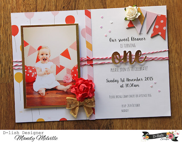
I'm back with my final D-lish Scraps design team project for this month, and as promised, it is something different to my previous two projects - I've made invitations for my daughter's 1st birthday party!

Let me say first up that I do not know where the last year has gone!!! Seriously it has just flown by, and my baby girl is already turning 1!!! I love those cake smash photos that people get done for their baby's 1st birthday. While I would love to do this, I decided to save some dollars and do my own photo shoot with Eleanor. I didn't do a cake smash, but I did dress her up, blow up balloons and put up banners! It was lots of fun! I wanted to use these photos on her birthday invitations (and I'm sure you will see them on some layouts in the near future as well)! We've learned over the years that young kids cope better with smaller birthday gatherings, so we decided to just invite close family to celebrate her 1st birthday. This meant that I only needed to make 7 invitations, so I decided that I was going to make them really special using my D-lish pretties!

I used different photos on each of the invitations and made them slightly different, so I've got four of them to share with you here:


If you're looking for some pretty things to add to your personalised invitations, there are so many gorgeous embellishments to choose from in the D-lish Scraps store!

Lets take a look at some closeups...


I LOVE LOVE LOVE these sequin bows - they are gorgeous!!! Amanda has just re-stocked these, so now is the time to grab them while they are available in all the colours!! On my invitations, I used a combination of the gold, the light pink and the red. Above the bow on each of the invitations, I've added a rose. I alternated between the 3cm Vintage Roses in crimson, and the large pink/white Roses. My goodness, these roses are just so pretty!!


Up in the top right hand corner of the invitations, I've added three of the Wood Veneer Bunting. To jazz them up, I simply covered them with patterned paper - I really love the look of this! I have also added a medium white Rose alongside the bunting on each of the invitations.


Here you can see the cotton twine that I've wrapped around the invitations. On some I used the Hot pink/Red/White twine and on others I used the Light pink/Red/White. I added some foam tape to the photo and the word 'one' so that they sat up above the twine to add some dimension. To finish the invitations off I added a sprinkling of the Mini Heart Sequins. I must say that these were smaller than what I imagined, but oh so cute!! They were also a little tricky to stick on, but I ended up using some tweezers to pick them up and to dip them into the glue. Not sure if there might be an easier way, but this seemed to work well for me!

Thank you so much for stopping by to take a look at my D-lish projects over the past few days! I hope that today I have shown you how versatile the D-lish embellies really are and maybe inspired you to use your D-lish stash to make something other than a layout... maybe even some invitations!

Mandy

Thursday, 22 October 2015

D-lish Scraps Design Team Layout - This is what it's all about

Hi again everyone!

I'm back today to share another one of my D-lish design team layouts with you.

"This is what it's all about"


I created this layout for Krisy's challenge over in The Scrap Suite. Are you a member of our Facebook group The Scrap Suite yet?? There is lots of awesome inspiration happening over there and we have four Cybercrop challenges running each month. Come on over and join us if you haven't already!! October Cybercrop kicked off on Friday night and this is the challenge that Krisy has set...


What a great challenge - white space!! Do you find white space challenging?? I think I'm getting better at incorporating white space into my layouts, but I must say I found it hard to leave the entire right hand side of my layout blank!! But never fear, I still managed to include lots of D-lish goodies onto my layout!!

I started my layout off by applying some watered down Distress Inks to my background. I just wanted a subtle watercolour look. I then adhered a strip of patterned paper down the left hand side of my layout with the ink peeking out from under the patterned paper. I matted my photo with a few layers of patterned paper, bringing in a couple of different shades of green. I then diecut some leaves from white cardstock using my Silhouette Cameo and arranged them vertically down the page. Then I was ready to start embellishing!!

Lets take a look at some closeups...


At the top of my layout I added a wood veneer heart that was included in a previous Just Add Paper Kit. I like how the raw wood veneer adds a natural element to the page. I also added a word strip from the Boy oh Boy Wordfetti pack and I attached a natural wooden peg to the top of my photo.


Tucked under the right hand side of my photo is a dip dye tag. I LOVE these!!! As soon as Amanda added these to the store, I knew that I would NEED them!! I attached a Freckled Fawn Short Arrow Clip to the tag - these are just so cute and come in lots of different colours! I also added a couple of enamel dots and another wood veneer heart to the right of the photo.


Underneath the photo I've added a flair button from the Weathered Wood set with some tangled thread underneath for some added texture. I also added a couple more word strips from the Everyday Moments and the Boy oh Boy Wordfetti sheets (I use these on nearly all my layouts recently - they are awesome!!). A couple more enamel dots added the finishing touch to my layout!

Thank you so much for joining me today - I hope that you enjoyed looking at my layout! I will be back tomorrow with one final D-lish share for the month... it's something a little different, so I hope you'll pop by to take a look! In the meantime, pop on over to The Scrap Suite and check out the Cybercrop challenges for some more inspiration!

Mandy

Wednesday, 21 October 2015

D-lish Scraps Design Team Layout - Hello Sunshine

Hi there!Today I am so excited to be sharing for the first time as a D-lish Scraps design team member! For my first project, I decided to create a layout for the October Inspiration Board...

"Hello Sunshine"


Here's a reminder of what the inspiration board looks like...


I had so much fun with this one!! There are so many things to be inspired by on the board!! I think that the colour palette is simply gorgeous and would lend itself to both masculine and feminine projects. Apart from the colours, I was also inspired by the birds and the big red flower on the cushion. I also based my layout on the sketch provided. I don't often use a grid format on my layouts, but I must say that it was quite fun embellishing each little rectangle!

So, lets take a look at a few closeups of my layout so that you can see all of the gorgeous D-lish embellishments that I've used on my page...


The photo that I've scrapped is of my nephew Charlie at my son's school athletics carnival. He was having so much fun running around on the grass in the sunshine that I just had to snap a few photos!! When I saw the colours for the October Inspiration Board, I knew that this photo would be just perfect!

Lots of the embellishments on my page are from the Summer Fiesta Just Add Paper Kit, and I have to say that I think this could be my favourite kit, like ever!! I LOVED the bright colours and all of the cute embellies!! This kit is now sold out, but many of the items in the kit are still available to purchase separately. To the right of my photo you can see that I've used one of the flair buttons from the kit, as well as a sprinkling of yellow sequins and a couple of resin roses.


I decided to use the washi tape in the kit to create my own custom 'patterned paper'. I simply covered a piece of white card with strips of the washi tape. I love that by doing this, it co-ordinates perfectly! To this part of the grid I added my title. How gorgeous is that wood veneer piece?!! I considered using some yellow ink on it, but I decided that I liked how it looked raw. (Here's a tip: if you're not sure how an ink/paint will look on your wood veneer, try it out on the back first to see if you like it, and that way if you're not completely happy, then you haven't altered the front.) Next to my title I've added a red cherry blossom and another flair button from the kit.


For this little rectangle, I've cut up a 5x7 chevron bag - another great way of adding extra patterns and layers to your layouts. I've attached my journal tag using the mini wooden peg from the kit packaging and I've added one of the yellow roses from the kit next to the peg. Tucked underneath the journal tag is a Pinkfresh Studio Foil Die Cut rainbow. I've also added some more sequins and a resin rose to this corner.


And lastly, here on this section, I've added a gorgeous triple layered crochet flower in red. I've been hoarding this for a little while waiting for just the right project to use it on, and when I saw the large red flower on the inspiration board, I knew that it would be perfect for this layout! I've also added a red word strip from the kit as well as a strip from the Life Documented Wordfetti pack. I love the wordfetti strips, they are one of my favourite go-to items and are great for adding little phrases here and there.

Thank you so much for stopping by and taking a look at my layout, and for any lovely comments that you leave also! I hope that I have inspired you to play along with the current Inspiration Board over on the D-lish blog! Make sure you take a look at the rules for entering the challenge before you get started!

I will be back tomorrow with another share for D-lish! Until then, happy scrapping!!

Mandy

Tuesday, 20 October 2015

The Scrap Suite Cybercrop Challenge

Hi there!

Just popping in today to share the Cybercrop challenge that I have set for this month over in The Scrap Suite! Each month, four of the D-lish Scraps Design Team members have the job of setting a challenge in The Scrap Suite and preparing a sample project based on the challenge! So this was my first time setting a challenge, and I must say, it was quite fun!! Here is my challenge for you...


And here is my sample layout...

"Birthday Girl"


I found the colour palette on Pinterest, and I just love how fresh and vibrant it is!! I've scrapped an older photo of my eldest daughter on her 2nd birthday. The colours in the photo were just perfect for this palette!

Most of the embellishments on my page were from the Sweet Celebrations Just Add Paper kit from a couple of months ago. The items from the kit that I've used are:
Washi Tape
Felt Flowers
Wood Veneer Hearts
Wood Veneer Word
Yellow Crochet Doily
Mini Pink Crochet Doily
Tab
Flair
Arrow Paperclip
Sequin Bow

I've even used the 'Sweet Celebrations' label from the kit packaging on my layout! These kits are seriously awesome!! You get so much stuff!! I still had quite a few things leftover from the kit after I completed this layout!

Other D-lish goodies that I've used on my layout include:
Yellow Rose from a previous kit
Crepe Paper from a previous kit
Enamel Dots
Word Strips from the Sugar & Spice Wordfetti sheet
Resin Flower

I hope that I've inspired you to play along with my Cybercrop challenge! I would really love to see what you come up with using this colour palette! The current challenges are open until 5pm AEST on Friday 13th November. Please pop on over to The Scrap Suite and take a look at the other awesome challenges that have been set by my fellow design team members! If you're not a member of our Facebook group The Scrap Suite yet, we would love you to join us!

I will be up on the D-lish Scraps blog for the next three days with my October design team shares, so I hope you'll pop on by!!

Thanks for visiting my blog today!

Mandy

Thursday, 15 October 2015

Stuck?! Sketches October 15th DT Reveal

Hi and welcome to my blog!

Today I am sharing my design team layout for the October 15th Stuck?! Sketches challenge!

First up, lets take a look at the fun sketch designed by Laura Whitaker...


I really enjoyed creating with this sketch - I love that big star!!

Here's what I came up with...
"For the Love of Books"


I am so glad that I captured this precious moment of my older two reading together. Mostly these two get along quite well, but there are certainly times when they drive each other crazy! So I just love it when they do something like this unprompted!

I've used papers and embellishments from the Echo Park Paper & Glue collection on my page. Although it isn't technically a school themed layout, they were wearing their school uniforms, so this collection seemed to fit.

Here are a few closeups of my layout...


I used quite a few stickers from the Paper & Glue collection on my layout. It makes it so easy when you have co-ordinating stickers and embellishments with your papers! I added some foam tape to some of the stickers to create some extra dimension and interest. (I seriously couldn't live without that stuff - I use it on every layout!)


I cut my title using my Silhouette Cameo and a cut file from the Silhouette store - I thought it was very appropriate! You can also see here a Freckled Fawn star paperclip and another sticker mounted on foam tape.


And one last closeup to show you some of the details at the bottom of the page... Another Echo Park sticker and a word strip from D-lish Scraps that says "Never forget this moment...". I finished the page off with a scattering of star stickers and die-cuts and some ink splatters.

If you haven't done so already, I hope that you'll pop on over to the Stuck?! Sketches blog and take a look at the fabulous layouts created by my fellow design team members - there are lots of different interpretations of this sketch! We would love you to play along with us by creating a layout inspired by this sketch and linking it up on the Stuck?! Sketches blog by October 29th! The randomly chosen winners will receive a prize from one of our very generous sponsors:


We will also be choosing one scrapbooker from each of our challenges to be a guest with us at a later date! So what are you waiting for?!!

Thank you so much for visiting my blog and taking a look at my layout! Thank you also for your lovely comments - they are very much appreciated!

Mandy

Thursday, 1 October 2015

Stuck?! Sketches October 1st DT Reveal

Hi there!

It's time for a new sketch challenge at Stuck?! Sketches! I am so thrilled to be able to stay on the Stuck?! design team for another term as I absolutely love creating with Laura's awesome sketches! So lets take a look at the latest sketch...


As soon as I saw the large chevron/arrows on this sketch it made me think of some Heidi Swapp papers that I have been hoarding for about a year! So it was the perfect excuse to pull them out and finally put them to good use!

Here is my layout inspired by the sketch...

"Happy Together"


How sweet are these photos of my husband with our daughter Eleanor?!! They both just love each other so much and they have such a special Daddy/daughter bond.

After playing around with the placement of my title for a little while, I decided to move it into the middle of the layout to create a vertical design, and I really like how this ended up.

Here are a couple of closeups...


To the left of my photos I've included a flair and a pink flower, both from D-lish Scraps, and I've added some tangled thread under the flair for some added texture. To the right of my photos I've included anther flower and a Heidi Swapp heart. I've also tucked a doily under the layers at the top right corner. The pretty pink and gold banner above the photos is from Pinkfresh Studios.


I usually like to hand write my journalling, but this time I decided to type it and cut it up into strips. I think this gives the layout a cleaner look. For my title I fussy cut the word 'happy' from one of the patterned papers, and I used my Silhouette Cameo to cut the word 'together'. I mounted the second word up with some foam tape, and I love how this really adds dimension to the page.

If you haven't done so already, I hope that you'll pop on over to the Stuck?! Sketches blog and take a look at the gorgeous layouts created by the new design team! We would love you to play along with us by creating a layout inspired by this sketch and linking it up on the Stuck?! Sketches blog by October 29th! The randomly chosen winners will receive a prize from one of our very generous sponsors:


Thanks so much for visiting my blog and taking a look at my layout! Thank you for any comments that you leave also - I do appreciate them and love reading them! I would also like to take this opportunity to say thank you to Laura for inviting me to stay on for another term with Stuck?! Sketches. I hope that I can continue to inspire the Stuck?! followers with my layouts!

Mandy

Scrap the Girls October DT Reveal

Hi there!

It's 1st October and that means its time for a new challenge to be revealed at Scrap the Girls! We've got a mood board to get you insired this month, and I think you're really going to love this one...

How pretty is it!! I was inspired by the colours (particularly the pink and aqua), the feathers, and the quote. Here's my layout...

"Make today so Awesome"


I took these photos of Abigail and Eleanor recently when we stopped off at a park on our way to our holiday destination. It was the first time that Eleanor had been on a slippery dip, and she had so much fun sliding down on Abi's lap! I love the joy on their faces!

I've used patterned papers from the Amy Tangerine Rise and Shine collection.

Here are a couple of closeups of my layout...


I used a cut file to cut out 'today' and 'awesome' on my Cameo, and I used Thickers for the other two words of my title. I love this quote and I thought it suited these photos perfectly! Up in the top right corner I've added a doily, flowers and a flair with some tangled thread. Apart from the aqua flower which is Prima, the rest of these pretty embellies are from D-lish Scraps. I also added my journalling straight onto the page up in the top right.


I created a similar cluster down in the bottom left to create a diagonal flow. I fussy cut the feathers from one of the patterned papers. Once again, all of the embellishments in this cluster are from D-lish Scraps, except for the aqua flower. I love that cute little deer!

If you haven't done so already, I hope that you'll pop on over to the Scrap the Girls blog and take a look at the amazing layouts that my fellow design team members have created with this mood board! We would love you to join us creating a layout inspired by this mood board and linking it up on the Scrap the Girls blog by 31st October to be in the running to win a prize from one of our very generous sponsors!

Thank you for taking the time to visit and for your lovely comments also! I will be back later today with my design team reveal for Stuck?! Sketches!

Mandy