Tuesday, 31 January 2017

You&Me Traveler's Notebook Spread | Felicity Jane Studio

Hi there!

Today I'm sharing a traveler's notebook spread that I created using the super beautiful 'Sophie' kit from Felicity Jane Studio!


I'm absolutely in love with this kit, and can't get enough of those gorgeous florals!!

I'm continuing to document all of the little everyday moments that I share with my youngest daughter in this traveler's notebook. I love how it's coming together, and I know that I will love looking back on this in years to come!

Here are a couple of closeups...


I covered the left hand side of the spread with the beautiful floral patterned paper. I added my photo to this side, and kept the embellishing fairly simple so as not to make it too busy. I LOVE those little wood veneer pieces that came in the kit!!


On the right hand side I added two of the cards from the cut apart sheet. The silicone charm that says 'You&Me' fit perfectly inside the open circle on the pink striped card. The other card I used to add my journaling to. I added a couple more wood veneer pieces to this side of the spread, as well as some of the super cute puffy hearts! Lastly I stuck one of the washi strips across the bottom of the page.


Although this kit has sold out, you can still purchase the papers and some of the embellishments separately in the Felicity Jane shop, so pop on over and take a look!

Thanks so much for stopping by! I'll be back tomorrow to share my first project for Cocoa Vanilla Studio!

Mandy x

Tuesday, 24 January 2017

Carnival Fun | The Cut Shoppe

Hi friends! Today I'm sharing my newest layout that I created using cut files from The Cut Shoppe!


I've documented a couple of photos from when we took the kids to a local carnival recently. My parents joined us too, and we had so much fun going on some rides and eating ice cream cones!

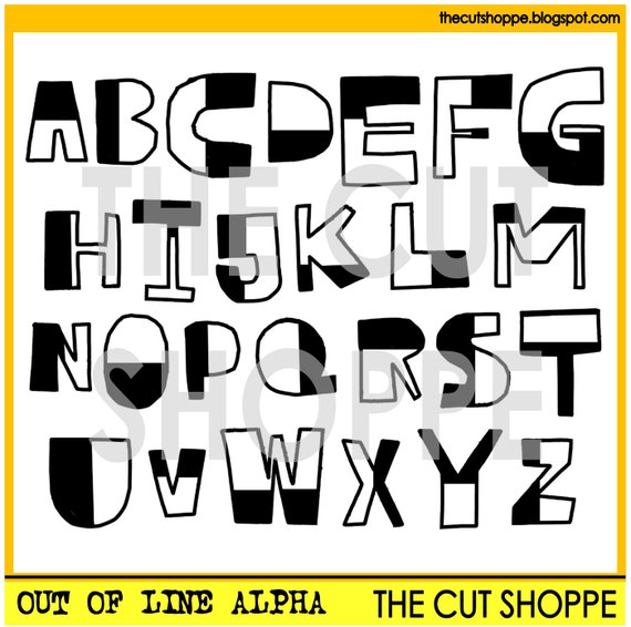
I wanted the layout to have a carefree and fun feel to it to match the photos, and the Out of Line Alpha cut file set was just perfect for this...

The Out of Line Alpha is an alphabet cut file set, that can be used on your scrapbooking and papercrafting projects.

I created the title for my layout using one of the patterned papers from the Paige Evans Take me Away collection and this cut file set. I backed the letters with a spotty patterned paper and  then added some foam tape underneath to give them some extra height and dimension. I completed my title with the word 'fun', which is a foam Thicker from the Take me Away collection.


Here you can see a closeup of how I embellished the top photo. How perfect is that chipboard horse for this layout?! The felt star that I layered underneath the horse is from Charms Creations, and the wood veneer scallop circle is another piece from the Take me Away collection.


The ice cream embellishment that I added to the right of the bottom photo is actually a sew on motif that I picked up from a kids clothing store recently. I'm always on the lookout for things that I can use on my layouts, and this worked perfectly on this page! I popped a flair button on top of the ice cream, and then tucked a colored wood veneer circle from the Take me Away collection underneath.


I finished the layout off by hand-writing my journaling straight onto the page, and then adding a sprinkling of star sequins.

Thanks so much for joining me on my blog today! Make sure you pop on over to the store to check out this super fun cut file!

Friday, 20 January 2017

Picture Perfect | The Cut Shoppe

Hi everyone!

Today I'm up on The Cut Shoppe blog sharing a layout that I created using one of the new cut files available from The Cut Shoppe Etsy store!


I absolutely love this photo of my youngest daughter with my nephew! It's so sweet how much they adore one another!

This is the new 'Bless Your Heart' cut file set that I used on my layout...

No automatic alt text available.

I used the heart that has the word 'love' repeated. I cut it from white cardstock and then backed three of the words with light grey patterned paper. I then added small pieces of foam tape to the back of the heart to give it some extra dimension.

Here are some closeups of my layout...


I created a cluster on the top left hand corner of the heart using some die cuts. I tucked some in peeking out from underneath the heart and added others on top. All of the patterned papers and embellishments on my layout are from the Cocoa Vanilla Studio 'Love Always' collection.


I created another little cluster on the bottom left hand corner of my photo using some more die-cuts, chipboard, and a paper bloom.


I added one more cluster on the top right hand corner of the photo to complete the visual triangle. This one includes another floral die cut and a flair button.

I finished the layout off with some journaling and enamel dots.

Thanks for joining me on my blog today! Why don't you head on over to The Cut Shoppe etsy store to check out all of the new cut files that were added this week!

Sunday, 15 January 2017

Our Adorable Kitten | Stuck?! Sketches January 15th Challenge

Hello scrappy friends!!

It's time for a new challenge over at Stuck?! Sketches! Let's take a look at the fabulous sketch that Laura has designed for us...

No automatic alt text available.

And here's my take on the sketch...


I documented a sweet photo of our new little kitten, Sasha! She is so beautiful and we all adore her!

I used the Crate Paper cute girl collection for this layout, which was so perfect as there are quite a few images of cats throughout the papers and embellishments in this collection!

Here are some closeups of my page...


I added a Charms Creations Terrific Tab to the top left hand corner of the photo, and I popped a little word sticker on top to give it some extra detail.


To the left of the title I created a little cluster that includes a Charms Creations DIY chevron, and a couple of flowers from D-lish Scraps.


I love combining different fonts to create my titles! On this page I used two different Felicity Jane alphabet stickers, as well as the gold word 'adorable' which is a sticker from the Cute Girl collection!


On the sketch there's a vertical photo as well as the horizontal one, but I decided instead to add a tag in that spot. How cute is that kitty cat sticker to the right of the tag?! I added a cute little bow to the sticker to make it look even more girly!

I finished my layout off by adding some journaling and a sprinkling of star sequins and stickers!

If you haven't done so already, I hope that you'll head on over to the Stuck?! Sketches blog and take a look at the fabulous layouts created by my fellow design team members! We'd love you to play along with us by creating a layout based on this sketch! Link up your layouts on the Stuck?! Sketches blog by January 29th to be in the running to win a prize from one of our very generous sponsors:

Image may contain: text

Image may contain: text

Thank you so much for visiting my blog and taking a look at my layout! Thank you to those who take the time to leave a comment as well - it is always very much appreciated!

Mandy

Monday, 2 January 2017

Love | Stuck?! Sketches January 1st Challenge

Hello friends!

It's time for a fun new sketch challenge over at Stuck?! Sketches! Here's the fabulous January 1st sketch designed by Laura Whitaker...


And here's my take on the sketch...


I switched it up a little by flipping the sketch horizontally and using one horizontal photo instead of two vertical ones. The photo that I scrapped is a recent one of my three kids on the day that we put up our Christmas tree. I totally love those happy little faces!

Charms Creations is one of the sponsors for this challenge and our design team were lucky to receive a DIY star each to use on our layouts!

The patterned paper that I used is from the Pinkfresh Studio Christmas Wishes collection.

Here are some closeups of my layout...


For my title I used a Flutterby Designs wood veneer word. I added some thin strips of foam tape underneath it to give it lots of dimension!


The Charms Creations DIY stars are perfect for altering with inks/paints, but I liked the look of it left white on this layout, so I simply added some word stickers on top for some extra interest.


For the little cluster in the top corner, I used a couple of strips of washi tape, and a wood veneer piece and flair button from Felicity Jane.

If you haven't done so already, I hope that you'll head on over to the Stuck?! Sketches blog and take a look at the fabulous layouts created by my fellow design team members! We'd love you to play along with us by creating a layout based on this sketch! Link up your layouts on the Stuck?! Sketches blog by January 29th to be in the running to win a prize from one of our very generous sponsors:


Thank you so much for visiting my blog and taking a look at my layout! Thank you to those who take the time to leave a comment as well - it is always very much appreciated!

Mandy

Sunday, 1 January 2017

Miss Granger | Scrap the Girls January Challenge

Hello & Happy New Year!!

I hope you all enjoyed welcoming in the New Year, and I hope that 2017 brings many wonderful things your way!

Today I'd like to share with you my layout for the Scrap the Girls January challenge! This month we have a mood board challenge...


It's not a colour palette that I've used before, but I loved the challenge! And it forced me to pull out some older papers and use up some stash, which is always a good thing! Here's what I came up with...


My eldest daughter Abigail recently went to a Harry Potter Movie Marathon Sleepover party at her friend's house and she of course had to dress up as Hermione Granger. I love that she put together a costume with things that we already had, and I think she looked awesome!

I used patterned papers from the Heidi Swapp Wanderlust collection, which worked perfectly with this colour palette!

Here's a few closeups...


I created my title using a combination of Felicity Jane alphabet stickers and Maggie Holmes Thickers. I added a Cocoa Vanilla chipboard arrow underneath the title.


I made the broomstick using a cut file from The Cut Shoppe. It was the perfect addition to a Harry Potter themed layout! I also added a few more Cocoa Vanilla embellishments, including the frame tucked in behind the photo, the flair button,the chipboard star, and the strip of stars tucked under the side of the patterned paper. They were all from different collections, but they worked perfectly together on this layout!


I created a little cluster in the top left hand corner of the page that includes another cut file from The Cut Shoppe, a Cocoa Vanilla little word sticker, and a Maggie Holmes star.

I finished the page off with some typed journaling and stamped stars.

I hope that you play along with us this month! Link up your layouts on the Scrap the Girls blog for your chance to win a prize from our sponsor...


If you haven't done so already, go check out the super inspiring layouts that the rest of the Scrap the Girls design team have come up with using this mood board! This will be my final month as part of this team. I've had so much fun designing for Scrap the Girls, and want to say a big thank you to Krisy for having me on the team!

I'll be back later today to share my layout for the Stuck?! Sketches January 1st challenge.

Mandy