Hello friends!
Today I'm up on the Off the Rails blog sharing some tips and techniques for adding texture and dimension to your layouts! When I look back at some of the first layouts that I created years ago they seem very flat. Now don't get me wrong, I still really love those layouts, but over the years my style has changed, and these days I'm drawn to layouts with lots of texture and dimension... the kind of layouts that you want to reach out and touch! So today I'm going to take you through a step-by-step tutorial and show you how I have added texture and dimension to my layout!
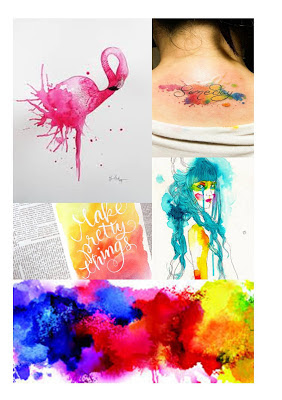
I created this layout for the current Off the Rails mood board...
What you'll need
This is everything that I used to create my layout
Step 1
Firstly, trim about 1/3 inch off each side of your patterned paper so that you can mat it on white cardstock. Next, using your chosen stencil, apply texture/modeling paste to your patterned paper. You can use a palette knife to do this if you have one, otherwise an old credit card/gift card will do the trick!
Using modeling paste with a stencil is a really effective way of adding texture and dimension to your layout!
Step 2
Next add some foam tape to the back of your photo and adhere it to your layout.
Using foam tape is another way that I like to add dimension to my layouts, as it gives different heights to the elements on your page.
Step 3
Next, create a flower cluster to the right of your photo. You can see here that the flowers add lots of beautiful texture and dimension to my layout!
Step 4
Next, add your title to the layout. Here's another opportunity to add different textures and dimension to your layout. I love to combine different alphas to create my titles! On this layout you can see that I've used chipboard alphas as well as a wood veneer word. The chipboard alphas also have gold foil on them so this adds another texture!
Step 5
Next, add a die-cut to the right of your title. I chose a flamingo to tie in with the mood board! Once again I've added foam tape to the back of it to give it extra dimension.
Step 6
Lastly, I've created a small cluster in the top right hand corner of the layout using another die-cut and a couple more flowers.
And that's how easy it is to create a layout with lots of texture and dimension! Next time you scrap, why don't you try out one of these techniques that I've used on my page...
- Add some stencilling using texture/modeling paste
- Add foam tape to the back of your photo and/or die cuts
- Create a flower cluster
- Use different textures such as chipboard, wood, foil etc
Here's another look at my completed layout...
And here's the current Off the Rails mood board that inspired my layout...

I hope that you get a chance to play along with our mood board challenge this month! There's only 2 more days left to get your projects linked up! Our sponsor for April is Memory Maze.
Thanks so much for stopping by, I hope that you found my tutorial useful and enjoyed looking at my layout!
Mandy


