Wednesday, 31 May 2017

It's a Good Day Traveler's Notebook Spread | Felicity Jane

Hi everyone!

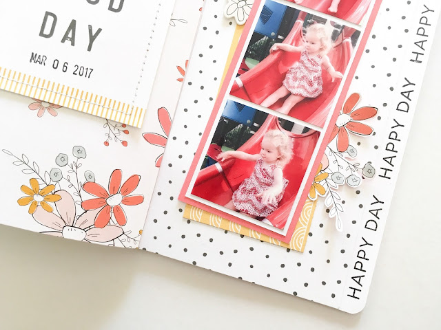
I'm popping in today to share a traveler's notebook spread that I created using the beautiful Felicity Jane 'Willow' kit!


I love these cute photos of my daughter enjoying a play on the slide at the playground!


That floral patterned paper was definitely my favourite thing in the kit this month! I've been fussy cutting those flowers A LOT! This time I decided to use it as is, and I covered the left hand side of the spread with it. I then machine stitched around the edge of one of the 3x4 journaling cards, and added it to the page. This made the perfect title for the layout!


I covered the right hand side of the spread with the black dot patterned paper. I left a thin strip down the side that was not covered with patterned paper so that I could stamp the phrase 'Happy Day' repeatedly along the edge of the page. I arranged my photos into a filmstrip, and then matted them with one of the solid color papers as well as the yellow and white scallop paper. I tucked one of the lovely die cut florals from the kit under the left hand side of the photos.


I couldn't help but fussy cut another floral cluster to tuck under the right hand side of the photos! I think they make the most lovely embellishments!

Thanks so much for popping in today!

Mandy x

Wednesday, 17 May 2017

Bon Voyage Traveler's Notebook Spread | The Cut Shoppe

Hi everyone!

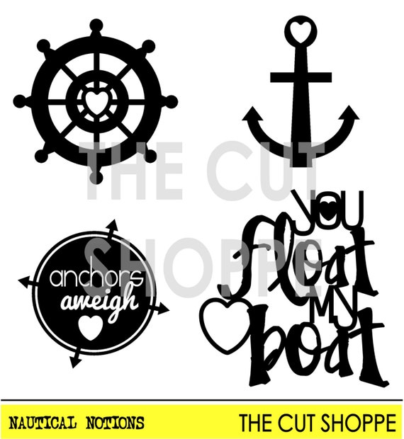
Today I have a traveler's notebook spread to share that I created using the Nautical Notions cut file set from The Cut Shoppe Etsy store!


I'm using this traveler's notebook to document photos from our cruise that we went on last year. This photo of my husband and son was taken from our balcony as we sailed out of Sydney Harbour. We were so excited!

This isn't the first time that I've used the Nautical Notions cut file set in this notebook, and it won't be the last! How perfect are the images in this set for documenting cruise photos!

The Nautical Notions cut file consists of four icons, that can be used on your scrapbooking and paper crafting projects.

I used a combination of Cocoa Vanilla and Felicity Jane products on this spread. Let's take a look at some closeups so that you can see all of the details...


I covered the left hand side of the spread with a patterned paper from the Cocoa Vanilla Endless Summer collection. I then added some layers of patterned paper behind my photo before adhering it to the page. I embellished the top left hand corner of the photo with a little Cocoa Vanilla banner die cut and a Felicity Jane rubber charm heart.


How awesome is this ship helm cut file! I cut it out of a wood grain patterned paper and added some foam tape underneath to give it some extra dimension. I love how it looks, and I think it really makes the page! I added the title 'Bon Voyage' at the top of the page using Felicity Jane puffy alphabet stickers.


Lastly I added my journaling and little banner sticker at the bottom of the page. I stamped the phrase 'wind in my hair' onto the sticker using a Felicity Jane stamp.

Thanks so much for joining me on my blog today! If you have some boating or cruise photos to scrap, make sure you go check out this cut file in The Cut Shoppe!

Monday, 15 May 2017

XO | Stuck?! Sketches May 15th Challenge

Hi friends!

It's time for a new challenge at Stuck?! Sketches and Laura has designed another beautiful sketch for us to be inspired by! Let's take a look...

No automatic alt text available. 

Here's my take on the sketch...


I used the beautiful Simple Stories 'Love & Adore' collection to document a photo of my eldest daughter and I taken when we were on a picnic recently.

Using the sketch as a guide, I added some layers of patterned paper, as well as a doily, to create a matt for my photo to sit on. Once I added my photo, I was ready to embellish.


I love the florals in this collection, and they were perfect for this very 'girly' page! I tucked one of the floral die cuts under the top left hand corner of the photo.


I created a pretty cluster of embellishments on the bottom right hand corner of the photo that includes a Charms Creations heart, a flair button from D-lish Scraps, and another floral die cut. Charms Creations is sponsoring this challenge, so make sure you pop on over to their store to check out their lovely embellishments, and play along for your chance to win a store voucher!


I decided to move my title down to the bottom right hand corner of the page, just because I liked how it looked there! I used some chipboard stickers from the 'Love & Adore' collection for my title, and then I embellished around the title with a couple more stickers from the collection.

Lastly I added some journaling, and then I finished the page off with some black ink splatters and enamel dots.

If you haven't done so already, I hope that you'll head on over to the Stuck?! Sketches blog and take a look at the fabulous layouts created by my fellow design team members! We'd love you to play along with us by creating a layout based on this sketch! Link up your layouts on the Stuck?! Sketches blog by May 29th to be in the running to win a prize from one of our very generous sponsors:

No automatic alt text available.

Image may contain: text

Thank you so much for visiting my blog and taking a look at my layout! Thank you to those who take the time to leave a comment as well - it is always very much appreciated!

Mandy x

You Rock | Cocoa Vanilla Studio

Hi friends!

This week on the Cocoa Vanilla blog the design team are going to be sharing some AWESOME masculine themed projects with you! I'm kicking it off today with a layout that I created using the fantastic new 'You ROCK' collection!

Here's my page...


I documented a recent photo of my son, and I really just wanted this layout to celebrate how awesome I think he is! With all of the amazing embellishments in this collection, it was so easy to do just that!

I started my layout off by covering the top half of the page with the Plus One patterned paper, and then adding a piece of the Stripped patterned paper across the middle of the layout.


I matted my photo with the Galactic patterned paper and then adhered it towards the left hand side of the page. I used one of the awesome wood veneer pieces from the collection as the title for my layout, and painted it with yellow acrylic paint. I love how this really helps it to pop off the page! I also added a chipboard star on top of the title to give it some extra detail.


I created an embellishment cluster to the left of the photo that includes a couple of chipboard stickers, a sticker, and a little die cut arrow. I really love the selection of embellishments in this collection, and how easy it is to create fun embellishment clusters!


I created another little cluster down in the bottom right hand corner of the page. Once again I used a combination of ephemera, stickers, and chipboard. How gorgeous and vibrant are the colours in this collection!!

I finished the layout off by adding my journaling, and a few of the enamel shapes.

Thanks so much for joining me on my blog today! I hope that you've been inspired to scrap a 'boy' layout too!

Mandy x

Tuesday, 9 May 2017

Days like this are the Best | The Cut Shoppe

Hey friends!

Today I'm up on The Cut Shoppe blog sharing a layout that I created using the new Summer Vibes cut file set from The Cut Shoppe Etsy store!


We recently decided to go on a little impromptu holiday to a lovely place that's about 2 hours up the coast from where we live. It was so nice to take a break as a family and we had such a relaxed time away! I think this selfie that we took while we were away really captures this feeling!

I used the lovely Endless Summer collection from Cocoa Vanilla Studio for this layout.

The Summer Vibes cut file set is perfect for documenting holiday snaps!

The Summer Vibes cut file includes 7 summer themed images, that can be used for your scrapbooking and papercrafting projects.

There are so many cool icons in this set, and I know that I'll be using it again and again! I decided to use the palm tree image on this layout to mimic the ones in the background of my photo.


First of all I flipped the tree horizontally, as I wanted to place it on the left hand side of my layout and have it leaning towards the centre of the page. I then enlarged it so that I could make it a feature on the page, and cut the leaves and the trunk separately out of two different patterned papers. I then added foam tape underneath it to raise it off the page and give it some extra dimension. I really love how it looks!


There are so many beautiful embellishments in the Endless Summer collection! Here you can see that I created a cluster on the bottom right hand corner of the photo that includes some die cut flowers, a paper bloom, and a flair button. I also added a couple of wooden buttons (woodies) to the layout.


I added my title up in the top right hand corner of the page using alphabet stickers from the Endless Summer collection as well as wood veneer words from the Cocoa Vanilla Colour Me Happy collection. I love combining different alphas to create my titles!

Thanks so much for joining me on my blog today! If you have some vacation or summer photos to scrap, then you must go check out this cut file set in The Cut Shoppe store!

Tuesday, 2 May 2017

Baby Cino Traveler's Notebook Spread | Felicity Jane Studio

Hello everyone!

Today I have a traveler's notebook spread to share with you that I created using the beautiful 'Caroline' kit from Felicity Jane Studio!


I love using this notebook to document all of the little things that my youngest daughter and I do together during the week! This spread is all about a lovely morning that we spent together doing things that she loves (including a visit to San Churros for a baby cino)!


I added my journaling to the left hand side of the spread using one of the 3x4 journaling cards from the kit. I layered some patterned papers behind the card, and also tucked a die cut tab under the top. On the bottom of the journaling card I added one of the cute silicone hearts. I finished the left hand page off with the beautiful tassel banner from the die cut shapes pack.


I covered the right hand side of the spread with the mustard dot patterned paper and then added a strip of the aqua stripe paper down the side. I added my photos, and then embellished the page with another silicone heart and some fussy cut flowers.


I used the FJ white alphabet stickers for my title. To create some extra interest I added my title vertically to the page.

Thanks so much for joining me today on my blog! Pop on over to the FJ shop to take a closer look at this beautiful kit!

Mandy x

Monday, 1 May 2017

Fun Days | Stuck?! Sketches May 1st Challenge

Hi friends!

I'm popping back in to share my layout for the May 1st challenge at Stuck?! Sketches! Here's the fabulous sketch that we have to work with, designed by the talented Laura Whitaker...

Image may contain: text

I decided to use one larger photo in place of the three smaller photos on the sketch. Here's what I came up with...


I love this photo of my eldest two kids walking along the beach. Last year we decided to go away for the weekend to celebrate Fathers' Day, and we stayed in beautiful Port Stephens, just a couple of hours away from where we live. This particular beach is one of my favourites... It's SO beautiful!

I used the lovely Endless Summer collection from Cocoa Vanilla for this layout.


There are so many beautiful embellishments in this collection! I used a couple of die cuts from the ephemera pack to create the title for this layout. I added some foam tape underneath them for some extra dimension.


I created a lovely cluster of embellishments to the right of the photo that includes a Charms Creations DIY heart, a flair button, wood veneer anchor, and a wooden button. I love all the different textures within this cluster!


Above the photo I added two clouds from the collection - one is a die cut and the other, a wood veneer piece. I also added a little banner up in the top left hand corner of the layout.

I finished the layout off with a little bit of journaling, and a few enamel shapes here and there.

If you haven't done so already, I hope that you'll head on over to the Stuck?! Sketches blog and take a look at the fabulous layouts created by my fellow design team members! We'd love you to play along with us by creating a layout based on this sketch! Link up your layouts on the Stuck?! Sketches blog by May 29th to be in the running to win a prize from one of our very generous sponsors:


Image may contain: plant and text

Thank you so much for visiting my blog and taking a look at my layout! Thank you to those who take the time to leave a comment as well - it is always very much appreciated!

Mandy x

Hello | Cocoa Vanilla Studio

Hi everyone!

Today I'm up on the Cocoa Vanilla blog sharing my first layout using the AWESOME new 'You ROCK' collection!! I've always been a fan of Cocoa Vanilla's boy themed collections, and this one is no exception! The bright and bold colours in this collection are amazing!!

Here's my layout...


I documented a photo of my son that I took a few months back. I love that it captures his happy personality! I've found that the best way to get him to smile naturally for the camera is to photograph him when he's doing something that he enjoys - in this instance he was playing with his new remote control car that he got for Christmas!


I started my layout off by creating some layers of patterned paper for my photo to sit on. As I said earlier, I absolutely love the colours in this collection, so I wanted to use a range of papers that really showcase all of those fabulous colours! The papers that I used are In Line (B-side), Stripped (B-side), and Plus One. I also matted my photo with the Night Sky patterned paper. On the left hand side of my photo I added the wood veneer word 'hello', which I used as the title for layout. I LOVE the wood veneer pieces in this collection!! I also popped a flair button to the left of my photo as well.


I created an embellishment cluster on the bottom right hand corner of my photo that includes a chipboard sticker, a die cut ticket from the ephemera pack, and a star that I fussy cut from the Starshine patterned paper. To create varying heights within the cluster I added a couple of the embellishments on top of the photo, and tucked the die cut piece underneath.


I added strips of patterned paper to the top and bottom of the layout using the Stripped paper. I also added a piece of washi to the top of the page. How fun are the new washi stickers in this collection?! I created a little cluster up in the top left hand corner of the page that includes a die cut piece and a wood veneer star. To complete the layout I scattered some more stars diagonally down the page.

Thanks so much for joining me on my blog today! Keep your eye out for the fabulous new 'You ROCK' collection hitting retailers very soon!

Mandy x