Sunday, 31 January 2016

Eleanor | Charms Creations Dec/Jan Challenge Two

Hi there!

Just popping in with a last minute entry for the Charms Creations Dec/Jan Challenge Two. This is the lovely mood board...


I was inspired by the beautiful pastel colours in the mood board. I scrapped a super cute photo of my baby girl taken at the beach. I love the sun flare in this photo!


I've wanted to create a layout about the meaning of my daughter's name for a while. Her name means "bright, shining one", and I thought this photo was just perfect for this!

My layout features patterned papers from the Pink Paislee Citrus Bliss collection, and embellishments from Charms Creations, D-lish Scraps and Cocoa Vanilla.

Here are a couple of closeups of my layout...


I LOVE these glittery gold Thickers from the Maggie Holmes Shine collection, and this was the perfect word for my layout!


How pretty is this Charms Creations heart!!

Thanks so much for stopping by and taking a look at my layout! Thank you to those lovely people who take the time to leave a comment as well!

Mandy

Saturday, 30 January 2016

Always Smiling | Scrap the Boys January Challenge

Hi there!

I haven't had a lot of time in between my design team commitments lately to play along with any challenges, but this month I was excited to get everything done and still have time to complete a couple of challenges! I decided that I wanted to play along with the awesome mood board challenge over at Scrap the Boys!

I scrapped a photo of my son when he was nearly 8 months old... He was always such a happy baby! Now he's 8 years old!! Here's my layout...


This is what the mood board looks like...

I loved the colour combo... Green and blue are often my go-to colours for a boy layout, but I like how the purple added a bit of a fun twist! I was also inspired by the stars!

I created my background using a new BasicGrey stamp that I purchased and Distress Inks. (How sad to hear this week that BasicGrey is closing its doors!) I really like how this turned out!

I embellished my layout with a Charms Creations arrow, and D-lish Scraps flair, buttons, sequins, Wordfetti, and punchinella!  

Here are a couple of closeups of my layout...


I added my title to the bottom right hand corner of my layout using Thickers.


Thanks so much for visiting my blog and taking a look at my layout! Thanks to those who leave lovely comments as well!

Mandy

Saturday, 23 January 2016

Cuties | D-lish Scraps Design Team Layout

Hi again!

Today I'm sharing my final D-lish Scraps layout for the month. I don't often scrap larger photos, and I wanted to challenge myself to do just that, so I used a 5x7 photo on this layout. I must admit that it was harder to fit as many embellishments on the layout as I usually like to use, but I still managed to use some gorgeous D-lish goodies that were just perfect for completing my page! My layout features a super cute photo of my three kids together at a playground...

"Cuties"


The strips of patterned paper on my layout are from the lovely Amy Tangerine Finders Keepers collection. I also added some stencilling using a fun triangle stencil and some Distress Inks that coordinated perfectly with the colours in this collection.

Here are a couple of closeups of my layout so that you can see the gorgeous D-lish embellishments that I used...


I created a lovely little flower cluster using a yellow wild rose (one of my fave D-lish embellishments!), a blue gardenia, and an aqua starflower. I've also tucked a coloured journal spot into this cluster that came in the December Just Add Paper kit. To the left of my photo I added an arrow word tab.


In between the paper strips I've tucked another starflower as well as some yellow punchinella. Punchinella is perfect for adding colour and texture to your projects... If you haven't tried it out yet, I recommend that you do! I also added a beautiful flair button here from the December Just Add Paper Kit.

If you feel like you're stuck in a rut with your scrapbooking, why don't you try scrapping a different size photo to what you usually do... or if you always scrap a single photo, why don't you try multiple photos on your next layout! I like to always challenge myself with my scrapbooking so that I keep learning new techniques!

Thank you so much for stopping by and taking a look at my D-lish layouts over the past few days! Thank you to those who take the time to leave me a comments as well!

Mandy

Friday, 22 January 2016

Sunshine | D-lish Scraps Design Team Layout

Hi again!

I'm back with my second share for D-lish Scraps for the month and this one is a layout featuring photos of my little cutie enjoying some watermelon at the beach...

"Sunshine"


Eleanor absolutely loves watermelon, and I love watching her eat it! I couldn't decide which of these photos to scrap because they are all just so cute, so I decided to include all three on my layout and arranged them in a photo strip. I gave the middle one a frame and mounted it up with some foam tape, just to give it some extra dimension and interest.

Once I had my photos in place, I was ready to start embellishing. The first thing I did was to add a strip of the black lace washi tape to the top and bottom of the layout. How pretty is this washi tape?! I fell in love with it as soon as I saw it!

Here are a couple of closeups so that you can see all of the other pretty embellishments that I used...


On top of my photos, I added two of the Little Birdie Boutique Elements Beaded Butterflies. These are absolutely gorgeous!! I've been hoarding them for awhile waiting for just the right project to use them on, and this was the perfect page for them! Above the photos here I also added a resin rose and a flair button from the Sweetly Scripted Love Notes set.


Under the middle photo I added a phrase from the Boy oh Boy Wordfetti sheet. Have I mentioned that I LOVE wordfetti?! I added my title and journalling, and then finished my layout off by adding a Freckled Fawn Glitter Chip Board Heart, two green spot wooden buttons, and another resin rose.

Thank you so much for stopping by today and taking a look at my layout! I hope that you'll pop back in tomorrow to see my final D-lish layout for the month! Until then, happy scrapping!

Mandy

Thursday, 21 January 2016

#handsome | D-lish Scraps Design Team Layout

Hi there scrappy friends!

This month I'm kicking off my D-lish Scraps layouts with my take on the January Inspiration Board!

My layout features a "handsome" photo of my son wearing his new glasses for the first time...


Here's a reminder of what the inspiration board looks like...


How much fun is this board?! Perfect for scrapping those photos of our boys! I was particularly inspired by the bunting and the fun combination of patterns on the blanket and cushion in the top left image. I was also inspired by the stars on the wall in the bottom right picture, and the phrase "hey, good lookin'". I also loved the sketch and used this as a basis for my layout. (If you're playing along with our inspiration board challenge, note that the sketch is optional, the colour scheme is compulsory, projects must be made EXCLUSIVELY for this challenge and can not be combined with any other challenges or DT commitments.)


I used lots of awesome embellishments from the January Just Add Paper kit on my layout, starting with the red spot tissue paper. I just used it as I would patterned paper, and added it as a strip down the right hand side of my layout. I really love how bright and vibrant it looks against the white cardstock. Along the edge of the tissue paper, I added a strip of the chevron arrows washi tape. I then used the Scrap FX Star Confetti stencil with grey distress ink to add some stars to the white cardstock. I love this stencil and use it quite often, particularly on boy layouts!

Here are some closeups of my layout...


I added some patterned paper layers behind my photo and also tucked the filmstrip that came in the JAP kit behind my photo. I created a little cluster to the left of my photo that includes the tag from the kit packaging, a flair button that came in the lucky dip bag of flair that I purchased, and the lovely felt bow from the JAP kit.


To the top right hand corner of my photo I added a felt star from my stash as well as a blue retro dot button.


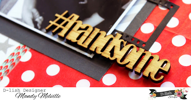
I ADORE this wood veneer word that came in the JAP kit! It was the perfect title for my layout! I decided to just leave it raw as I like how this looks.


This cluster in the bottom left hand corner of my layout includes a journal spot that came in the Christmas mini kit, a phrase from the Everyday Moments Wordfetti sheet, a strip of blue washi tape from a previous JAP kit, and the super cute wood veneer glasses that came in this month's kit. These glasses were actually the starting point for this layout and are what prompted me to scrap this photo! I love how one embellishments can do that!

I finished my layout off with some typed journalling. I've noticed lately that I haven't been including as much journalling on my pages... sometimes that's because the photo doesn't need a whole lot of journalling and that's fine, but other times it's because journalling is the last thing that I add to my layouts and there just isn't enough room to say all that I want to. This time though I was determined to include all of this journalling on my layout, so I decided to type it, and used a size 10 font so that I could fit more on my page. After I cut it up into strips, it fitted perfectly where I wanted it to!

I do hope that you will join in on our inspiration board challenge at D-lish Scraps this month! I always enjoy visiting your blogs and seeing what you've been creating when you link up your layouts here on our blog. Prizes are awarded each month both for the layout decided as 'best' and a random draw from all eligible participants! So what are you waiting for... Give it a go!

Mandy

Friday, 15 January 2016

So Much Fun | Stuck?! Sketches January 15th DT Layout

Hi there!

It's time for a new sketch challenge at Stuck?! SketchesLaura has designed a fun multi-photo sketch to inspire us...


I love the photo strip on this sketch! I decided to use 3 photos instead of 4, but otherwise kept the embellishment clusters and title in the same place as the sketch. Here's my layout...

"So Much Fun"


I just love these photos that I took of my eldest two kids and my nephew playing on the slip-n-slide on Christmas day! The Cocoa Vanilla Studio Hello Sunshine collection was perfect to document these memories!

Here are some closeups of my layout...


The cluster up in the top left is made up of a flair, a die cut, and a puffy sticker. I just love all of the fun embellishments in this collection! They made putting this layout together a breeze!


Up in the top right hand corner I've included some more die cuts, and used the "so much fun" die cut as the title for my layout. I also added my journalling here as well.


How cute is that little sun puffy sticker?! I also added a Charms Creations chevron that co-ordinated perfectly with my layout!

If you haven't done so already, I hope that you'll pop on over to the Stuck?! Sketches blog and take a look at the gorgeous layouts that my fellow design team members have created! We would love you to play along with us by creating a layout based on this sketch! Link up your layouts on the Stuck?! Sketches blog by January 29th to be in the running to win a prize from one of our very generous sponsors:


We will also be choosing a scrapbooker from each of our challenges to be a guest designer with us at a later date!

Thank you so much for visiting my blog and taking a look at my layout! Thank you to those who take the time to leave a lovely comment as well - it is very much appreciated!

Mandy

Thursday, 14 January 2016

Escape | CSI Guest Designer Layout

Hi there!

This month D-lish Scraps is sponsoring the CSI challenges and our design team were invited to play along with one or more of their challenges as guest designers. I chose to play along with Case File No. 188, which looks like this...


If you haven't played along with the CSI challenges before, the idea is that you have to use all 5 colours, choose at least 3 items from the evidence list, choose at least 1 item from the testimony list, and for this case there is also a sketch to use as inspiration! So here is the layout that I created...

"Escape"


I had a lot of fun creating this layout! From the evidence list I used an animal (bird), a cloud and a sun (on my patterned paper), and wire. For the testimony I chose to use song lyrics as part of  my journalling... I used a line from the Beach Boys song Kokomo... "That's where you wanna go to get away from it all". I also used the sketch as inspiration, however instead of the two photo strips I used two photos.

Here are some closeups of my layout...


Here is a list of all of the gorgeous D-lish Scraps embellishments that I used on my layout...

If you'd like to play along with this challenge, you have until January 22nd to link up your layout.

Thank you so much for visiting my blog and taking a look at my layout! Thank you to those who take the time to leave a comment as well!

Mandy

Monday, 4 January 2016

Guest Designing for The Cut Shoppe

Hi there!

I am so excited to be guest designing for The Cut Shoppe this month! I absolutely love their cut files and use them all the time on my layouts, so I was absolutely thrilled when Ashley Horton, the super talented owner of  The Cut Shoppe, invited me to be a guest designer!

I created three layouts for my guest design team spot. First up is a layout featuring a photo of my husband and I taken recently on Christmas day...

"You're the one for me"


For this layout I used the So in Love cut file, which had the perfect phrase to use as the title for my layout! I also used the Plus Infinity background cut file, but instead of using it to create an entire background, I shrunk it down and used it for layering behind my photo.

This layout features lovely patterned papers from Cocoa Vanilla Studio, and embellishments from D-lish Scraps and Charms Creations.

And here are some closeups...


My next layout features a photo of my eldest two children having fun playing in the rain. Although the photo is a little blurry, I really wanted to document this memory, and The Cut Shoppe had the perfect cut files for me to be able to scrapbook this photo and bring it to life...

"Rainy Days"


For this layout I used A Walk in the Clouds cut file to create a fun background element. After cutting it out of white cardstock, I backed all of the open clouds with patterned papers from the Pink Paislee Atlas collection. I then mounted the whole piece up with foam tape to give it some extra dimension. For my title I used one of the phrases from the Moody Blues cut file set. The original phrase says 'Rainy days and Mondays', but I altered it as I only wanted the 'Rainy days' part for my title, and I'm really happy with how it turned out!

Here are a couple of closeups of this layout...


My final layout features a super cute photo of my youngest daughter on her 1st birthday...

"Celebrate"


For this layout I used the It's my Party cut file to create my title. This super fun cut file contains party themed phrases and icons, and is just perfect for scrapping all of those birthday photos that we have so many of!

This layout features patterned papers from Pinkfresh Studio and embellishments from Cocoa Vanilla Studio and D-lish Scraps.

And here are a couple of closeups so that you can see all the details...


I had so much fun creating these layouts for The Cut Shoppe, and I really love how they turned out! If you're looking for some fabulous cut files to use on your projects, I can't recommend The Cut Shoppe highly enough!

Thank you so much for stopping by and taking a look at my layouts! Thank you so much to those who leave lovely comments as well!

Mandy

Friday, 1 January 2016

Oh Christmas Tree | Stuck?! Sketches DT Layout

Hi there!

I'm back with my second post for today, this time sharing the new sketch challenge over at Stuck?! Sketches!

I always love creating with Laura's sketches, and this one was no exception! Here is the lovely sketch...


I decided to rotate the sketch 90 degrees counter-clockwise as I wanted my photos going vertically down the page. Here is my layout...

"Oh Christmas Tree"


I really love the Pinkfresh Studio Christmas Wishes range, and I've already used it for a few Christmas themed layouts that I've created over the past month or so! The patterned papers have such great designs that it makes it so easy to put a layout together! 

Since this sketch had three photos, I decided to use it as an opportunity to scrap photos of each of my children decorating our Christmas tree!

Here are some closeups of my layout so that you can see all of the details...


I LOVE the rubber stickers that are part of this collection! I added two of them here as well as a Freckled Fawn glitter chipboard star which I mounted up with foam tape.


For my title, I cut the word 'Christmas' out of one of the patterned papers and combined it with the coordinating puffy alpha stickers from this collection. The wood veneer Christmas tree was leftover from a mini kit that I purchased from D-lish Scraps. I left it raw and just added a little gold star to the top of it!


In the bottom left hand corner of the layout I created a little cluster that includes another rubber sticker (which had the perfect phrase for my layout), as well as a gorgeous gold sequin bow and a cherry blossom, both from D-lish Scraps.


Underneath the photos I added another one of the rubber stickers (I seriously could have used the whole pack up on one layout, I had to restrain myself!), as well as a word strip that also came in the D-lish Scraps Christmas mini kit.


Here I added another Freckled Fawn glitter chipboard star. I love that by adding foam tape to the back of it, it looks as though its floating above the layout! I finished the layout off with a few star sequins and some gold Color Shine ink splatters.

If you haven't done so already, I hope that you'll pop on over to the Stuck?! Sketches blog and take a look at the fabulous layouts that my fellow design team members have created! We hope that you'll play along with us this month by creating a layout based on this sketch! Link up your layouts on the Stuck?! Sketches blog by January 29th to be in the running to win a prize from one of our very generous sponsors:


We will also be choosing a scrapbooker from each of our challenges to be a guest designer with us at a later date!

Thank you so much for visiting my blog and taking a look at my layout! Thank you to those who take the time to leave lovely comments as well - it is very much appreciated!

Mandy