Saturday, 15 September 2018

Let Your Smile Change the World | Cocoa Vanilla Studio

Hey friends!

Today I have a new layout to share with you featuring the gorgeous Bohemian Dream collection by Cocoa Vanilla Studio. Have I mentioned how much I love this collection?! It's definitely one of my all-time favourites for creating pretty 'girly' layouts! On this layout I documented a recent photo of my youngest daughter Eleanor playing at the playground. The colours in the photo matched perfectly with those in the Bohemian Dream collection!

Here's my page...


I decided to create a grid style design for this layout, and instead of my usual white cardstock background, I used the lovely woodgrain side of the Kaleidoscope patterned paper. I also matted the entire layout with the reverse side of the Dreamer paper, which gave it a nice frame.


For the three sections of the grid other than the photo, I used pieces from the Boho Bits cut apart patterned paper. I especially love the one with the quote on it, and I thought that this would make the perfect title for my page! Plus the beautiful shade of purple on that piece matched my daughter's top beautifully! Under the left hand side of that card I tucked a label, which I stamped the date onto, and a mini floral die cut piece.


I wanted my photo to have some nice dimension so that it would really stand out on the page. So I tucked a chipboard frame from the Wild at Heart collection underneath it, and I also added a piece of patterned paper from the Bohemian Dream 6x6 paper pad. Along the bottom of the photo I adhered a wood veneer word from the Love Always collection, and on the right hand side I added a butterfly that I fussy cut out of the Boho Bits patterned paper.


I used another one of the pieces from the Boho Bits patterned paper, for the bottom left hand part of the grid. I added some layers behind it using a doily from my stash, as well as a piece of the Abundant patterned paper. I also created a little cluster on the left of the card using another wood veneer piece from the Love Always collection, as well as a die cut butterfly from the Bohemian Dream collection.


For the final piece of the grid, I used the dream catcher card from the Boho Bits patterned paper, and I layered a piece of the Abstract patterned paper behind it. I also added a little die cut banner on top, which I adhered with foam tape.


I finished the layout off with a couple of little word stickers, and some enamel dots.

Thanks so much for joining me here today. I had so much fun creating this layout, and I hope that you enjoyed taking a look at it!

Mandy x

Saturday, 1 September 2018

Hey! | Cocoa Vanilla Studio

Hi friends!

Today I want to share a new layout that I created featuring the awesome Cocoa Vanilla Boys Rule collection. This weekend on the Cocoa Vanilla blog, we are sharing projects that celebrate fatherhood! I decided to document a photo of my hubby with our two eldest kids, taken nearly ten years ago now. He is such an awesome Dad, and I love seeing how much the kids adore him!


I started my layout off with a star wreath cut file by Paige Evans, and I backed each of the open stars in the cut file with patterned papers from the Boys Rule collection. This did take quite awhile to do, but I'm so happy with how it turned out. The patterned papers that I used to back the cut file were...
Entitled (reverse side)
Expressionist (reverse side)
Messed Up (reverse side)
Straight & Narrow (reverse side)

I decided on using the Good Times patterned paper as my background, and I adhered the cut file to the page using foam tape for added dimension.


Next I created some layers behind my photo using the Entitled patterned paper, as well as a die cut frame from the Miscellany pack, and a couple of labels that I cut out of the Boy Stuff patterned paper. I also added a die cut arrow on the left hand side of the photo.


I wrote my journaling onto a lined journaling spot that I cut out of the Boy Stuff patterned paper. I love all of the bits and pieces that you can cut out of this one sheet of paper!


To balance out the photo on the left, I added the chipboard piece that says 'Hey! You're pretty rad' over on the right hand side. I decided on using this as the title for my page, as it suited the photo perfectly.


I finished the layout off with some star stickers (cos you really can't have too many stars right?!), and a couple of little phrase stickers.

Thanks so much for joining me here on the blog today, and I hope that those who are celebrating Father's Day this weekend have a wonderful time with their loved ones.

Mandy x

Wednesday, 15 August 2018

Stay a Little Bit Wild | TN Layout | Cocoa Vanilla

Hi everyone!

Today I'm sharing a traveler's notebook layout using the gorgeous Bohemian Dream collection from Cocoa Vanilla Studio! I've loved seeing what the design team have been sharing this week over on the Cocoa Vanilla blog for our 'Make it Mini' theme! So many cute projects, and lots of amazing inspiration! I decided to scrapbook a photo of my youngest daughter Eleanor when she was just being cute and silly. I love to use my traveler's notebooks to document those little everyday moments!


I started off by covering the left hand side of the spread with the Abstract patterned paper. I love how the bright colours in this paper really help the black and white photo to pop! I also thought that the 'messy' look of this patterned paper would add to the fun and playful feel that I wanted to achieve on this layout.


I matted my photo with one of the patterned papers from the 6x6 paper pad. I also layered a die cut frame, and a couple of labels that I cut out of the Boho Bits patterned paper behind the photo to add some more interest. On the bottom right hand corner of the photo I created a little cluster using a floral chipboard sticker, and die cut, as well as the sticker that says 'Shine Bright'. (A little tip, when I use chipboard stickers in my TN inserts, I peel some of the layers of chipboard off the back to make them a little thinner and less bulky).


Next I covered the right hand side of the spread with the Wild & Free patterned paper. This lighter paper provided a nice contrast to the darker one I'd used on the left hand side. For my title, I fussy cut the piece that says 'Stay a little bit Wild' out of the Boho Bits patterned paper. This suited the photo (and my daughter's personality in general) perfectly! I also fussy cut that beautiful butterfly out of the Boho Bits patterned paper, and I adhered it with just a little bit of glue in the middle, so that the wings would lift off the page a little bit.


To finish the layout off, I added a strip across the bottom of the right hand page (once again this was cut out of the Boho Bits patterned paper). I also added a few lines of typed journaling which I cut up into little strips.


I love how this traveler's notebook layout turned out! The Bohemian Dream collection is just so bright and colourful!

Thanks so much for joining me today!

Mandy x

Thursday, 2 August 2018

Dina | Vicki Boutin

Hey friends!

Today I have a bright and fun layout to share with you, featuring Vicki Boutin Color Pop paints, and the ‘All the Good Things’ collection. I also used a gorgeous cut file from JustNick Studio on this page. The photo that I documented is one of myself with the lovely Dina Wakley! I was lucky to attend a class with Dina last weekend, and so of course I had to scrapbook this photo to document the day! 

Here’s a look at my layout… 


I started my layout off by painting the background using the Blue Hawaiian Color Pop paint. I toned down the colour a little bit by mixing white gesso with it. I painted most of the background, but left about an inch around the edge unpainted. Once that was dry I used one of the Vicki Boutin circle stamps, and stamped onto the background using watered down gesso. I also added some white splatters using the gesso. I love how the bright background really helps the cut file to pop off the page! 


I backed the butterflies in the cut file with patterned papers from the ‘All the Good Things’ collection. I chose papers in warmer tones so that they would contrast nicely with the aqua background. I also matted the photo with the Pretty Words patterned paper. 


To the right of the photo I created a pretty cluster of embellishments that includes a die cut butterfly, a flower, and leaves. I used foam tape to adhere some of the embellishments to give them extra dimension. 


I added my title using the chipboard Thickers from the collection. 


To finish the layout off I added a couple of fussy cut butterflies, as well as a few watercolour stickers to the page. 


Thanks so much for joining me here today! I hope that you enjoyed taking a look at my layout!

Supplies Used: 
Foundations Paper 
Gesso 
Color Pop Acrylic Paint – Set 3 
Stamps & Dies – Set 3 
Brushes 
Mister Bottles 
Thickers – Alpha/B&W Chipboard 
Cardstock Die Cuts – Icons 
Watercolor Stickers 
Single-Sided Card Pad 7”x10” 
Double-sided Patterned Paper – Pretty Words 
Double-sided Patterned Paper – Social Butterfly 
Double-sided Patterned Paper – Picked for You 

This will actually be my last project for the Vicki Boutin design team as I've made the difficult decision to step down from the team. Family life is busy at the moment and we have some things coming up that are going to take lots of my time and energy, and I didn't want to commit to another 6 month term on the team if I couldn't give it 100%. I have absolutely LOVED being on this team, and creating with Vicki's gorgeous products! I want to say a huge thank you to Vicki for inviting me to be a part of her very first design team. It has been an absolute pleasure, and I hope that I've been able to inspire all of you as well!


Wednesday, 1 August 2018

Awesome | Cocoa Vanilla Studio

Hey friends!

Today I have a new layout to share with you, featuring the awesome Cocoa Vanilla 'Boys Rule' collection! I can't get enough of this collection, it's just so fun to create with! On this layout, I documented a photo of my son when he was just 17 months old. He was such a happy and easy-going baby, and I adore his cute little smile in this photo! I printed the photo in black and white to help it to really pop off the page!


I decided to arrange all of the elements on the layout down the right hand side of the page, leaving lots of white space on the left hand side. This design really helps to draw the viewer's focus to the photo.


I started at the top of the page by layering together a chipboard piece with a die cut banner. I love that the chipboard pieces in this collection are all pre-cut pieces, making it easier to move them around the page.


I used another chipboard piece as the title for the page. I love to use the large chipboard words on my layouts! They make an easy title, and they really make an impact on the page!


Underneath the photo I layered a few die cut and chipboard frames. I also matted my photo with the reverse side of the Entitled patterned paper, and I adhered it with foam tape to give it some extra dimension. I created a little cluster of embellishments on the bottom right hand corner of the photo using die cut ephemera. I used a label to add my journaling to, and tucked it under the side of the photo.


At the bottom of the page I added the grey scallop die cut piece. I finished the layout off with a sprinkling of stars and a few little word stickers.


I love how this turned out, and it was a quick and easy layout to put together! I hope that you've been inspired and that you enjoyed taking a closer look at my layout.

Mandy x
Saturday, 28 July 2018

July Junque Journal Summer Camp Challenge Week 3 | Vicki Boutin

Hi everyone!

I have some new Junque Journal pages to share with you today that I’ve created for Vicki Boutin’s Junque Journal Summer Camp challenge. I used some of the prompts from week 3 of July to inspire my pages. I had so much fun creating them! 

Prompt #16 Brushstrokes 

The first page I created was for the brushstrokes prompt… 


To create the background for this page, I chose four different colours of the Color Pop acrylic paints, I watered them down just a little bit, and then I used the widest of the VB paint brushes to add stripes of paint to the page. 


I had some excess paint left on my craft mat after I finished painting the background, so I decided to stamp some flowers using black archival ink, and I used the leftover paint to paint the flowers. I also stamped some leaves and fussy cut these as well. 


Once everything was dry, I arranged the flowers on the painted background, matching up the colour of each flower to the painted stripes. I love how bright and summery this looks, and I definitely want to try out this design on a scrapbook layout! 


To finish the page off, I added a die cut from the ‘All the Good Things’ collection, which I adhered with foam tape for added dimension. 


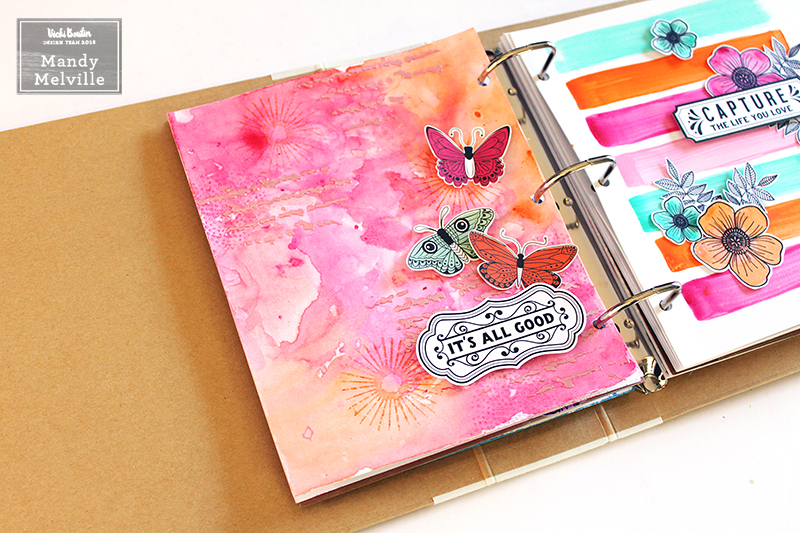
Prompt #17 Art Crayons & Iridescent Glaze 

The second page that I created was inspired by prompt #17… 


I started this page off by creating a watercolour effect on the background using pink, orange and red art crayons. I applied the art crayons using the packaging / kissing technique, and then used my waterbrush to blend the colour and move it around on the page. Next I added some stamping using a couple of the circle stamps, and the same colour art crayons that I had already used. For the final layer on the background, I mixed the pink and red art crayons with the iridescent glaze and applied it through the script stencil. 


I love the shimmer and texture that the Iridescent glaze adds to the page, and also that you can customise it to whatever colour you like using your art crayons! 


I embellished this page with a few fussy cut butterflies and a sticker from the watercolor sticker pack. Once again, I used foam tape to adhere the embellishments to give them lots of dimension. 


Prompt #19 Gesso Resist 

For my final Junque Journal page this week, I created a background using the gesso resist technique… 


To start this page off, I applied some gesso through the flower stencil using a palette knife. 


Once the gesso was dry, I added some watercolour over the top using art crayons with plastic packaging. I mixed together the light blue art crayon with the lime green one to create a pretty aqua colour. I also added some splatters to the page using a paint brush. 


I waited for everything to dry, and then I used a baby wipe to buff the areas where I had added the gesso through the stencil. Because the gesso resists the art crayons, it was easy to remove the colour from those stencilled areas, and it allowed that stencilling to really show through. 


To finish the page off, I created a little cluster using embellishments from the ‘All the Good Things’ collection. 


That’s it for this week! I hope that you enjoyed taking a look at my Junque Journal pages! I have a process video which shows how I created the first two pages, if you’d like to check it out… 


Thanks so much for joining me today! 

Supplies Used: 
Junque Journal 
Junque Journal Refills – White Paper 
Gesso 
Color Pop Acrylic Paint – Set 1 
Color Pop Acrylic Paint – Set 3 
Art Crayons #1 – Warm 
Art Crayons #2 – Cool 
Creative FX Glaze – Iridescent 
Stamps & Dies – Set 2 
Stamp & Dies – Set 3 
Stencils 
Watercolor Brushes 
Mister Bottles 
Cardstock Die-Cuts – Icons 
Cardstock Die-Cuts – Frames 
Watercolor Stickers 
Double-sided Patterned Paper – Social Butterfly 


Thursday, 19 July 2018

July Junque Journal Summer Camp Challenge Week 2 | Vicki Boutin

Hey friends!

Today I want to share with you what I’ve been creating in my Junque Journal this week. I’ve been playing along with Vicki Boutin's July Summer Camp prompts, and I love that these give me a quick jumping off point for my junque journal pages! 

Lately I’ve been creating mini scrapbook pages in my junque journal, and I’ve really enjoyed doing that, but this week I started working in a new journal, and this one is going to be just for playing and experimenting with my mixed media products… No photos. So it will be more like an art journal, than a mini album. Here’s a look at the three pages that I created this week… 


I had so much fun creating these pages, and I love how they tuned out! Let’s take a closer look at them, and I’ll show you how I created each one… 

Prompt #9 Monochromatic 

To start this page, I painted the whole background with the Cotton Candy acrylic paint. I used a baby wipe to apply it. 


Next I applied some gesso through the flower stencil using an ink blending tool. I also watered down some gesso and splattered it onto the background with a paint brush. 


Once that layer was dry, I repeated this process, but this time I used the Sugared Strawberry acrylic paint through the butterfly stencil. 


For the final layer, I added some stamping using one of the circle stamps and the bright pink ink from the Color Wheel. 


Here’s a look at the completed page… 


I finished the page off with a stamped sentiment using one of the ‘All the Good Things’ stamp sets. 


Prompt #13 Punch it Out 

I started this page off by creating a pretty watercolour effect on one of the Junque Journal inserts, using pink, purple and blue art crayons. I added the colour to the page using the packaging / kissing technique, and then used my waterbrush to blend the colour and move it around on the page. 


Next I used my stencil brush to apply the art crayons through the circle stencil. Because I knew that I was going to be punching shapes out of this background, I wanted to create lots of interest and varying depths of colour on the page. 


Once I was finished with the background, I used one of my VB stamp sets to stamp lots of flowers onto the page in different sizes. I then used the dies in the set to cut the flowers out. (This counts as punching right?!) 


I decided on using one of the Kraft inserts for this page, as I thought the flowers would look pretty against the Kraft. I wanted to create a hazy white background behind the flowers so I used my stencil brush to apply some gesso to the page. I then arranged the flowers, cascading down the right hand side of the page. Here’s a look at the finished page… 


I added some foam tape underneath some of the flowers to give them some extra dimension. Once again, I finished the page off by adding a stamped sentiment using a stamp from my stash. 


Prompt #14 Plastic Cups / Found Objects 

I was on a roll, so I created one more quick page for the ‘found objects’ prompt… 


As with the first page, I applied acrylic paint to my background using a baby wipe. I then built up the layers on the background by applying gesso through a stencil, as well as stamping in various cool colours using the circle stamps. My found object was a small medicine cup, which I used to stamp the black circles onto my page. The final layer is what really gives this page a ‘wow’ factor… I applied some gold glaze through a small circle stencil from my stash to three areas on the background. I LOVE how this looks! 


As with my previous two pages, I added a stamped phrase, as this just gives the page a focal point. 


I really love how that gold glaze shines in the light! 


That’s it for this week! I hope that you enjoyed taking a look at my Junque Journal pages! I have a process video which shows how I created the first two pages, if you’d like to check it out… 


Thanks so much for joining me today! 

Supplies Used: 
Junque Journal 
Junque Journal Refills – White Paper 
Junque Journal Refills – Kraft Paper 
Gesso 
Color Pop Acrylic Paint – Set 1 
Color Pop Acrylic Paint – Set 2 
Color Pop Acrylic Paint – Set 3 
Art Crayons #1 – Warm 
Art Crayons #2 – Cool 
Color Wheel Pigment Ink – Cool Tones 
Color Wheel Pigment Ink – Warm Tones 
Creative FX Glaze – Gold 
Stamps & Dies – Set 2 
Stamp & Dies – Set 3 
Stencils 
Watercolor Brushes 
Stencil Brush Set 
Mister Bottles