Saturday, 1 December 2018

Happy Days | Cocoa Vanilla Studio

Hello everyone!

Today I have a new layout to share using the gorgeous Midnight collection from Cocoa Vanilla Studio! The beautiful soft colours in this collection made it perfect for documenting some super cute photos of my youngest daughter Eleanor. I took these photos when we were out at a playground recently, and I think that they just capture her sweet personality beautifully. I decided to print them in black and white so that they would really pop against the soft colours that I've used on the page.


I started my layout off by adding a strip of the Inky Depths patterned paper down the length of the page, which provided a base for me to add my photos on top of. I matted my photos with patterned papers from the 6x8 Paper Pad to help them to stand out from the background, and I adhered the smaller one with foam tape to give it some extra dimension.


Next I got to work fussy cutting some floral clusters out of the Bloom & Grow patterned paper. I seriously can't get enough of fussy cutting that paper! I tucked the florals under the right hand side of the top photo, and under the left hand side of the bottom photo. I didn't add any adhesive under the outer leaves of the floral clusters as I wanted them to lift off the page a little rather that sit flat against it. On the left hand side of the smaller photo I also added a flair button and a die cut flower from the collection.


For my title, I combined the chipboard word that says 'happy' with some alpha stickers from my stash. Underneath the title I added some strips of typed journaling.


To finish the layout off I added a couple of little word stickers as well as a few more little die cut flowers.

Thanks so much for joining me today! I hope that you've enjoyed taking a look at my layout, and that you've been inspired in some way. I'll be back later in the month with another project to share with you. Until then, take care!

Mandy x

Thursday, 15 November 2018

Hello Mr Fantastic | Cocoa Vanilla Studio

Hey everyone!

I'm back today to share a traveler's notebook layout that I created using the awesome Cocoa Vanilla Studio Boys Rule collection! One of the things that I love about this collection is that there are so many different colour combinations that you can use. For my last layout using this collection, I used mainly the greens and woodgrain elements within the collection... This time I decided to focus on the navy and grey. These colours were perfect for documenting a photo of Isaac dressed up as 'Ninja Kid' for book week earlier this year.


I started off by covering the left hand side of the spread with the reverse side of the Expressionist patterned paper. This provided a nice bold contrast to the white background on the right hand side. I also added a thin strip of the Straight & Narrow patterned paper down the inside edge of the page. For my title, I chose two of the die cuts from the collection, and I added them to the left hand page, creating the phrase 'Hello Mr Fantastic'. I gave the banner die cut some extra dimension by adhering it with some foam tape.


I matted my photo with one of the papers from the 6x8 paper pad and I adhered it to the right hand side of the spread. I also added a cute camera die cut on the bottom right hand corner of the photo.


To finish the layout off I added some stars, using both die cuts and clear stickers, and I also added a few lines of hand-written journaling.


I love how this spread turned out, and it was quick and easy to put together! I hope that you enjoyed taking a look at it, and hopefully you've been inspired as well!

Mandy x

Thursday, 1 November 2018

Live the Life You Love | Cocoa Vanilla Studio

Hey everyone!

Today I have a new layout to share using the beautiful new Midnight collection from Cocoa Vanilla Studio! This week on the blog our theme is 'gorgeous & girly', so I decided to document a lovely photo of my eldest daughter Abi, all dressed up and ready for her dance concert earlier this year. And what could be more gorgeous and girly than the new Midnight collection?!

Here's a look at my finished layout...


I chose the pretty Inspired patterned paper as my background, as I really like the subtle mixed media look that it gives to the page. I love that the Cocoa Vanilla collections always include some more subtle patterned papers that are perfect for backgrounds. Even though I love my white cardstock backgrounds, I've found that lately I've been mixing it up a bit and I'm using more of these kinds of patterned papers as well.


How gorgeous are the florals in the Midnight collection?! I decided to fussy cut a bunch of the floral clusters out of the Bloom & Grow patterned paper, and I used these as the basis for the design of my page. I arranged them so that they flowed from the bottom left hand corner of the page, up to the top right, which helps to direct the viewer's eye across the layout. I used some foam tape under parts of the flowers to give them lots of dimension.


I tucked my photo into the floral clusters, and I love how pretty it looks with the flowers surrounding it. To the right of the photo I added the card that says 'Live the Life You Love', which I cut out of the All the Things patterned paper, and I used this as the title for my page. I also layered a die cut frame behind the photo, and I tucked a tab under the left hand side.


At the top of the page I added some more fussy cut florals, and I also added a chipboard banner to the left of the floral cluster. I finished the layout off with a few little word stickers as well as a couple of butterflies from the accessory sticker sheet.

Thanks so much for joining me here today! I hope that you enjoyed taking a look at my layout! Head on over to the Cocoa Vanilla blog for lots more 'gorgeous & girly' projects from the design team this week!

Mandy x

Monday, 15 October 2018

You + Me | Cocoa Vanilla Studio

Hi friends!

I'm so excited to be sharing my first layout using the beautiful new Midnight collection from Cocoa Vanilla Studio! I absolutely adore the gorgeous colours in this collection, and the pretty florals! It will be perfect for documenting photos of my girls, but for my first project using this collection, I decided on scrapbooking a photo from our wedding day 16 years ago!


I used the reverse side of the Moonlight patterned paper as my background. I love the beautiful scripty font on this paper, and I think it looks so pretty as a background! I also added a strip of the Bloom & Grow floral patterned paper down the left hand side of the page. I think that has to be my favourite paper in the collection!!


I matted my photo with one of the papers from the 6x8 paper pad, and I also layered a chipboard frame under the left hand side. I created a pretty cluster of embellishments above the photo that includes both chipboard and die cut flowers, as well as a flair button. I overlapped the embellishments onto the photo as there was some white space at the top of the photo.


Under the bottom edge of the photo I tucked a die cut label and I added a little word sticker along the bottom of the photo as well. You can also see here the dimension that was achieved by adhering the photo with foam tape. I love the shadow that it creates!


I added my title in the top right hand corner of the layout using one of the cardstock titles. How awesome are these!? They make adding a title to your project, so easy! Underneath the title I adhered another chipboard frame, and I completed the cluster with a pretty butterfly sticker.


I created a third cluster of embellishments at the bottom of the page, which completes the visual triangle, helping to direct the viewer's eye around the page. This one includes the other half of the chipboard frame that I used at the top of the page, as well as die cut flowers and leaves, a little chipboard banner, and another butterfly sticker.


I love how this layout turned out with the soft colours, the beautiful florals, and the pretty little details. I hope that you enjoyed taking a look! The Midnight collection is now hitting retailer's shelves, so make sure you keep your eye out so that you can snap it up for yourself!

Mandy x

Monday, 1 October 2018

Totally Awesome | Cocoa Vanilla Studio

Hi everyone!

Today I have a traveler's notebook layout to share with you, using the awesome 'Boys Rule' collection! I documented a photo of my hubby with our son Isaac, enjoying the great outdoors! This week on the CVS blog, the design team will be sharing projects featuring stickers... I used both the clear stickers and the accessory stickers from the Boys Rule collection to embellish my layout.

Here's a look at the finished spread...


I started off by covering the left hand side of the spread with the reverse side of the Boy Stuff patterned paper. I also added a thin strip of the woodgrain side of the Fun & Games patterned paper down the inside edge of the page. I like how the woodgrain and green elements on the layout tie in well with the 'outdoorsy' feel of the photo.


I matted my photo with one of the cut apart pieces from the Fun & Games patterned paper, and then I created a little embellishment cluster on the bottom right hand corner of the photo, using some stickers from the accessory sticker sheet.


Next I covered the right hand side of the spread with the reverse side of the Straight & Narrow patterned paper. I added my title to this page using a couple of the clear stickers. I LOVE the scripty font, and how it looks like it's been hand-drawn straight onto the page!


At the top of the page, I added a die cut label from the Miscellany pack. This helped to bring a little bit of the woodgrain pattern over to the right hand side of the spread. I added a little word sticker to the label, and then I finished the layout off with some handwritten journaling, and a sprinkling of star stickers


Thanks so much for joining me here today! I hope that I've inspired you to pull out your stickers to embellish your next project with!

Mandy x

Saturday, 15 September 2018

Let Your Smile Change the World | Cocoa Vanilla Studio

Hey friends!

Today I have a new layout to share with you featuring the gorgeous Bohemian Dream collection by Cocoa Vanilla Studio. Have I mentioned how much I love this collection?! It's definitely one of my all-time favourites for creating pretty 'girly' layouts! On this layout I documented a recent photo of my youngest daughter Eleanor playing at the playground. The colours in the photo matched perfectly with those in the Bohemian Dream collection!

Here's my page...


I decided to create a grid style design for this layout, and instead of my usual white cardstock background, I used the lovely woodgrain side of the Kaleidoscope patterned paper. I also matted the entire layout with the reverse side of the Dreamer paper, which gave it a nice frame.


For the three sections of the grid other than the photo, I used pieces from the Boho Bits cut apart patterned paper. I especially love the one with the quote on it, and I thought that this would make the perfect title for my page! Plus the beautiful shade of purple on that piece matched my daughter's top beautifully! Under the left hand side of that card I tucked a label, which I stamped the date onto, and a mini floral die cut piece.


I wanted my photo to have some nice dimension so that it would really stand out on the page. So I tucked a chipboard frame from the Wild at Heart collection underneath it, and I also added a piece of patterned paper from the Bohemian Dream 6x6 paper pad. Along the bottom of the photo I adhered a wood veneer word from the Love Always collection, and on the right hand side I added a butterfly that I fussy cut out of the Boho Bits patterned paper.


I used another one of the pieces from the Boho Bits patterned paper, for the bottom left hand part of the grid. I added some layers behind it using a doily from my stash, as well as a piece of the Abundant patterned paper. I also created a little cluster on the left of the card using another wood veneer piece from the Love Always collection, as well as a die cut butterfly from the Bohemian Dream collection.


For the final piece of the grid, I used the dream catcher card from the Boho Bits patterned paper, and I layered a piece of the Abstract patterned paper behind it. I also added a little die cut banner on top, which I adhered with foam tape.


I finished the layout off with a couple of little word stickers, and some enamel dots.

Thanks so much for joining me here today. I had so much fun creating this layout, and I hope that you enjoyed taking a look at it!

Mandy x

Saturday, 1 September 2018

Hey! | Cocoa Vanilla Studio

Hi friends!

Today I want to share a new layout that I created featuring the awesome Cocoa Vanilla Boys Rule collection. This weekend on the Cocoa Vanilla blog, we are sharing projects that celebrate fatherhood! I decided to document a photo of my hubby with our two eldest kids, taken nearly ten years ago now. He is such an awesome Dad, and I love seeing how much the kids adore him!


I started my layout off with a star wreath cut file by Paige Evans, and I backed each of the open stars in the cut file with patterned papers from the Boys Rule collection. This did take quite awhile to do, but I'm so happy with how it turned out. The patterned papers that I used to back the cut file were...
Entitled (reverse side)
Expressionist (reverse side)
Messed Up (reverse side)
Straight & Narrow (reverse side)

I decided on using the Good Times patterned paper as my background, and I adhered the cut file to the page using foam tape for added dimension.


Next I created some layers behind my photo using the Entitled patterned paper, as well as a die cut frame from the Miscellany pack, and a couple of labels that I cut out of the Boy Stuff patterned paper. I also added a die cut arrow on the left hand side of the photo.


I wrote my journaling onto a lined journaling spot that I cut out of the Boy Stuff patterned paper. I love all of the bits and pieces that you can cut out of this one sheet of paper!


To balance out the photo on the left, I added the chipboard piece that says 'Hey! You're pretty rad' over on the right hand side. I decided on using this as the title for my page, as it suited the photo perfectly.


I finished the layout off with some star stickers (cos you really can't have too many stars right?!), and a couple of little phrase stickers.

Thanks so much for joining me here on the blog today, and I hope that those who are celebrating Father's Day this weekend have a wonderful time with their loved ones.

Mandy x

Wednesday, 15 August 2018

Stay a Little Bit Wild | TN Layout | Cocoa Vanilla

Hi everyone!

Today I'm sharing a traveler's notebook layout using the gorgeous Bohemian Dream collection from Cocoa Vanilla Studio! I've loved seeing what the design team have been sharing this week over on the Cocoa Vanilla blog for our 'Make it Mini' theme! So many cute projects, and lots of amazing inspiration! I decided to scrapbook a photo of my youngest daughter Eleanor when she was just being cute and silly. I love to use my traveler's notebooks to document those little everyday moments!


I started off by covering the left hand side of the spread with the Abstract patterned paper. I love how the bright colours in this paper really help the black and white photo to pop! I also thought that the 'messy' look of this patterned paper would add to the fun and playful feel that I wanted to achieve on this layout.


I matted my photo with one of the patterned papers from the 6x6 paper pad. I also layered a die cut frame, and a couple of labels that I cut out of the Boho Bits patterned paper behind the photo to add some more interest. On the bottom right hand corner of the photo I created a little cluster using a floral chipboard sticker, and die cut, as well as the sticker that says 'Shine Bright'. (A little tip, when I use chipboard stickers in my TN inserts, I peel some of the layers of chipboard off the back to make them a little thinner and less bulky).


Next I covered the right hand side of the spread with the Wild & Free patterned paper. This lighter paper provided a nice contrast to the darker one I'd used on the left hand side. For my title, I fussy cut the piece that says 'Stay a little bit Wild' out of the Boho Bits patterned paper. This suited the photo (and my daughter's personality in general) perfectly! I also fussy cut that beautiful butterfly out of the Boho Bits patterned paper, and I adhered it with just a little bit of glue in the middle, so that the wings would lift off the page a little bit.


To finish the layout off, I added a strip across the bottom of the right hand page (once again this was cut out of the Boho Bits patterned paper). I also added a few lines of typed journaling which I cut up into little strips.


I love how this traveler's notebook layout turned out! The Bohemian Dream collection is just so bright and colourful!

Thanks so much for joining me today!

Mandy x

Thursday, 2 August 2018

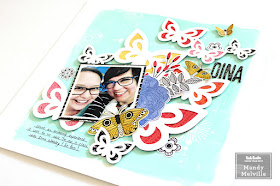
Dina | Vicki Boutin

Hey friends!

Today I have a bright and fun layout to share with you, featuring Vicki Boutin Color Pop paints, and the ‘All the Good Things’ collection. I also used a gorgeous cut file from JustNick Studio on this page. The photo that I documented is one of myself with the lovely Dina Wakley! I was lucky to attend a class with Dina last weekend, and so of course I had to scrapbook this photo to document the day! 

Here’s a look at my layout… 


I started my layout off by painting the background using the Blue Hawaiian Color Pop paint. I toned down the colour a little bit by mixing white gesso with it. I painted most of the background, but left about an inch around the edge unpainted. Once that was dry I used one of the Vicki Boutin circle stamps, and stamped onto the background using watered down gesso. I also added some white splatters using the gesso. I love how the bright background really helps the cut file to pop off the page! 


I backed the butterflies in the cut file with patterned papers from the ‘All the Good Things’ collection. I chose papers in warmer tones so that they would contrast nicely with the aqua background. I also matted the photo with the Pretty Words patterned paper. 


To the right of the photo I created a pretty cluster of embellishments that includes a die cut butterfly, a flower, and leaves. I used foam tape to adhere some of the embellishments to give them extra dimension. 


I added my title using the chipboard Thickers from the collection. 


To finish the layout off I added a couple of fussy cut butterflies, as well as a few watercolour stickers to the page. 


Thanks so much for joining me here today! I hope that you enjoyed taking a look at my layout!

Supplies Used: 
Foundations Paper 
Gesso 
Color Pop Acrylic Paint – Set 3 
Stamps & Dies – Set 3 
Brushes 
Mister Bottles 
Thickers – Alpha/B&W Chipboard 
Cardstock Die Cuts – Icons 
Watercolor Stickers 
Single-Sided Card Pad 7”x10” 
Double-sided Patterned Paper – Pretty Words 
Double-sided Patterned Paper – Social Butterfly 
Double-sided Patterned Paper – Picked for You 

This will actually be my last project for the Vicki Boutin design team as I've made the difficult decision to step down from the team. Family life is busy at the moment and we have some things coming up that are going to take lots of my time and energy, and I didn't want to commit to another 6 month term on the team if I couldn't give it 100%. I have absolutely LOVED being on this team, and creating with Vicki's gorgeous products! I want to say a huge thank you to Vicki for inviting me to be a part of her very first design team. It has been an absolute pleasure, and I hope that I've been able to inspire all of you as well!


Wednesday, 1 August 2018

Awesome | Cocoa Vanilla Studio

Hey friends!

Today I have a new layout to share with you, featuring the awesome Cocoa Vanilla 'Boys Rule' collection! I can't get enough of this collection, it's just so fun to create with! On this layout, I documented a photo of my son when he was just 17 months old. He was such a happy and easy-going baby, and I adore his cute little smile in this photo! I printed the photo in black and white to help it to really pop off the page!


I decided to arrange all of the elements on the layout down the right hand side of the page, leaving lots of white space on the left hand side. This design really helps to draw the viewer's focus to the photo.


I started at the top of the page by layering together a chipboard piece with a die cut banner. I love that the chipboard pieces in this collection are all pre-cut pieces, making it easier to move them around the page.


I used another chipboard piece as the title for the page. I love to use the large chipboard words on my layouts! They make an easy title, and they really make an impact on the page!


Underneath the photo I layered a few die cut and chipboard frames. I also matted my photo with the reverse side of the Entitled patterned paper, and I adhered it with foam tape to give it some extra dimension. I created a little cluster of embellishments on the bottom right hand corner of the photo using die cut ephemera. I used a label to add my journaling to, and tucked it under the side of the photo.


At the bottom of the page I added the grey scallop die cut piece. I finished the layout off with a sprinkling of stars and a few little word stickers.


I love how this turned out, and it was a quick and easy layout to put together! I hope that you've been inspired and that you enjoyed taking a closer look at my layout.

Mandy x