Wednesday, 15 August 2018

Stay a Little Bit Wild | TN Layout | Cocoa Vanilla

Hi everyone!

Today I'm sharing a traveler's notebook layout using the gorgeous Bohemian Dream collection from Cocoa Vanilla Studio! I've loved seeing what the design team have been sharing this week over on the Cocoa Vanilla blog for our 'Make it Mini' theme! So many cute projects, and lots of amazing inspiration! I decided to scrapbook a photo of my youngest daughter Eleanor when she was just being cute and silly. I love to use my traveler's notebooks to document those little everyday moments!


I started off by covering the left hand side of the spread with the Abstract patterned paper. I love how the bright colours in this paper really help the black and white photo to pop! I also thought that the 'messy' look of this patterned paper would add to the fun and playful feel that I wanted to achieve on this layout.


I matted my photo with one of the patterned papers from the 6x6 paper pad. I also layered a die cut frame, and a couple of labels that I cut out of the Boho Bits patterned paper behind the photo to add some more interest. On the bottom right hand corner of the photo I created a little cluster using a floral chipboard sticker, and die cut, as well as the sticker that says 'Shine Bright'. (A little tip, when I use chipboard stickers in my TN inserts, I peel some of the layers of chipboard off the back to make them a little thinner and less bulky).


Next I covered the right hand side of the spread with the Wild & Free patterned paper. This lighter paper provided a nice contrast to the darker one I'd used on the left hand side. For my title, I fussy cut the piece that says 'Stay a little bit Wild' out of the Boho Bits patterned paper. This suited the photo (and my daughter's personality in general) perfectly! I also fussy cut that beautiful butterfly out of the Boho Bits patterned paper, and I adhered it with just a little bit of glue in the middle, so that the wings would lift off the page a little bit.


To finish the layout off, I added a strip across the bottom of the right hand page (once again this was cut out of the Boho Bits patterned paper). I also added a few lines of typed journaling which I cut up into little strips.


I love how this traveler's notebook layout turned out! The Bohemian Dream collection is just so bright and colourful!

Thanks so much for joining me today!

Mandy x

Thursday, 2 August 2018

Dina | Vicki Boutin

Hey friends!

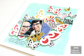
Today I have a bright and fun layout to share with you, featuring Vicki Boutin Color Pop paints, and the ‘All the Good Things’ collection. I also used a gorgeous cut file from JustNick Studio on this page. The photo that I documented is one of myself with the lovely Dina Wakley! I was lucky to attend a class with Dina last weekend, and so of course I had to scrapbook this photo to document the day! 

Here’s a look at my layout… 


I started my layout off by painting the background using the Blue Hawaiian Color Pop paint. I toned down the colour a little bit by mixing white gesso with it. I painted most of the background, but left about an inch around the edge unpainted. Once that was dry I used one of the Vicki Boutin circle stamps, and stamped onto the background using watered down gesso. I also added some white splatters using the gesso. I love how the bright background really helps the cut file to pop off the page! 


I backed the butterflies in the cut file with patterned papers from the ‘All the Good Things’ collection. I chose papers in warmer tones so that they would contrast nicely with the aqua background. I also matted the photo with the Pretty Words patterned paper. 


To the right of the photo I created a pretty cluster of embellishments that includes a die cut butterfly, a flower, and leaves. I used foam tape to adhere some of the embellishments to give them extra dimension. 


I added my title using the chipboard Thickers from the collection. 


To finish the layout off I added a couple of fussy cut butterflies, as well as a few watercolour stickers to the page. 


Thanks so much for joining me here today! I hope that you enjoyed taking a look at my layout!

Supplies Used: 
Foundations Paper 
Gesso 
Color Pop Acrylic Paint – Set 3 
Stamps & Dies – Set 3 
Brushes 
Mister Bottles 
Thickers – Alpha/B&W Chipboard 
Cardstock Die Cuts – Icons 
Watercolor Stickers 
Single-Sided Card Pad 7”x10” 
Double-sided Patterned Paper – Pretty Words 
Double-sided Patterned Paper – Social Butterfly 
Double-sided Patterned Paper – Picked for You 

This will actually be my last project for the Vicki Boutin design team as I've made the difficult decision to step down from the team. Family life is busy at the moment and we have some things coming up that are going to take lots of my time and energy, and I didn't want to commit to another 6 month term on the team if I couldn't give it 100%. I have absolutely LOVED being on this team, and creating with Vicki's gorgeous products! I want to say a huge thank you to Vicki for inviting me to be a part of her very first design team. It has been an absolute pleasure, and I hope that I've been able to inspire all of you as well!


Wednesday, 1 August 2018

Awesome | Cocoa Vanilla Studio

Hey friends!

Today I have a new layout to share with you, featuring the awesome Cocoa Vanilla 'Boys Rule' collection! I can't get enough of this collection, it's just so fun to create with! On this layout, I documented a photo of my son when he was just 17 months old. He was such a happy and easy-going baby, and I adore his cute little smile in this photo! I printed the photo in black and white to help it to really pop off the page!


I decided to arrange all of the elements on the layout down the right hand side of the page, leaving lots of white space on the left hand side. This design really helps to draw the viewer's focus to the photo.


I started at the top of the page by layering together a chipboard piece with a die cut banner. I love that the chipboard pieces in this collection are all pre-cut pieces, making it easier to move them around the page.


I used another chipboard piece as the title for the page. I love to use the large chipboard words on my layouts! They make an easy title, and they really make an impact on the page!


Underneath the photo I layered a few die cut and chipboard frames. I also matted my photo with the reverse side of the Entitled patterned paper, and I adhered it with foam tape to give it some extra dimension. I created a little cluster of embellishments on the bottom right hand corner of the photo using die cut ephemera. I used a label to add my journaling to, and tucked it under the side of the photo.


At the bottom of the page I added the grey scallop die cut piece. I finished the layout off with a sprinkling of stars and a few little word stickers.


I love how this turned out, and it was a quick and easy layout to put together! I hope that you've been inspired and that you enjoyed taking a closer look at my layout.

Mandy x