Friday, 28 October 2016

Spider World | Off the Rails Scrapbooking

Hi everyone!

Today I'm up on the Off the Rails blog sharing a closer look at the layout that I created for this month's mood board, as well as some time saving tips! I know that we are all so busy with work, family etc, and sometimes it's hard to squeeze in time for our precious hobby, so I hope these tips are helpful for making the most of your creative time!

Here's my layout inspired by the October mood board...


We personally don't celebrate Halloween, so I took inspiration from the spider web on the October mood board as well as the colours. I documented a photo of my son when we visited the Reptile Park recently. One of the highlights of the day for him was Spider World, where he could take a closer look at lots of big creepy crawly spiders!

I'm usually a fairly slow scrapper, but sometimes I have deadlines to meet, and so I have to get things done more quickly. Here are some tips and techniques that I use to save time when I need a layout to come together quickly...

1) Start with a mood board or sketch
Having a starting point such as a mood board or sketch is a great way to get the creative juices flowing. When you're short on time it makes it easier if you have a jumping off point. Off the Rails have great mood boards every month!

2) Re-use a design that you've used before
If you've created a layout that you love, why not scrap-lift yourself? There are no rules that say you can't re-use the same design again, and more often than not, your layout will probably turn out different to the original layout anyway.

3) Work with limited supplies
For me, a big time waster is having to sift through supplies to find papers and embellishments that coordinate. When I'm short on time, I limit my supplies. Sometimes I'll work with just one collection or kit, or other times I might get out a few supplies ahead of time and limit myself to these. You'd be surprised at how this can not only save you time, but also boost your mojo!

4) Set yourself a time limit
It can be easy to lose track of time when you're scrapping, right? So if you're short on time, set a timer and challenge yourself to complete a project in a set amount of time. That way, you'll be less likely to waste time fluffing around.

5) Use a large cut file or design element
When I don't want to have to think too much about the design, I like to use a large cut file or design element on my page. This takes the hard work out of deciding where to place all of the elements on the page. On my layout 'Spider World', I used my Cameo to cut a large spider web. As this took up half of the page, it limited the possibilities of where I could place the photo, title and embellishments, which saved me time.

Of course there will be times when we can actually slow down and just enjoy the process of creating, but often we just have to make do with the little time that we do have to scrap, so hopefully these tips will be helpful for making the most of your creative time!

Here are some closeups of my layout so that you can see all of the details...


And here's a reminder of this month's mood board...

October mood board

I hope that you get a chance to play along with our mood board challenge this month! There's only a few days left to get your projects linked up over on the Off the Rails blog!

Thanks so much for joining me today, and for any lovely comments that you leave as well!

Mandy

Traveler's Notebook Spreads | Felicity Jane Studio

Hello!

I'm super excited to be sharing my first project using the Felicity Jane October Emeline kit! Take a look at all the goodies that you get in this kit...


I absolutely adore the colours... it's all soooo pretty!

I created a traveler's notebook spread using the kit...


I'm loving using my traveler's notebook to document all of the little things that my youngest daughter and I do together during the week! How sweet is this photo of her playing in our backyard!

Here are a couple of closeups...


I layered some strips of patterned paper across the page and then added my photo on the left-hand side. I created a little cluster on the bottom left hand corner of the photo using a sticker from the cut-apart sheet and a couple of enamel dots. I also tucked a cute little tag under the top of the photo. I finished off the left hand side of the layout with some stamping, using a stamp from the Emeline stamp set. How awesome are the stamp sets that come in the kits!?!


I LOVE that 'Happy' banner that comes on the sticker sheet, and it worked perfectly for this spread! I added one of the cute little puffy stickers underneath the banner, as well as another enamel dot. I finished the layout off with some journaling and the date.

I still have quite a few goodies left over from my September kit (there's seriously so much good stuff in these kits!), so I've created an additional traveler's notebook spread to share with you today using the September Felicity kit!


This page documents a week when my little one was not feeling so well. All she wanted to do was snuggle with me on the lounge. She even fell asleep on me, which she doesn't usually do, so I made the most of the cuddles. Although most of my traveler's notebook spreads will document all of the fun that we have together, I also want to document some of the not-so-happy times, because this is part of real life.

Here are some closeups of this spread...


I wanted to keep the left hand side of the layout uncluttered in order to keep the focus on the photo and journaling. I cut a heart out of one of the patterned papers and then simply added a little phrase and a flower sticker, which I popped up on some foam tape to create dimension.


I layered one of the acetate pieces from the kit behind my photo, as well as a tag which was one of the September subscriber printables. On the bottom right hand corner of the photo I added a flair button and a little word sticker from the cut apart sheet, which had the perfect phrase for this spread.


I finished the layout off with a few lines of journaling, and then I added one of the patterned paper branding strips across the bottom of the pages.

Thanks so much for joining me on my blog and taking a look at my traveler's notebook spreads! Make sure you keep an eye on the Felicity Jane blog for lots of inspiration from the whole Creative Team!

Mandy

Monday, 24 October 2016

Cute | The Cut Shoppe

Hello!

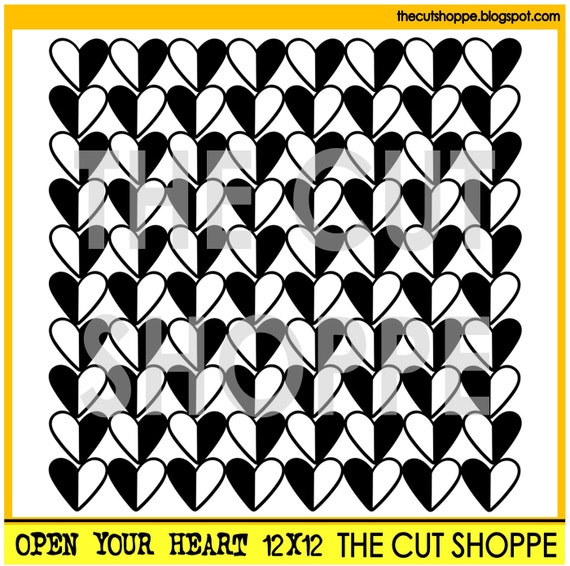
Today I'm sharing a layout for The Cut Shoppe using the Open Your Heart background cut file!


I couldn't wait to document this sweet photo of my two girls together! They are ten years apart, but they are so close, and I love seeing how much they adore one another. I think this photo really captures their special bond.

The Open Your Heart background cut file was perfect for this page!

The Open Your Heart background cut file is available in 8.5x11 and 12x12 sizes for your scrapbooking and papercrafting projects.

I cut it from white cardstock, and then added some foam tape underneath to give it some dimension. I love the shadows that this creates!

My layout features patterned papers and embellishments from the Crate Paper Cute Girl collection.

Here are a few closeups...


I created a cluster on the bottom left hand corner of the photo that includes some flowers that I fussy cut from one of the patterned papers, as well as some stickers from the Cute Girl collection, and a silicone charm from Felicity Jane.


On the top right hand corner of the photo I added a Charms Creations heart. I tucked another fussy cut flower underneath the heart, and finished it off with a Crate Paper word sticker.


I created a third point of interest in the top right hand corner of the layout. You'll notice that the three embellishment clusters are positioned diagonally across the page so that the viewer's eye is drawn down towards the photo. This is where I added my title, as well as some more Crate Paper Cute Girl stickers. I finished the layout off with a few sequins.

Thanks so much for joining me on my blog today and taking a look at my layout! If you like to use background cut files on your layouts, you'll find this one, as well as many more, in The Cut Shoppe Etsy store!


Saturday, 15 October 2016

Just Plain Fun | Stuck?! Sketches October 15th challenge

Hi friends!

It's time for a new challenge over at Stuck?! Sketches! Here is the October 15th sketch designed by Laura Whitaker! It's a fun multi-photo one...


And here is my take on the sketch...


I flipped the sketch horizontally as this worked better with my photos. I scrapped  a series of photos that I took of my daughter on a trampoline when we were on holidays recently. I think she's so clever... she does the most amazing tricks and flips! This sketch was perfect for documenting these photos!

My layout features patterned papers and embellishments from the Felicity Jane Happy Day kit designed by Suse Fish. I also used a Cute Cat embellishment from Charms Creations!

Here are some closeups...


Up in the top left hand corner I added a cloud which I fussy cut from one of the patterned papers and I tucked a cute little sun puffy sticker under the edge of the cloud.


How sweet is this Charms Creations Cute Cat embellishment!?! I love the pop of colour and texture that it adds to the page!


Here you can see the little cluster that I created in the bottom left hand corner. I tucked a tab under the side of the photo and then added a flair button as well as a couple of flower stickers on the corner of the photo.


I created my title using some Amy Tangerine puffy stickers as well as some yellow alphas from Pinkfresh Studio. Lastly I added my journaling underneath my title.

If you haven't done so already, I hope that you'll head on over to the Stuck?! Sketches blog and take a look at the gorgeous layouts created by my fellow design team members! I hope that you'll play along with us by creating a layout based on this sketch! Link up your layouts on the Stuck?! Sketches blog by October 29th to be in the running to win a prize from one of our very generous sponsors:


Thank you so much for visiting my blog and taking a look at my layout! Thank you to those who take the time to leave a comment as well - it is always very much appreciated!

Mandy

Thursday, 13 October 2016

Hello You | The Cut Shoppe

Hi everyone!

Today I'm up on The Cut Shoppe blog sharing something a little bit different using cut files from The Cut Shoppe etsy store! I have recently discovered a love of traveler's notebooks, and so I thought I would share with you how I used the Oakley Avenue cut file set on one of my traveler's notebook spreads!


I use my traveler's notebook to document all of the little things that my youngest daughter and I do together during the week. We often like to meet my sister and my nephew down at the beach in the mornings. The kids enjoy a play together and we usually get a coffee too! This layout documents a day that we did that recently.

I used the Paige Evans 'Take me Away' collection for this layout. I love the gorgeous colours in this collection!

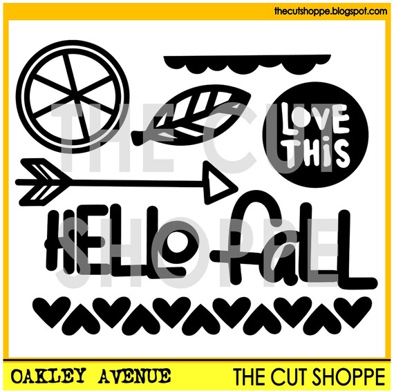
This is the Oakley Avenue cut file set that I used...

The Oakley Avenue cut file set includes 8 fall themed images, that can be used for your scrapbooking and papercrafting projects.

Even though this is a fall themed set, I think it's really versatile and has plenty of images that could be used on a range of different projects! I used three of the cut files from this set on my traveler's notebook spread!


I added patterned paper to the left hand side of the layout, and then created some layers behind my photo to help it stand out from the background. Because of the busy patterned paper, I didn't feel like this side need much embellishing, so I simply added a wood veneer ampersand to the bottom left corner of the photo.


To create the title for my layout I used the word 'Hello' from the Oakley Avenue cut file set, and combined it with a wood veneer word from the Take Me Away collection. I added an arrow underneath the title using another cut file from the same set.


I added my journaling and then finished my layout off with a few hearts. I used the row of hearts in the Oakley Avenue set to cut the hearts out of coordinating patterned papers.

Thanks for joining me on my blog today! I hope you enjoyed taking a peek inside my traveler's notebook!

Mandy

Saturday, 1 October 2016

Avengers Lego | Stuck?! Sketches October 1st Challenge

Hello!

It's time for the reveal of the Stuck?! Sketches October 1st challenge! Here is the fabulous sketch designed by Laura Whitaker...


And here is my design team layout inspired by the sketch...


I scrapped a recent photo of my son Isaac, proudly showing off his new Lego set that he had put together. How awesome is Lego... It never seems to go out of fashion, and it's great for all ages! I'm glad that Isaac enjoys it!

I used the Cocoa Vanilla Studio Totally Rad collection on this layout, which was just perfect for this photo!

Here are some closeups...


The cluster in the top left hand corner of my layout includes a Charms Creations star as well as some Cocoa Vanilla die cuts.


I created another cluster of Cocoa Vanilla goodies down in the bottom right hand corner of the layout, and used a journal card in place of the photo on the sketch. I love that robot die cut... it reminded me of a little Lego man, which I thought was appropriate for this page.


I finished the layout off with some typed journaling and a little bit of stamping to add some interest to the bakground.

If you haven't done so already, I hope that you'll head on over to the Stuck?! Sketches blog and take a look at the gorgeous layouts created by the new design team. I'm excited to say that I'm staying on with Stuck?! Sketches for another term!! I'm so pleased because I love Laura's sketches so much!!

I hope that you'll play along with us by creating a layout based on this sketch! Link up your layouts on the Stuck?! Sketches blog by October 29th to be in the running to win a prize from one of our very generous sponsors:


Thank you so much for visiting my blog and taking a look at my layout! Thank you to those who take the time to leave a comment as well - it is always very much appreciated!

Mandy

"Mummy's Eyes" | Scrap the Girls October challenge

Hi everyone!

It's time for a new challenge over at Scrap the Girls and this month we have a gorgeous mood board to inspire you!


Such a pretty colour palette! Here's my design team layout that I created inspired by the mood board...


I love these cute photos of Eleanor! She likes to try on my glasses and calls them "Mummy's eyes"! So adorable!

I used the Felicity Jane July Happy Day kit designed by Suse Fish for this layout. It's such a super cute kit with lots of fun little details... Just perfect for scrapping these cute photos.

Here are some closeups...


I added a chipboard frame around the smaller photo and then embellished it with some flowers from the cut apart sheet, a flair button, and some cute puffy stickers.


More gorgeous embellies from the Happy Days kit! Love those puffy stickers!!


I finished the layout off with a little cluster down in the bottom left hand corner that includes more pretties from the cut apart sheet, a flair button, and a little heart puffy sticker.

If you haven't done so already, I hope that you'll pop on over to the Scrap the Girls blog and take a look at the gorgeous layouts that my fellow design team members have created inspired by this mood board! I hope that you'll play along with us this month! Link up your layouts on the Scrap the Girls blog by 31st October to have a chance of winning a prize from our very generous sponsor Colour Blast!

Thanks for visiting and taking a look at my layout! Thank you to those who leave a lovely comment as well!

Mandy