Thursday, 29 September 2016

Just be You | Felicity Jane Studio

Hello!

Today I have a new layout to share with you that I created using the super gorgeous September 'Felicity' kit from Felicity Jane. In case you haven't seen all the goodies that come in this kit yet, here's a peek...

How beautiful are the colours and patterns?! And the embellishments are so fun!

This is the first layout that I've created using the kit, and I can't wait to dive back in and play some more!


I don't often create layouts that are just about me, but there were so many pretty things in this kit that just seemed so "me", and I thought it might be fun! Plus today is my birthday, so I thought what better time to scrap a selfie, right?!

I also don't very often use such a bold pattern for my background, but I just adore the black and white stripes, and when I teamed it up with the coral and mint florals... perfection!

This week the Felicity Jane girls are teaming up with Tombow, who were very generous to give our team some goodies to use on our projects. I hadn't tried out their adhesives, so I gave them a go on this layout, and was very happy with them!

Here are some closeups of my layout so that you can see all the details...


The floral from the sticker sheet is one of my favourite things about the kit, and I had to use it straight away! It's so so pretty! I decided to leave the back on the sticker as I didn't want it to stick down flat, I wanted the leaves to lift off the page to create dimension. So I added some Tombow Mono Multi Liquid Glue to the back of the sticker, but just in the middle, and this created the look that I was wanting.


I fussy cut some more flowers from the floral patterned paper, and also printed off the subscriber printables which had some more flowers on it. I tucked these underneath the top left hand corner of my photo. To the left of my photo I added one of the stamps from the kit. I'm really loving the Felicity Jane stamps sets!


My title 'Just be you' is one of the subscriber printables for this month. I think this was the perfect title for my layout, as its something that I need to be reminded of. I used my Silhouette Cameo to cut it out and then added some foam tape to the back to give it some extra dimension.


Up in the top left hand corner of my layout I created a little cluster that includes a label from the sticker sheet, another flower from the printables, and a flair button from the 'everything' set (available as an add on from the Felicity Jane shop). I also cut the scallop border off the coral solid coloured paper and adhered it down the left hand side of the page using the Tombow permanent tape runner.

To finish off the layout, I added a couple of acrylic black stars and a sprinkling of sequins. I used the Tombow Mono Multi Liquid Glue to stick them down which worked perfectly.

Thanks for joining me on my blog today! I look forward to sharing more projects using the 'Felicity' kit soon!

Mandy

Tuesday, 27 September 2016

Laugh | The Cut Shoppe

Hi there!

Today I'm sharing a layout for The Cut Shoppe using the Snapshots digital collection and the Friends Forever cut file set! This was the first time that I'd used a digital/printable collection, and I loved it! My printer only prints up to A4 size, so I wasn't able to print the papers at full 12x12 size, but this worked perfectly for me as I didn't need a full sheet for the design that I had in mind. Here's my layout...


When I was sorting through some photos recently, I came across these ones of the my eldest two kids, taken 5 years ago. I love these photos so much, and just knew that I had to scrap them right away before they got forgotten for another 5 years! I'm so glad that I had my camera handy when they were having some fun together before bed one night! I can't believe how fast time flies by... this feels like just yesterday, not 5 years ago!!

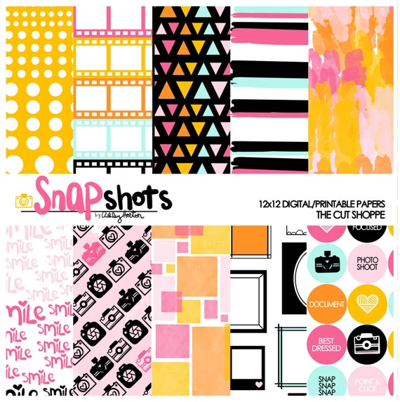
Here's a look at the Snapshots digital collection that I used... I just love the bright, fun colours! The pink and aqua were a perfect match to my photos!

Snapshots is a Digital Scrapbook collection, that can be used in your digital and hybrid scrapbooking, or printed out on your home printer.

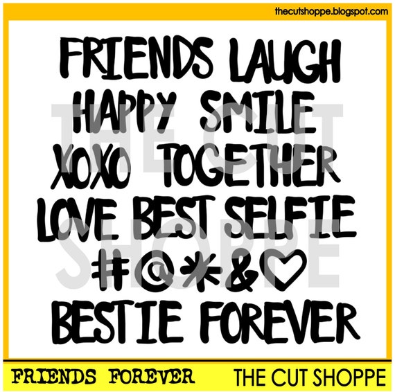
The cut file that I used for my title is from the Friends Forever cut file set.

The Friends Forever cut file set includes a mix of 16 hand-drawn words and icons, that can be used for your scrapbook & papercraft projects.

Here are a couple of closeups of my layout...


How awesome is it that the collection has a cut apart sheet and ephemera! The beauty of this is that you can print them any size you want, and as many times as you like! I created a little cluster to the left of the photos using a heart and a phrase from the Snapshots collection, and then finished it off with a flair button.


I love the Friends Forever cut file set a lot, because it's so versatile! The word 'laugh' was absolutely perfect as the title for my layout! I also added another phrase and a scallop, both from the cut apart sheet, underneath my title.

I added my journaling and then finished the layout off with a Maggie Holmes crepe paper rosette, and a sprinkling of star sequins.

Have you checked out the other digital/printable collections that The Cut Shoppe has on offer? There's a fun new Halloween collection! There are also some new Autumn themed cut files in the shop, so make sure you head on over there to take a look!

Thanks so much for joining me on my blog today!


Friday, 23 September 2016

Family | D-lish Scraps

Hello friends!

I'm back today to share my very last design team project for D-lish Scraps. I'd like to say a very big thank you to Amanda for having me on her design team over the past year! It has been an honour to design for such an awesome shop and alongside such talented ladies!

So here is my final D-lish Scraps layout...


I created this layout for Sonia's September Cybercrop challenge in The Scrap Suite...


From the recipe list I included:
C - Circle (flair button)
R - Resin / A - Animal (resin bird)
P - Paper Flowers

The photo that I scrapped is a selfie that we took on a recent family picnic. We don't have many photos of all 5 of us together, so I knew wanted to scrap this one straight away! Even though it's not the most well composed photo, I think it's pretty special and I love it! When I finished this layout off, I decided to put it into a frame to display in our home rather than tuck it away in an album!

The design of this layout is one that I've used before, but when something works for you, why not do it again, right?! The patterned papers that I used are from the August Felicity Jane kit.

Let's take a look at some closeups...


On the bottom left hand corner of my photo, I created a pretty cluster that includes a gorgeous magnolia, a white cherry blossom, a hydrangea petal, and a Charms Creations heart finished off with an arrow word tab. You can also see here the lovely lace doily that I layered behind my photo.


Under the right hand side of my photo, I tucked a manilla shipping tag finished off with some cotton twine. I also added a flair button (from the Washi Hearts Set A) and another hydrangea petal to create a little cluster. You'll notice that I popped an enamel dot in the centre of each of the hydrangea petals... I like how this finishes them off!


I added my title to the bottom right hand corner of my layout. I used one of the Corbett Creations wood veneer words, which I absolutely LOVE!! To finish off the title area I added another hydrangea petal and a pretty resin bird.

Thank you so much for stopping by and taking a look at my D-lish layouts over the past few days! Thank you to those lovely people who leave comments as well - I always love reading them!

Mandy

Thursday, 22 September 2016

Love this Adventure | D-lish Scraps

Hi friends!

I'm back today to share another layout for D-lish Scraps! This one features a photo of my husband with my three kids on Fathers' Day earlier this month...


This year we decided to go away for the weekend to celebrate Fathers' Day, and wouldn't you know it... everyone came down with the flu just in time for the weekend, and to top it off, the weather was terrible! We still managed to have a nice time together though. On the day we were leaving the sun came out, and so despite everyone not feeling very well, we stopped off for some morning tea at a cafe and a play down at the beach. The beach was so beautiful and it made for some lovely photos for Fathers' Day that I of course needed to scrap right away!

I wanted a light and airy feel for this layout. I also went for a minimalist approach, which I think is sometimes harder because I keep wanting to add just one more thing!

The patterned paper that I used is from Felicity Jane Studio.

Here are some closeups...


Behind the top left hand corner of the photo I added a wood veneer scalloped frame that came in the  August special release Just Add Paper kit. To the left of the photo I added a white magnolia (my new favourite!) and a Kaisercraft Paper Bloom from the 'Sea Breeze' pack.


To create my title 'Love this Adventure', I used a a phrase from the black minifetti sheet along with a Felicity Jane cut file. Underneath my title I added a flair button from the 'Wood Veneer Words' set.


Up in the top right hand corner of the layout I created a little cluster that includes a journal spot, a white pastel petal, and a wood veneer heart (also from the August special release kit). I finished this cluster off with an enamel dot, which added a little pop of the blue to this corner.

Even though this was a fairly simple layout with minimal embellishments, I was still able to include quite a few of my favourite D-lish goodies!

Thanks for joining me on my blog today! I'll be back tomorrow with my very last share for D-lish Scraps!

Mandy

Wednesday, 21 September 2016

Cherish | D-lish Scraps

Hi everyone!

This will be my final month as part of the D-lish Scraps Design Team... I am so grateful to Amanda for the amazing opportunity it has been to be on this team for the past year and I have loved sharing my D-lish projects with you all! Over the next few days I'll be sharing my final three D-lish Scraps projects with you. Today I'm sharing my layout that I created for the September Inspiration Board challenge...


Here's a reminder of what the September 'Berry Blast' Inspiration Board looks like...


How stunning is this colour palette?!! Pink and teal are two of my favourite colours to use on a layout, so this was right up my alley!! Other than being inspired by the colours, I also used the optional sketch as the basis for my layout.

The photo that I scrapped is one of my youngest daughter, Eleanor and my nephew, Charlie. I just love how sweet they are together, and I'm so glad that I captured this photo of Charlie giving Eleanor a little kiss on the cheek!

I teamed up patterned papers from a few different collections on this layout... I used Crate Paper Hello Love, Heidi Swapp Hello Beautiful, and Cocoa Vanilla Colour Me Happy.

I used lots of items from the September Just Add Paper kit to embellish my page!

Let's take a look at some closeups so that you can see all the details...


I created some pretty layers behind my photo using patterned papers as well as the lovely heart doily and the tissue paper from the kit. I love the texture and interest that these items add to the layers. On the bottom left hand corner of the photo I added a gorgeous white magnolia and a hot pink rose. The magnolias are fast becoming one of my favourite paper flowers! How cute is the little wood veneer word in this month's kit? I added it to the bottom of my photo and used it as the title for my layout.


I attached one of the little phrases in the journal pack to the top of the photo using the mini peg from the kit packaging, and then added one of the cute little white roses next to the peg. I tucked the journal spot under the right hand side of my photo and used it to add the date to my layout. I finished this cluster off with a hot pink resin button and one of the resin birds from the kit.


In the bottom right hand corner of the layout I added a wood veneer 'XO' that came in the special release August kit. Can you tell I love my wood veneers?? I also included some of the teal spot washi tape in this corner as well. I added my journaling and some stamping to the layout, and then finished it off with some D-lish enamel dots. Did you check out the new enamel dots/shapes that were added to the store recently?

I hope that I've inspired you to play along with our Inspiration Board challenge this month! I'll be back tomorrow with another D-lish Scraps layout to share with you.

Mandy

Tuesday, 20 September 2016

Days like this | Felicity Jane Studio

Hello friends!

I'm up on the Felicity Jane Studio blog today sharing another layout using the stunning August 'Maggie' kit! Here's a little sneak peek...


I'd love you to pop on over there to take a look at the full layout and find out how I turned a project life card into a cut file!

There are still add-ons from this kit available to purchase from the Felicity Jane shop, and have you seen the new September kit 'Felicity'? It's gorgeous and I can't wait to start creating with it!!

Mandy

Monday, 19 September 2016

Make a Splash | Stuck?! Sketches September 15th Challenge

Hi there!

The anniversary celebrations are continuing throughout this month over at Stuck?! Sketches! I hope that you're having as much fun as we are! We have THREE awesome sponsors for the September 15th challenge! One of these sponsors is JustNick, and they have very generously allowed some of our design team to have a play with their cut files for our September 15th layouts!! Let me remind you of the sketch that the lovely Laura Whitaker has designed for us...


Here is the layout that I created inspired by this sketch...


I changed the sketch a little to suit my photos... I used one larger horizontal photo in place of the two square photos at the back, and I also flipped the sketch. That's the beauty of a sketch isn't it... it gives you a jumping off point for your design, and then you make it your own!

This layout features photos of my kids enjoying a swim in the pool when we were on holidays earlier this year.

I used patterned papers from a few different Cocoa Vanilla Studio collections... Hello Sunshine, Totally Rad, and Hello Lovely! I love how well they all came together!

Here are some closeups of my layout...


Here you can see the JustNick cut file that I used for my title. It is from the 'Summer Lovin' cut file set and it was just perfect for this layout! I cut it out of patterned paper and then mounted it on foam tape to give it extra dimension.


To the right of my the photos I created a cluster that includes a Charms Creations arrow, a Cocoa Vanilla flair button, and a D-lish Scraps paper flower.


My cluster in the bottom left hand corner includes more Cocoa Vanilla die cuts and stickers, as well as a pretty lace doily.

I finished my layout off with some typed journaling and a few enamel dots.

I hope that you'll play along with us by creating a layout based on this sketch! Link up your layouts on the Stuck?! Sketches blog by September 29th to be in the running to win a prize from one of our very generous sponsors:


Thank you so much for visiting my blog and taking a look at my layout! Thank you to those who take the time to leave a comment as well - it is always very much appreciated!

Mandy

Monday, 12 September 2016

Cute | The Cut Shoppe

Hi friends!

Today I'm sharing a layout for The Cut Shoppe using the super cute Hello Hearts cut file! I loved this cut file as soon as I saw it and have been waiting for just the right layout to use it on! When I decided to scrap this cute photo of my youngest daughter, I knew that this cut file would be perfect!


I just love this photo of Eleanor playing dress-ups! This girl is as sweet as she is sassy! She's going to be one who stands out from the crowd!

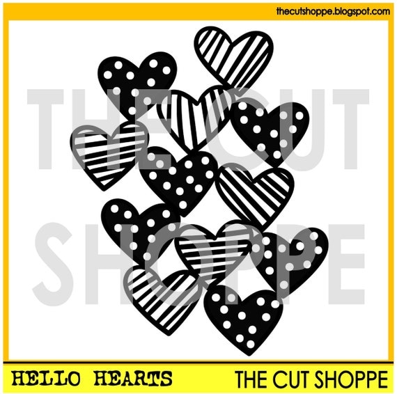
This is the Hello Hearts cut file that I used...

The Hello Hearts cut file is a background design, that can be used for your scrapbooking and papercrafting projects.  

I cut the hearts out of white cardstock and backed each heart with patterned papers from the Crate Paper Hello Love collection as well as the Paige Evans Fancy Free collection. I also added foam tape underneath the cut file to raise it up and give it some dimension.

Here are some closeups...


I created a little cluster in the top left hand corner of the layout using a Fancy Free chipboard sticker, a Prima flower, and a pink polka dot button.


Over the top of one of the hearts I added a black Charms Creations felt heart. I think the black helps to ground the bright colours and also balances out the black title and the stripes down the left hand hand side of the layout. I also popped a flair button from Accent Scrapbooking on top of the heart.


I added a couple of flowers on the right hand side of the photo, and then added my title and journaling underneath.

I finished my layout off with some stamped words and black ink splatters.

I really loved using the Hello Hearts cut file on this layout, and will definitely be using it again! If you love it too, head on over to The Cut Shoppe Etsy store to pick it up for yourself, and while you're there, check out the new cut files that were added to the store on Thursday!

Thanks so much for joining me on my blog today. I'll be sharing another layout for the Cut Shoppe later in the month!


Friday, 9 September 2016

Autumn | Felicity Jane Studio

Hey friends!

Today I'm up on the Felicity Jane blog sharing another layout using the gorgeous Maggie kit! I think I've already said how much I love this kit, but seriously, the colours... the papers... the embellishments... They're all so beautiful!!! If you get a chance to purchase this kit, you won't be disappointed!

Here's a sneak peek of my layout...


Pop on over to the Felicity Jane blog for the full layout plus all the details!

Mandy

Wednesday, 7 September 2016

Lulu Bell | CSI Guest Detective

Hi there!

Last month Charms Creations was one of the sponsors over at CSI challenge blog, and our creative team were invited to play along as guest detectives! I decided to have a go at Case File No. 210...


Here are the requirements for the challenge...


And here is my layout...


From the evidence list I used a check pattern, clouds and circles, and from the testimony list I used journaling strips.

The photo that I scrapped is of my eldest daughter dressed up for book week a couple of years ago. She always has a lot of fun planning her costumes for book week!

I teamed up patterned papers from the Maggie Holmes Bloom collection with the Paige Evans Fancy Free collection. I really like how well these two collections coordinated!

I used a cut file from The Cut Shoppe to create my title. I'm loving large titles on my layouts at the moment!

Here are some closeups of my layout...


Of course I had to use a couple of Charms Creations clouds on my layout!! I'm finding myself using these clouds quite often lately! I love the subtle texture of the white clouds against the white background. I added a couple of chipboard embellishments from the Fancy Free collection and an enamel dot to create a little cluster here.


Some more Fancy Free chipboard and a Maggie Holmes crepe paper rosette made for another lovely little cluster to the right of the photo. I also added a sub title using the gold glitter thickers from the Bloom collection.


I added a smaller Charms cloud up in the top right hand corner of the layout. I also added a flair button and some enamel dots, both from D-lish Scraps.

Thanks so much for joining me on my blog today!

There's still a couple of days left to play along with this challenge... The case closes on September 9th, so why don't you give it a go!

Mandy

Sunday, 4 September 2016

You & Me | Felicity Jane Studio

Hi friends!

I'm so super excited to be sharing my first layout with you as a Creative Team member for Felicity Jane Studio!!! What an absolute honour it is to have been chosen for the team along with such talented ladies!! It still feels surreal!! Just look at all the talent on this team...


Today I'm sharing a layout that I created using the August 'Maggie' kit. Take a look at all the gorgeous papers and embellishments that are in the kit...


Here's the layout that I created...


This is my favourite patterned paper in the kit!! I really love the geometric design and the colours!! I wanted to make the most of the angles on the paper, so I decided to arrange all of the elements on my page along the main diagonal line on the paper. The photo that I chose to scrap is one that was taken on Mothers' Day four years ago. I always make sure that I rope my kids into having a few photos with me on Mothers' Day, and I'm always so glad that I do because it's not something that we do often.

Here are some closeups of my layout...


I love the mini doilies that are in the kit! I tucked one under the corner of the photo and then layered two of the flowers from the sticker sheet on top. How pretty are these flowers?!! I popped some foam tape underneath them to give them some extra dimension. To finish the cluster off I added one of the gorgeous silicone charms on top. These are available to purchase as an add on to the kit, so you can grab yourself some extras! They can be found in the Felicity Jane shop here!


The project life cut apart sheet had this pretty geometric heart on one of the cards, and I decided to cut it out to use as an embellishment. I added some foam tape underneath it and popped a lovely flair button on top. I don't often do stamping on my layouts, but I absolutely loved the stamp set that came in this kit and it inspired me to add some stamping to this layout. I stamped the word 'perfect' onto white cardstock and cut it out to use as a little word sticker. This is a good way to include stamping onto your layouts if you are a little afraid of stamping straight onto your patterned paper. I also used the circle stamp by once again stamping it onto white cardstock multiple times, and simply cutting them out by hand to add as a finishing touch to my layout.


Wood veneer words are one of my fave embellishments, and this one was just perfect as the title for this layout! Once again I added foam tape underneath to raise it up a little. (Can you tell I love my dimension?!!)

I finished my layout off by adding some journalling, as well as a couple of hearts from the sticker sheet and asterisks from the alphabet set.

As you can see, there are just so many gorgeous things in this kit, I don't think I could pick a favourite!!

Thanks so much for stopping by to take a look at my layout, and for any lovely comments as well!

I'll be back to share some more projects with this kit over the month!

Mandy