Monday, 23 May 2016

Happy Family | D-lish Scraps Design Team Layout

Hello again!

I'm back today with my final design team layout for D-lish Scraps for the month! I love playing along with challenges and the Cybercrop challenges in The Scrap Suite this month are super inspiring! Yesterday I shared my take on Sonia's challenge, and today I'm sharing my layout that I created for Michelle's challenge...

"Happy Family"


If you haven't seen it yet, this is the challenge that Michelle has set for us...


I love using cut files on my layouts, so this was right up my alley! I also included fussy cutting and a die cut on my layout!

I used a cut file from The Cut Shoppe to create my title and I backed it with pretty patterned papers from the Paige Evans' Fancy Free collection.

Here are some closeups of my layout so that you can see all of the D-lish pretties that I've used...


You can probably tell that the wood veneers are one of my fave things in the D-lish store at the moment because I included them on all of my layouts this month! I used the wood veneer word 'happy' as part of my title on this layout, which I painted with black Heidi Swapp Color Shine. You can also see here the super pretty printed veneer butterfly that I used on my layout! In the middle of the letter 'a' in my title, I popped a flair button from the 'Washi Hearts Set B'.


I created some layers behind my photo using one of the lovely 6" lace doilies, a black stripe bitty bag, and a dip dye tag. I also added an arrow word tab to the left of my photo.


I tucked one of the fussy cut flowers underneath the right hand side of my photo and then added a white azalea and a red gardenia to create a pretty flower cluster. You can also see here one of the wooden heart buttons that I added to my layout.


Another one of my all time favourite D-lish embellies are the wordfetti and minifetti sheets! They are perfect for adding little words and phrases to your layouts, and I use them all the time! Here you can see one of the words from the black minifetti sheet.

Thanks so much for stopping by and taking a look at my D-lish Scraps design team layouts over the past few days. Thank you to those who leave lovely comments as well, it is very much appreciated!

Mandy

Sunday, 22 May 2016

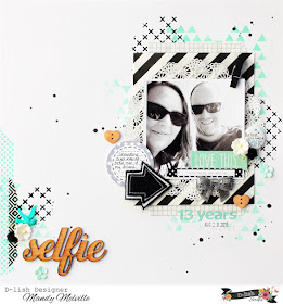
Selfie | D-lish Scraps Design Team Layout

Hi everyone!

I'm back today to share another one of my design team layouts for D-lish Scraps. I created this for one of the current Cybercrop challenges in The Scrap Suite. Here's my layout...

"Selfie"


This is for Sonia's challenge, which is all about scrapping with numbers:


I created this layout to celebrate my 13th wedding anniversary with my husband last year. We managed to get the kids minded so that we could go out for lunch to celebrate. We had a lovely time, and of course we had to commemorate the occasion with a selfie!

Who else managed to snap up some of those awesome Dusty Attic stencils when they went up in the store last month? Boy they flew out the door fast! Luckily I managed to purchase a few before they sold out! To create my background on this layout I used the Triangles stencil with Distress Ink and the Criss Cross stencil with black gesso.

I went a little crazy embellishing this layout and it is jam packed with D-lish goodies! Here are some closeups...


How awesome are these wood veneer words! They make adding a title to your layout super easy! I left mine raw, but you could also add paint or ink to them if you wanted to! Down the left hand side of my layout I added some strips of torn washi tape (these two are from previous Just Add Paper kits, but there are lots of other fun designs in store). I then created a little cluster above the title using a white pastel petal, a black mini rose, and a resin bird.


I actually used no patterned papers on this layout (I know, don't fall over, lol). All of the layers behind my photo are items that you'll find in the D-lish Scraps store. You can see here that I used a bitty bag from last month's Just Add Paper kit, which I cut in half and tucked under the top and bottom of the layers to give the illusion that it is a long piece. I also used a 5x7 diagonal stripe bag and one of the super pretty 6" lace doilies. To the top right hand corner of my photo I also attached a black mini wooden peg.


To the left of my photo I added a journal spot and a wooden heart button. (As well as an arrow from my stash).


Lots more D-lish goodies here! To the right of my photo I created another little cluster using a flair button from the 'Let's take a Selfie' set, with another white pastel petal and black mini rose. On the bottom of my photo I added a phrase from the black minifetti sheet as well as a grey sequin bow. You can also see here that I added another wooden heart button and a little paper flower from a previous Just Add Paper kit (I think it might be a bitty bloom). I also created a sub-title on my layout, which you can see here, using the Kaisercraft Alpha Stickers.

If you haven't checked out our Cybercrop challenges for this month, make sure you head on over to The Scrap Suite to take a look! You've got until 17th June to play along, so still plenty of time!

I'll be back tomorrow with my last D-lish Scraps share for the month!

Mandy

Saturday, 21 May 2016

A Fun Day | D-lish Scraps Design Team Layout

Hello Scrappy friends!

I'll be sharing some projects over on the D-lish Scraps blog over the next few days! I'm kicking it off today with my take on the current Inspiration Board challenge! I absolutely love the colour palette this month! Here's my layout...

"A Fun Day"


And here's a reminder of the "Tranquil Pools" Inspiration Board...


How divine is this?! This recent photo of my son taking a swim in the pool when we were on holidays was just perfect for creating a layout inspired by this board! I also used the sketch as the basis for my layout.

I used lots of items from this month's Just Add Paper kit to create my layout! These kits are amazing value and make it so easy to create a layout with perfectly co-ordinated embellishments! But you have to be quick, because they sell out super fast!

Here are some closeups of my layout so that you can see all of the lovely embellishments...


The wood veneer circles in this month's kit were so much fun! I used two different coloured spray inks to add colour to them. Rather than spraying the ink on though, I got a paintbrush and painted it on as I felt like it gave a more even coverage and there was less wastage. I love how well the wood veneer took the colour, and how bright and vibrant the colours are! Here you can also see that I added one of the flair buttons from the kit, as well as two of the resin flowers and a sprinkling of sequins.


On the bottom right hand corner of my photo I created a little cluster that includes a phrase from the Boy oh Boy Wordfetti sheet, a wooden button (this particular button is no longer available), a paper flower from the kit, and a puffy sticker from my stash. I also tucked the tab from the journal pack in the kit underneath the right hand side of my photo.


In the bottom right hand corner of my layout I added my title, as well as the date tag from the journal pack, another paper flower from the kit, a resin flower, and some more sequins.

I hope that you play along with our Inspiration Board challenge this month! If you get some creative time this weekend, why don't you give it a go! Link up your project over on the D-lish Scraps blog by the end of the month for your chance to win a prize!

I'll be back tomorrow with another share! Until then, happy scrapping!

Mandy

Sunday, 15 May 2016

Happy Boy | Stuck?! Sketches Design Team Layout

Hello scrappy friends!

It's the middle of the month and that means that it's time for the reveal of the May 15th challenge at Stuck?! Sketches! Let's take a look at the fabulous sketch designed by Laura Whitaker...


And here's my layout that I created using this sketch...


I had a lot of fun with this sketch! Instead of the circles behind the photos, I decided to use stars, which I cut on my Cameo using a cut file from The Cut Shoppe.

I just love these photos of my son when he was just learning to walk! He's now 8 years old and I'm still slowly documenting his baby photos! I must admit though that I do love going back and scrapping these photos of when he was so little! What a cutie!

My layout features patterned papers and embellishments from the Cocoa Vanilla Studio Flying High collection with a few embellishments from some of their other collections as well.

Here are some closeups of my layout...


I love Cocoa Vanilla Studio embellishments!! To create my title I used a puffy sticker from the Free Spirit collection as well as a sticker from the Flying High collection. You can also see here a puffy star sticker and a woodie from the Hello Sunshine collection! I love how well these embellishments all co-ordinate even though they're from different collections!


I tucked a Charms Creations star under the right hand side of my photo and popped a Cocoa Vanilla flair on top.


I created another little cluster in the bottom right hand corner of my layout using more Cocoa Vanilla stickers and ephemera.

If you haven't done so already, I hope that you'll head on over to the Stuck?! Sketches blog and take a look at the gorgeous layouts that my fellow design team members have created! We would love YOU to play along with us by creating a layout based on the sketch! Link up your layouts on the Stuck?! Sketches?! blog by May 29th to be in the running to win a prize from one of our very generous sponsors:


We will also be choosing a scrapbooker from each of our challenges to be a guest designer with us at a later date!

Thank you so much for visiting my blog and taking a look at my layout! Thank you to those who take the time to leave a comment as well - it is always very much appreciated!

Mandy

Friday, 6 May 2016

Better Together | Off the Rails Blog Hop

Hello and welcome to my blog!

Today I'm excited to be participating in the Off the Rails Design Team Blog Hop! The theme is fun, bright and colourful!


Team A are starting off today, Friday May 6th through to Sunday May 8th. Please visit each blog and leave a comment as you're hopping along!


Mandy Melville - http://mandymelville.blogspot.com.au/ You are here...


At the end of the hop please head back to the Off the Rails blog here:


and leave a comment for your chance to win a fabulous prize in the random draw!

*****************************************************************************

So, here is my "fun, bright and colourful" layout that I created for the blog hop...


I thought that this fun photo of my eldest two kids and I enjoying some frozen yoghurt would be perfect for this mood board! I originally chose it because of the bright colours in the photo, but I ended up printing it in black and white so that it didn't get lost amongst all of the bright colours on my page.

My layouts features gorgeous patterned papers and embellishments from the Amy Tangerine Better Together collection, as well as a Charms Creations arrow.

Here are some closeups of my layout so that you can see all of the fun details...


Next up on the blog hop is 
Thank you so much for visiting my blog! Please leave me a comment so that I know you were here, and if you like my work, I would love you to follow me! (links to all my social media are in the sidebar)!

Wishing everyone a happy National Scrapbooking Day for this Saturday!

Mandy

Sunday, 1 May 2016

Jump! | Stuck?! Sketches Design Team Layout

Hello again!

I'm back to share another layout with you! This one is for the May 1st challenge at Stuck?! Sketches. I always love Laura's sketches, but I think this might be one of my all time favourites! I love the design of it, and my layout came together really quickly! Here's the sketch...


I stuck fairly closely to the sketch, although I did mirror reverse it, and I used one horizontal photo instead of two vertical ones. Here is my layout...

"Jump!"


How fun is this photo of my two eldest kids! We recently went on a family holiday and the place where we stayed had this awesome lagoon that you could swim and canoe in. My kids had an absolute ball jumping off the wharf into the lagoon!

I was so happy recently to find that my local Spotlight store finally got the Amy Tangerine Better Together collection in! I have been loving seeing everyone's gorgeous projects with this collection, so I was so pleased to finally have a play with it myself! And I think that it was just perfect to document this photo!

Here are a couple of closeups of my layout...


Lots of the sayings on the cut apart sheet were perfect for this layout... I used the "Here we go" and the "Happy Together" ones! For my title I used Thickers from one of the older Amy Tangerine collections (Rise and Shine I think).


As always I used lots of foam tape between my layers for added dimension. To the right of my photo I created a little cluster using a couple of D-lish Scraps flowers. You can also see here the resin bird that I added.

If you haven't done so already, I hope that you'll head on over to the Stuck?! Sketches blog and take a look at the gorgeous layouts that my fellow design team members have created! We would love YOU to play along with us by creating a layout based on the sketch! Link up your layouts on the Stuck?! Sketches blog by May 29th to be in the running to win a prize from one of our very generous sponsors:


We will also be choosing a scrapbooker from each of our challenges to be a guest designer with us at a later date!

Thank you so much for visiting my blog and taking a look at my layout! Thank you to those who take the time to leave a comment as well - it is always very much appreciated!

Mandy

Sweet Dreams | Scrap the Girls May Design Team Layout

Hello friends!

I can't believe that May is upon us already, but here we are at the start of a new month once again, and that means that it's time for some fresh scrappy challenges!

This month over at Scrap the Girls we have a sketch challenge! Everybody loves a good sketch to inspire your creativity right?! Well, here is our sketch for this month, designed by Kristine Davidson...


For my layout, I stuck to the basic placement of all of the elements on the sketch including the photos, the title, the embellishment clusters and the journalling, but I decided to exclude all of the paper layers behind the photos. Here's my layout...

"Sweet Dreams"


How sweet are these photos of my baby girl sleeping?! I don't often get to snap photos of her sleeping because she's quite a light sleeper and will usually only sleep when she is tucked into her cot with her bunny and dummy. But this day we were visiting my sister and she was so tired that she fell asleep on the lounge. Of course I had to take the opportunity to quietly take some photos of her!!

I finally got my hands on the Maggie Holmes Bloom patterned papers recently and I just love them! I fussy cut the yellow flowers from one of the patterned papers and I love how pretty these are!

Here are some closeups of my layout...


As I quite often do, I combined different alphas to create my title. I used a foam word from the Amy Tangerine Better Together Thickers pack combined with chipboard Thickers.


I created a little cluster here with a Maggie Holmes tag, which a added a glitter chipboard heart to, as well as a flair button and a resin flower, both from D-lish Scraps.


I added this strip from one of the cut apart sheets along the bottom of my layout to replicate the strips of patterned paper running horizontally on the sketch. The phrase on it was just perfect for my photos!

If you haven't done so already, I hope that you'll pop on over to the Scrap the Girls blog and take a look at the gorgeous layouts that my fellow design team members have created with this sketch! Link up your layouts on the Scrap the Girls blog by May 31st to have a chance of winning a prize from our very own AJ Redicliffe!

Thank you for taking the time to visit and for your lovely comments also! I will be back later today with my design team layout for Stuck?! Sketches!

Mandy