Tuesday, 23 February 2016

Beautiful Girl | D-lish Scraps Design Team Layout

Hi again!

I'm back today sharing my final layout for D-lish Scraps for the month! I was in the mood to play with a bit of mixed media when I sat down to do this layout, so I created a pretty background using Distress Inks and texture paste with a stencil. My layout features a super sweet photo of my baby girl...


I know lots of people don't really like using purple on their scrapbook layouts, but I personally love it and wish that more scrapbook collections had some purple in them because it's often hard to find purple scrapbook supplies. But never fear, D-lish Scraps has got your back, with embellishments in every colour that your heart could desire (including purple)!

Let's take a look at a few closeups of my layout so that you can see all of the gorgeous D-lish embellies that I used...


I love this pretty cluster of embellishments! I started by tucking a doily underneath the corner of the photo. I then added a phrase from the Sugar & Spice wordfetti sheet on top of my photo and attached it with a wooden peg. To finish this cluster off, I added a couple of small flowers (a plum sweetheart bloom and a white pastel petal), as well as a resin diamond. Here you can also see one of the small paper butterflies that I used on my layout.


I created a small flower cluster on the bottom left hand corner of the photo using a large purple rose and a sage coloured flower that is no longer being stocked.


The main flower cluster on the right hand side of my photo consists of two flowers from the Boutique Elements Camden Cottage French Carnival pack as well as another large purple rose. The Boutique Elements flowers have now been moved to the Clearance section of the store and are currently still available, but once they are sold out, they won't be re-stocked, so get in quick if you want to grab yourself a pack!

I hope that you have enjoyed looking at my D-lish Scraps layouts over the past few days! Thank you so much for visiting my blog, and also for any lovely comments that you leave for me!

Mandy

Monday, 22 February 2016

Year Six | D-lish Scraps Design Team Layout

Hi there!

Today I'm here with another layout for D-lish Scraps, and this time I'm sharing my take on one of the current Cybercrop Challenges in The Scrap Suite. If you're not yet a member of our Facebook group, then we'd love you to come and join us! Each month we have four Cybercrop Challenges running that are set by the D-lish Scraps Design Team members.

Inspired by Emma's Cybercrop challenge this month, I created this layout about my daughter starting Year six...


This is the challenge that Emma has set...


This is such a great challenge because I'm sure if you're anything like me, you have stacks of school related photos that are waiting to be scrapped! I decided to scrap this recent photo of my daughter's first day back at school this year. I wanted to document how I felt about her starting her final year of primary school (I must admit I was a bit emotional!) as well as how excited she was about being a 'school leader' this year.

Here are a few closeups of my layout...


I started my layout off by creating lots of layers behind my photo using patterned paper, as well as a 5x7 chevron bag and some red spot tissue paper that I had left over from last month's Just Add Paper kit. I mounted my photo up with foam tape to add some dimension. I then attached an arrow paperclip to the top left hand corner of the layers... I like how the paperclip adds to the 'school' theme!


Up in the top right hand corner of my layout I created a little cluster to add another point of interest. I first added two strips of washi tape. (The washi tapes have recently been moved to the clearance section of the D-lish Scraps store so be quick if you want to grab some at a bargain price because once they're gone, they're not being restocked). On top of the washi tape I added a flair button from the School Days set.


To the right of my photo I added a bright chevron journal spot which I stamped the date onto, and another flair button from the school days set. On the bottom right hand corner of my photo I stuck a gorgeous felt polka dot bow. Below my photo I added two phrases, one from the yellow minifetti sheet, and the other from the Everyday Moments wordfetti sheet. They were the perfect sentiments for my layout. I especially like the 'Just be You' phrase, as I really want my daughter to remember this as she will soon be entering the difficult teenage years. Does anyone else love wordfetti/minifetti as much as me?! I finished my layout off by adding a couple of wooden apple buttons (which are perfect for a school themed layout), and some gold glitter chipboard stars (these are no longer in stock).

If you haven't done so already, I hope that you'll pop on over to The Scrap Suite and check out all of the current Cybercrop Challenges (one of them is set by me!). These challenges will remain open until Friday 11th March, so you still have plenty of time to join in!

I'll be back tomorrow with my final D-lish Scraps share for the month... this time I had a play with some mixed media! Until then, happy scrapping!

Mandy

You & Me | Off the Rails Scrapbooking Tutorial

Hi there!

Today I'm excited to be sharing my first tutorial for Off the Rails!

When it comes to using mixed media on your layouts, do you find it all a bit daunting and scary? I only dabble in mixed media, but I absolutely adore the beautiful watercolour backgrounds that talented scrappers such as Missy Whidden and Adele Toomey create. I wanted to show you how easy it is to create a watercolour effect on your background even for those who are new to mixed media!

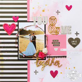
I created this layout for the current 'Romance' mood board at Off the Rails...


I'm going to take you through my process for creating this layout.

What you'll need

Obviously you'll choose whatever papers and embellishments you like, but this is what I used to create my layout.

Step 1

Using a credit card or a similar type of card, start by covering your white cardstock with gesso. I used clear gesso, but you could also use white. Just swipe it over your cardstock until it is all covered (or at least the area where you want to apply the wet media). Then wait for it to dry, or use a heat gun if you want to dry it more quickly.

Step 2

Stamp your chosen colour of distress ink onto some plastic packaging a few times, then add a couple of sprays of water. I also sprayed some water onto my cardstock. Next, simply "smoosh"/smear the plastic packaging around on your cardstock. You might need to repeat this process a couple of times until you have covered the area that wish to cover. It's as easy as that, nothing difficult or technical involved!

Step 3

To add some further interest and contrast to the background I did some stamping with black ink. I stamped three plus signs to create a visual triangle on my page, but you could use any stamp you like, and you could add more stamping than this if you wish.

Step 4

Next, add a 10cm strip of patterned paper down the left hand side of your layout with another thin strip of patterned paper tucked under the edge (you could also use washi tape).

Step 5

Matt your photo, then adhere it to your layout overlapping it onto the strip of patterned paper. Next to the photo I've added a piece from one of the cut-apart sheets of patterned paper. Alternatively you could add a tag or a PL card. Underneath this, I also added a strip of black lace washi tape.

Step 6

Next add your title to the page. I also added a subtitle underneath my photo as I liked that this balanced out the title at the top, as well as adding another gold element to the page. I mounted up the word 'together' with some foam tape to create some extra dimension.

Step 7

Next I added a pip berry stem over my photo to draw the viewers focus in. You could also make a circle out of twine or wire. I think this is a nice way to frame the main subject of the photo. Because I had hot pink and white roses in my wedding bouquet I also included a paper rose in each of these two colours on my page!

Step 8

Then it's time to add some more embellishments to your layout!

I finished my layout off by adding some glitter chipboard hearts and some gold Color Shine ink splatters.

Here's another look at my completed layout...


Here's a reminder of this month's 'Romance' mood board...

I hope that you get a chance to play along with one of our mood boards this month! Our sponsors for February are Candy Chelepy and Memory Maze.

Thanks so much for stopping by, I hope that you found my tutorial useful and enjoyed looking at my layout!

Mandy

Sunday, 21 February 2016

Heart you | D-lish Scraps Design Team Layout

Hi there!

Over the next few days I'll be sharing some of my D-lish Scraps layouts with you. To kick it off, today I'm sharing my take on the current Inspiration Board challenge.

My layout features a lovely photo of my Mum with my youngest daughter and my nephew...


Here's a reminder of what the current inspiration board looks like...


Isn't this just gorgeous?! Every month when the inspiration board is revealed, I think "this is definitely my fave so far!", and then the next one is revealed and that becomes my new fave! But I think it will be pretty hard to top this one... I love it!! I was totally inspired by the yummy colours and the hearts! I also based my layout on the optional sketch, although I kind of added a few additional elements that weren't on the sketch.

I used lots of items from the February Just Add paper kit on my layout. Oh my goodness, there were so many beautiful items in this kit! Although the kit has now sold out you can still purchase some of the items from the kit here.

I think my favourite item in the kit this month was the heart confetti garland which I adhered down the right hand side of my layout! It is just stunning!

Let's take a look at a couple of closeups so that you can see all of the D-lish pretties that I used on my layout...


Amongst the layers behind my photo I included a 5x7 gold horizontal stripe bag (which I cut in half so that I can use the other half on another layout). Also tucked into the layers is a manilla shipping tag which I used to write my journalling on. I finished the tag off with some twine from the JAP kit. I tucked a doily in behind my photo, and created a lovely flower cluster on the top left hand corner of my photo. Included in the flower cluster is a white azalea and a light peach mini heirloom flower (both from Green Tara), as well as a large hot pink rose. Below the flower cluster I added an arrow word tab and a Freckled Fawn glitter chipboard heart (unfortunately these are no longer available).


One of my other favourite items in this month's kit was the scalloped glitter strip. I cut it in half to stretch it further and used it as a border along my patterned paper. I'm also loving the wood veneer pieces that have been making an appearance in the JAP kits lately... I used one from this month's kit as the title for my my layout! I created another little cluster next to the title using a journal spot and flair, both from the JAP kit, as well as another hot pink rose and a mini mint rose from a previous kit. Lastly, I tucked a Pinkfresh Studio ampersand die cut under the right hand side of my photo.

I finished my layout off by adding the date and a few gold ink splatters.

If you haven't had a chance to play along with our inspiration board challenge yet this month, you've still got just over a week to get your layout linked up! We've got some great entries in so far!

Thanks so much for popping by and taking a look at my layout. I'll be back tomorrow with another layout to share with you!

Mandy

Monday, 15 February 2016

Bright Eyes | Stuck?! Sketches February 15th DT Layout

Hi there!

It's time for our mid-month reveal over at Stuck?! Sketches, and Laura has designed another fabulous sketch to inspire us all! Let's take a look at the sketch...


And here is my layout inspired by this sketch...


I really like the design of this sketch and it was perfect to showcase this beautiful photo of my baby girl! My layout features gorgeous patterned papers and ephemera from the Cocoa Vanilla Free Spirit collection, as well as some D-lish Scraps embellishments and a lovely Charms Creations heart.

Here are a couple of closeups of my layout...


I created a pretty flower cluster on the top left hand corner of my layout using some beautiful D-lish Scraps flowers.


I love combining different fonts to create my titles, and so I used one of the die-cut words in the Cocoa Vanilla ephemera pack along with Thickers. What do you do when you run out of a certain letter in your pack of Thickers/lettering? I like to get creative... I had run out of the letter 's' but really wanted to use these letters, so I used the number '8' and turned it into an 's'!

If you haven't done so already, I hope that you'll pop on over to the Stuck?! Sketches blog and take a look at the gorgeous layouts that my fellow design team members have created! We would love YOU to play along with us by creating a layout based on this sketch! Link up your layouts on the Stuck?! Sketches blog by February 29th to be in the running to win a prize from one of our very generous sponsors:


We will also be choosing a scrapbooker from each of our challenges to be a guest designer with us at a later date!

Thank you so much for visiting my blog and taking a look at my layout! Thank you so much to those who take the time to leave a comment as well - it is always very much appreciated!

Mandy

Saturday, 13 February 2016

Love | The Scrap Suite Cybercrop Challenge

Hi there!

Are you a member of the D-lish Scraps Facebook group, The Scrap Suite? We are a fun and supportive group of scrappers who love D-lish Scraps embellies. Come over and join us if you're not already a part of our group! Each month, four of the D-lish Scraps design team members set a Cybercrop challenge for The Scrap Suite members to play along with, and this month is my turn! Being the month of love, I decided to set a Valentines themed challenge...


I scrapped a photo of me with my family. This is the first photo of us taken together as a family of five, so it is pretty special to me!


My layout was inspired by one of Gail Lindner's layouts where she also used a large vertical title on her page.

My layout features patterned papers from the AC Shimelle True Stories collection. I love the bright bold colours in this collection!

I used the following D-lish Scraps embellishments on my layout...
doily -
- wild rose (yellow) -
- starflowers (aqua and tangelo) -
- medium rose (white) -

The teal green flower, the gold hearts and the confetti are also from D-lish Scraps but are now sold out and will no longer be stocked. By the way, if you are looking for a bargain, check out the clearance section on the D-lish Scraps website, as Amanda has recently added lots of items to this section and they are heavily discounted!

Thank you so much for stopping by and taking a look at my layout! Thank you to those who take the time to leave a comment as well... It is always very much appreciated! The current cybercrop challenges are open until 11th March, so you have plenty of time to play along, and the randomly chosen winner of each challenge will win a $10 D-lish Scraps store credit! Pop on over to The Scrap Suite to check out the other cybercrop challenges that have been set by Krisy, Emma and Sue! We would love to see you play along with us this month!

Mandy

Monday, 1 February 2016

Nice | Stuck?! Sketches February 1st Design Team Layout

Hi again!

I'm back to share my design team layout for the February 1st sketch challenge at Stuck?! Sketches! Laura has designed another great multi-photo sketch to inspire us, and I really love the design of this! So let's take a look at the sketch...


I know Christmas has well and truly come and gone now, but I really wanted to scrap these fun photos of my daughter taken at one of our family gatherings this Christmas. Plus I am still loving the Pinkfresh Studio Christmas Wishes collection! So here's my take on the sketch...


My brother-in-law and sister-in-law had some fun christmas-themed photo booth props, and Abi had a ball playing around with them! I love the photos I snapped of her because they really capture her fun personality!

Here are some closeups of my layout...


I cut the stars out of patterned paper using my Silhouette Cameo.


I really love the rubber stickers that co-ordinate with this collection!


I added a wood veneer santa hat on top of my daughter's head in this photo... I think it adds to the sense of fun!


I finished my layout off with a sprinkling of star sequins. It ended up being a fairly simple scrapbook layout, but I wanted to keep the focus on the photos, and I love the patterned paper so much that I didn't think it needed too much.

If you haven't done so already, I hope that you'll pop on over to the Stuck?! Sketches blog and take a look at the lovely layouts that my fellow design team members have created!  We would love you to play along with us by creating a layout based on this sketch! Link up your layouts on the Stuck?! Sketches blog by February 29th to be in the running to win a prize from one of our very generous sponsors:


We will also be choosing a scrapbooker from each of our challenges to be a guest designer with us at a later date!

Thank you so much for visiting my blog and taking a look at my layout! Thank you to those who take the time to leave a lovely comment as well - it is always very much appreciated!

Mandy

Happy | Scrap the Girls February Design Team Layout

Hi there!

Not sure where January disappeared to, but here we are in February already!! The start of a new month means that it's time for some new scrappy challenges to be inspired by! The first one that I'm going to share with you is the stunning mood board challenge over at Scrap the Girls...


Amazing, right??! Love this colour combo! Here's my layout inspired by this mood board...


I added a bit of yellow to the mix, but yellow is pretty much gold right?! I just love this photo I snapped of my daughter with my Mum at my Dad's 60th birthday last year, and it was perfect for this black and gold mood board!

I've used patterned papers from the Maggie Holmes Shine collection... This is definitely one of my fave collections right now!

Here are some closeups of my layout so that you can see all the details...


I really love how the stencilling turned out on this layout. I used gold Faber-Castell Texture Luxe with a TCW stencil. To the left of the photo I created a little flower cluster using some gorgeous flowers from D-lish Scraps.


Absolutely loving these glittery gold Thickers!!! I mounted the word up with some foam tape for some added dimension.

If you haven't done so already, I hope that you'll pop on over to the Scrap the Girls blog and take a look at the gorgeous layouts that my fellow design team members have created! We would love you to join us this month by creating your own layout inspired by this mood board! Link up your layouts on the Scrap the Girls blog by February 29th to be in the running to win a prize from one of our very generous sponsors!

Thank you for taking the time to visit and for your lovely comments also! I will be back later today with my design team layout for Stuck?! Sketches!

Mandy