Sunday, 31 May 2015

My Awesome Boy - Scrapbooking Top 50 and Paper Issues

Hello there and welcome!

I hope that you are having a lovely weekend! I have one last layout to share for this month. I created this layout for the May sketch challenge at Scrapbooking Top 50. The sketch looks like this:
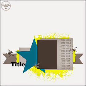
May Challenge

What a cool sketch right? As soon as I saw it I knew that I had to play along with this one! I love the big star in the sketch!

So, here is my layout...
"My Awesome Boy"


I had a lot of fun creating this layout! The photo is of Isaac when he was 6 1/2 months old & was just starting to crawl! He has always been a busy boy & I love that about him! Like every little boy, he's always keen for some kind of adventure!

I also used some free cut files on my layout from Paper Issues:


I used the card with the stars as well as the one that says 'Be Awesome Today', but I rearranged the letters to say 'Awesome Boy'. I thought that I would also play along with the Paper Issues Red, White and Blue Link Party!

Here are some closeups of my layout...


I started my layout by first applying texture paste through a Kaisercraft stencil to the background. This is one of my favourite techniques for adding some subtle interest to a layout! I also flicked some blue watercolour paint onto the background. The red stars on the layout are the cutout pieces from cut file! The large blue star is Heidi Swapp and I coloured it using the same watercolour paint.


I backed the cut file with some cardstock and separated the layers with some foam tape to give it some more depth.


Because the title was fairly long, I moved it up here as it seemed to work better. Other than that, I stayed fairly close to the sketch apart from giving the main elements a bit of a tilt.

Thank you so much for visiting my blog & looking at my layout! And thank you to those who leave lovely messages as well!

Mandy

Monday, 25 May 2015

Love This - Scrap the Girls / Sassy Scrapper / Scrap Our Stash

Hello!

There are a few challenges that I wanted to get done by the end of the month and as time is fast running out, I decided to combine 3 different challenges into one layout!

So here is my layout...
"Love This"


My layout was based on the current sketch challenge at Scrap the Girls, which look like this:


I was also inspired by the current mood board at Sassy Scrappers:

May Moodboard Challenge

I was inspired by the colours - the bright pink combined with dark blue and touches of yellow - as well as the stripes. 

I am also entering this layout into the current stash challenge at Scrap our Stash, which is:

Stash Challenge #26~ Word EMBOSS

The items that I've used are:
E - Enamel Dots
M - Modeling Paste
B - Butterflies
O - 'Oh so Lovely' Kaisercraft Collectables
S - Stenciling
S - Stripe Patterned Paper / Silhouette Cut file

I absolutely fell in love with the Inked Rose collection from We R Memory Keepers as soon as I saw it!! My LSS didn't have the whole collection as a pack so I grabbed one of nearly every sheet of the patterned paper!

The photo that I've scrapped is of my daughter Abigail when she was 3 years old. 

Here are some closeups of my layout...


The flowers that I've used are a combination of D-Lish Scraps and Prima.


This tag is from the 'Oh so Lovely' collection from Kaisercraft... It says "A daughter is someone you laugh with, dream with & love with all you heart"... I thought it was very appropriate!


Another flower and a flair from D-Lish scraps. I fussy cut the butterflies from the patterned paper and mounted them with some foam tape to make it look like they are fluttering off the page!


I cut my title using a Silhouette cut file.

Thank you so much for visiting my blog and taking a look at my layout! Thank you for any lovely comments that you leave for me as well!

Mandy

Friday, 22 May 2015

123 Challenge Blog Guest Designer

Hi there!

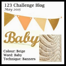
I was so thrilled to be offered a Guest Design Team spot over at 123 Challenge Blog this month! Here are the requirements for the May Challenge...

123 ChallengeI

I was quite pleased when I found out that the word for this month is 'Baby' as I have a huge pile of baby photos of Eleanor that is increasing by the day!! At first I wondered how I would include beige into my layout... I decided that I would use it as an accent colour, with pink as the main colour, and a bit of yellow thrown in as well. And banners... well that was the easy part... my 10 year old daughter recently pointed out that I include some kind of banner on nearly all of my layouts!

So here is the layout that I created...
"Life is Beautiful"


This is my little Eleanor, looking super cute as always, at 10 weeks old!

How awesome is that Heidi Swapp patterned paper?!! I decided I wanted to use the 'life is beautiful' as my title, so I positioned my photo and embellishments around this so as not to cover it up.

I started my layout with a bit of mixed media... I used some texture paste with a Kaisercraft doily stencil at the bottom of my layout behind the photo to give the background some added interest. I then smeared and splattered some pink Tim Holtz distress ink around.

Here are some closeups of my layout...


Here you can see my banner which I created using a Die-namics die. In this cluster on the left of my photo I included a Heidi Swapp acetate butterfly and heart, a D-Lish doily and paper flowers, a BasicGrey resin flower, and a Making Memories word sticker that I've had in my stash for many many years. I really love how this little cluster of embellishments came together!


On the right of my photo I've included a D-Lish flair, a Simple Stories sticker (with the word 'baby') that I've mounted with foam tape, and another Heidi Swapp heart.


I journalled straight onto my layout in the top left corner. You can also see that I included a couple more stickers at the top here from Simple Stories and Making Memories, and also  a strip of washi tape.

Thank you so much for visiting my blog and taking a look at my layout! If you haven't done so yet, why don't you pop on over to the 123 Challenge Blog to check out this challenge and take a look at what the design team have done with it! And there's still time to create your own layout and link it up on the 123 Challenge Blog for the chance to win a prize from Scrapbook Fantasies!

Thank you so much to Alicia and the team at 123 Challenge Blog for having me join them as a guest designer this month!

Mandy

Friday, 15 May 2015

Stuck?! Sketches May 15th DT Reveal

Welcome!

It's time for another sketch to be revealed at Stuck?! Sketches!! Do you love working with sketches when you create?? I do! I love how they are a great jumping off point and can give you fresh design ideas! I really enjoy browsing through all the wonderful entries by our participants at Stuck?! and seeing how everyone puts their own spin on the sketch!

So without further ado, here is the next sketch designed by Laura Whitaker for Stuck?! Sketches...


And here is my take on the sketch...

"You are Precious"


How sweet is that photo?!... Eleanor's cute little feet when she was 2 weeks old... Just so adorable!!

I used Heidi Swapp papers for this layout, from both the Dreamy and Serendipity collections. I love the combination of pink and mint together! I felt like this layout was calling for some haberdashery items and so I included some lace, ribbon, pearl string, a button, and a crocheted heart. I even pulled out a needle and thread and did some hand stitching which I haven't done in ages! I love how all of these elements work well together to give the layout a soft and textured feel.

Here are some closeups...


I used a Heidi Swapp word combined with some thickers for my title. In my little cluster next to the title I've included a crocheted heart and a couple of paper flowers from D-Lish Scraps.


In place of the second photo in the sketch, I used this card that I cut from a sheet of Simple Stories patterned paper. I just love this phrase - its so appropriate for the photo!


And to finish the layout off I've created a cluster of sweet little things on the right hand side of the photo. I chose some more D-Lish goodies including the paper flowers, the resin flower, the peg and the doily. The 'Loved' die cut was from a pack of American Crafts project life embellishments.

I am also entering this layout into this month's challenge at Scrap Around the World. The challenge is to be inspired by this mood board...


I was inspired by the colours in the picture of the ice cream and also by the image of the feet which inspired me to scrap a photo of my baby's precious little feet!

If you haven't done so already, I hope that you'll pop on over to the Stuck?! Sketches blog and take a look at the amazing layouts by my fellow design team members! We would love you to play along with us by creating a layout inspired by this sketch and linking it up on the Stuck?! Sketches blog! The randomly chosen winner will receive a prize from one of our very generous sponsors:


Thank you so much for taking the time to visit and for your lovely comments also!

Mandy

Saturday, 9 May 2015

Isn't She Lovely - The Studio Challenges Blog

Hello!

Today I'm popping in to share a layout that I created for the current challenge at The Studio Challenges blog. The challenge is to be Inspired by a Song - Choose a song a take inspiration from the title or lyrics.

I wanted to scrap a photo of our baby girl Eleanor, and the first song that came to mind was Isn't she Lovely by Stevie Wonder. Here's my layout...

"Isn't she Lovely"


I love this photo of my hubby and I with our new baby girl - my 10 year old daughter snapped it for us just before we headed home from hospital!

The lyrics of this song were just perfect for this layout - they put into words exactly how I was feeling when the photo was taken! I usually hand write my journalling, but I decided that because I was using song lyrics for my journalling that I would print it instead. Here's a closeup...


I included just the first two verses of the song. I did change one word in the lyrics to make it more applicable to the photo... where it says "Less than one minute old" I changed to "Less than one week old".

Here are some more closeups of my layout...


I created the word 'Lovely' using a Silhouette cut file and mounted it with some foam tape to give it some height and dimension. The little letter stickers are ones that I've had for a very long time, I think they are Making Memories.


I just love this clear acetate butterfly by Heidi Swapp - it came in a pack of Ephemera from the Dreamy collection, and sadly I think I've used up all of the butterflies now! The purple flower here is from Prima and the wood veneer arrow is WOW.


Here I've used a selection of stickers and die cuts from different manufacturers... The 'Sweetheart' sticker is from Grant Studios (which I mounted with foam tape), the heart is from Bella Blvd, and the bird cage is a Kaisercraft die cut. The doily and the sequins are from D-Lish Scraps. I also popped some tangled thread in behind this cluster to add some different texture.


And one final closeup of the main area.

I also used a sketch designed by Laura Whitaker for Scrapmuch? as inspiration for my layout design...


(This challenge has now closed but I really liked this sketch and wanted to use it anyway!)

Thank you so much for visiting my blog today, and also for the lovely comments!

I hope that all of the Mums out there celebrating Mothers Day tomorrow have a a very lovely day!

Mandy

Friday, 1 May 2015

Stuck?! Sketches May 1st DT Reveal

Hi there!

Today I am sharing my design team layout for the May 1st sketch at Stuck?! Sketches.Take a look at the wonderful sketch created by our very talented sketch designer Laura Whitaker...


The photos that I wanted to use for this layout were vertical so I decided to rotate the sketch like this:


And here is my layout...
"Hey Rock Star"


I just love these super cute photos of Isaac pretending to be a rock star! I don't know about you but when I purchase papers and embellishments I don't usually have in mind the exact photos that I'm going to use with them, but this time I did! When I saw the Max collection from Bella Blvd, I knew I had to purchase it just so that I could scrap these photos!

I started my layout by applying inks to my background using plastic packaging. This is an easy yet effective technique that I picked up from watching Missy Whidden's process videos. The inks that I used include Heidi Swapp Color Shine (green), Dylusions Ink Spray (yellow), Glimmer Mist (blue), and Distress Ink (orange). I love the fun and messy look that this created! I then painted black Color Shine around the rim of a plate and pressed it down onto my layout to make the circle.

Here are some closeups of my layout...


At the top of my layout here I used a couple of stickers from My Minds Eye, as well as one of the coordinating stickers from Bella Blvd. I mounted a couple with foam tape to give them some height and added interest.


I only wanted to use two photos on my layout so I replaced the third photo in the sketch with this 'Rock Star' card, which I also used as part of my title!


Here you can see that I used some more stickers from the Max collection as well as some sequins. The tab at the side of the photo that says 'be yourself' is attached to my hidden journalling tag.


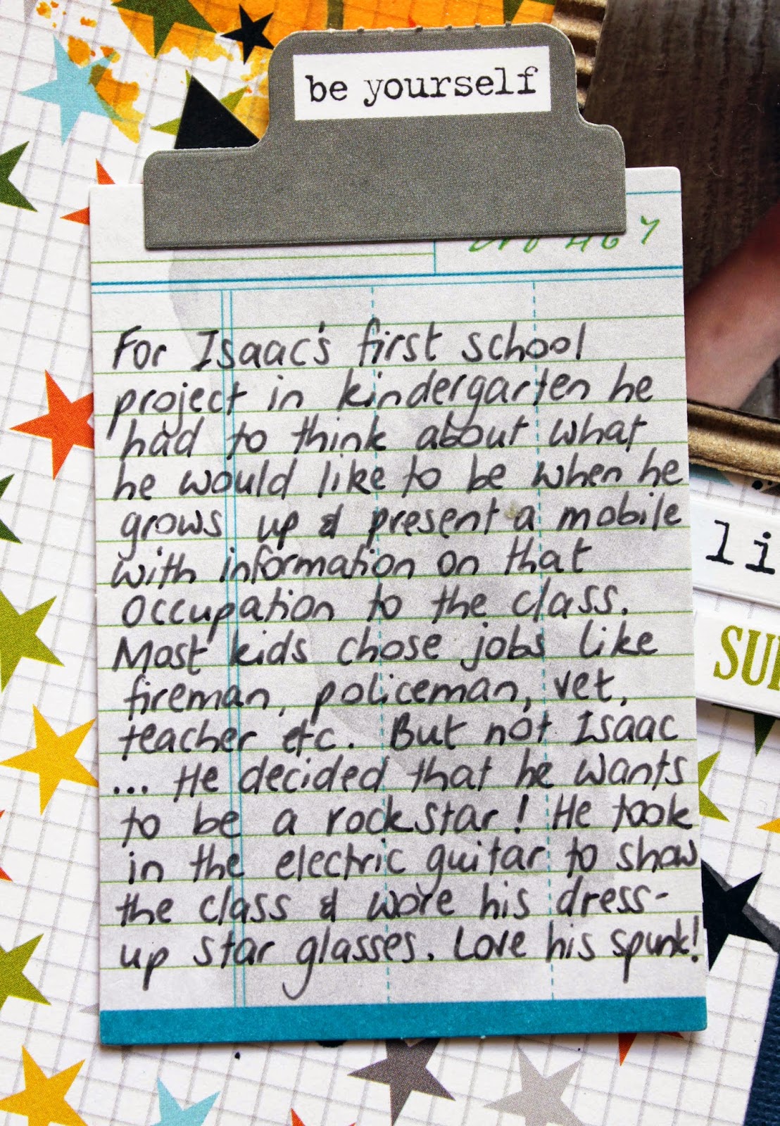
And here is my journalling!

I am also joining in with the challenge at Artastic Challenge Blog. The challenge criteria is to use stars on your project and to be inspired by this artwork:


What a cool challenge, and just perfect for these photos of my little rock star!!

If you haven't done so already, I hope that you'll pop over to the Stuck?! Sketches blog and take a look at the amazing layouts by my fellow design team members! We would love you to play along with us by creating a layout with this sketch and linking it up on the Stuck?! Sketches blog. You will be in the running for one of the fabulous prizes from our lovely sponsors:


Thank you so much visiting and also for any comments that you leave - I do enjoy reading each one!

Mandy